Wordpress Twenty Seventeen Header Scroll Mobile Zooms in
This is happening because mobile-chrome calculates the address bar into the viewport height and while scrolling webpage the address bar scrolls too and the visible area changes it's height dynamically.
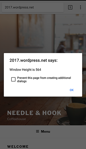
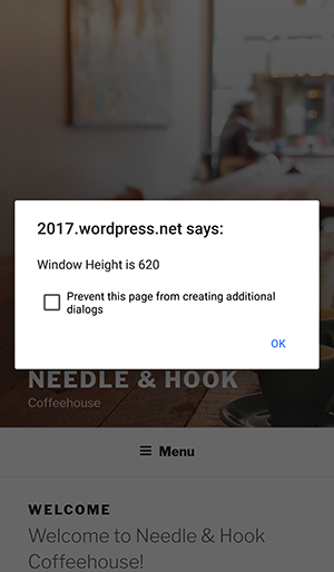
E.g. on 320px X 360px screen, on mobile-chrome with address bar the height of viewport is 564px and after scroll when address bar disappears, the height of viewport changes to 620px.
Viewport Height with address bar
Viewport Height without address bar
Now image in .wp-custom-header taking min-height:100%;height:100% which will change height dynamically, therefore image changing it's dimension while scrolling.
Better way is to fix height of image in pixels in media queries.
.has-header-image .custom-header-media img{
    height: 620px;
    min-height: 0;
}
Similar issue:
css3-100vh-not-constant-in-mobile-browser
Add position: relative; to your cover img:
.wp-custom-header img {
    position: relative;
}
The current position is fixed, which in conjunction with object-fit: cover;, is causing the zoom effect.