SwiftUI Create a Custom Segmented Control also in a ScrollView
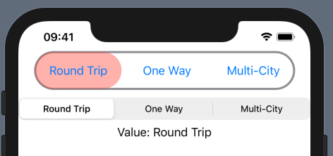
Is this what you are looking for?
import SwiftUI

struct CustomSegmentedPickerView: View {
  @State private var selectedIndex = 0
  private var titles = ["Round Trip", "One Way", "Multi-City"]
  private var colors = [Color.red, Color.green, Color.blue]
  @State private var frames = Array<CGRect>(repeating: .zero, count: 3)

  var body: some View {
    VStack {
      ZStack {
        HStack(spacing: 10) {
          ForEach(self.titles.indices, id: \.self) { index in
            Button(action: { self.selectedIndex = index }) {
              Text(self.titles[index])
            }.padding(EdgeInsets(top: 16, leading: 20, bottom: 16, trailing: 20)).background(
              GeometryReader { geo in
                Color.clear.onAppear { self.setFrame(index: index, frame: geo.frame(in: .global)) }
              }
            )
          }
        }
        .background(
          Capsule().fill(
            self.colors[self.selectedIndex].opacity(0.4))
            .frame(width: self.frames[self.selectedIndex].width,
                   height: self.frames[self.selectedIndex].height, alignment: .topLeading)
            .offset(x: self.frames[self.selectedIndex].minX - self.frames[0].minX)
          , alignment: .leading
        )
      }
      .animation(.default)
      .background(Capsule().stroke(Color.gray, lineWidth: 3))

      Picker(selection: self.$selectedIndex, label: Text("What is your favorite color?")) {
        ForEach(0..<self.titles.count) { index in
          Text(self.titles[index]).tag(index)
        }
      }.pickerStyle(SegmentedPickerStyle())

      Text("Value: \(self.titles[self.selectedIndex])")
      Spacer()
    }
  }

  func setFrame(index: Int, frame: CGRect) {
    self.frames[index] = frame
  }
}


struct CustomSegmentedPickerView_Previews: PreviewProvider {
  static var previews: some View {
    CustomSegmentedPickerView()
  }
}
If I'm following the question aright the starting point might be something like the code below. The styling, clearly, needs a bit of attention. This has a hard-wired width for segments. To be more flexible you'd need to use a Geometry Reader to measure what was available and divide up the space.

struct ContentView: View {

      @State var selection = 0

      var body: some View {

            let item1 = SegmentItem(title: "Some Way", color: Color.blue, selectionIndex: 0)
            let item2 = SegmentItem(title: "Round Zip", color: Color.red, selectionIndex: 1)
            let item3 = SegmentItem(title: "Multi-City", color: Color.green, selectionIndex: 2)

            return VStack() {
                  Spacer()
                  Text("Selected Item: \(selection)")
                  SegmentControl(selection: $selection, items: [item1, item2, item3])
                  Spacer()
            }
      }
}


struct SegmentControl : View {

      @Binding var selection : Int
      var items : [SegmentItem]

      var body : some View {

            let width : CGFloat = 110.0

            return HStack(spacing: 5) {
                  ForEach (items, id: \.self) { item in
                        SegmentButton(text: item.title, width: width, color: item.color, selectionIndex: item.selectionIndex, selection: self.$selection)
                  }
            }.font(.body)
                  .padding(5)
                  .background(Color.gray)
                  .cornerRadius(10.0)
      }
}


struct SegmentButton : View {

      var text : String
      var width : CGFloat
      var color : Color
      var selectionIndex = 0
      @Binding var selection : Int

      var body : some View {
            let label = Text(text)
                  .padding(5)
                  .frame(width: width)
                  .background(color).opacity(selection == selectionIndex ? 1.0 : 0.5)
                  .cornerRadius(10.0)
                  .foregroundColor(Color.white)
                  .font(Font.body.weight(selection == selectionIndex ? .bold : .regular))

            return Button(action: { self.selection = self.selectionIndex }) { label }
      }
}


struct SegmentItem : Hashable {
      var title : String = ""
      var color : Color = Color.white
      var selectionIndex = 0
}


struct ContentView_Previews: PreviewProvider {
    static var previews: some View {
        ContentView()
    }
}