How to set up different Auto Layout constraints for different screen sizes
Without writing a single line of Code!
Once my junior developer asked me the same question that how can I differentiate between iPhoneSE and iPhone6 for some constraint at that time there was only one solution that was writing some thing like
if device == iPhoneSE {
   constant = 44
} else if device == iPhone6 {
   constant = 52
}
To overcome this issue I created a library Layout Helper so now you can update constraint for each device without writing a single line of code.
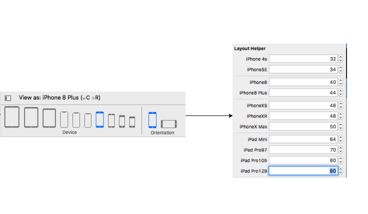
Step 1
Assign the NSLayoutHelper to your constraint
Step 2
Update the constraint for the device you want
Step 3
Run the app and see the MAGIC
Very easy. You can change constants values for difference size classes in Storyboard. I am giving u a few steps after which you will be able to grasp it.
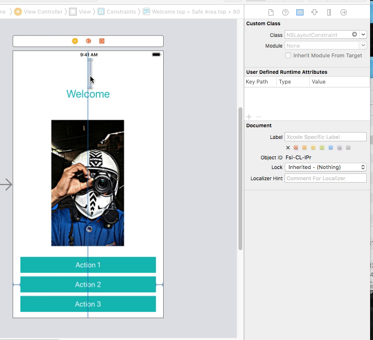
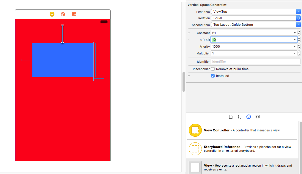
First we create constants as you can see on this view
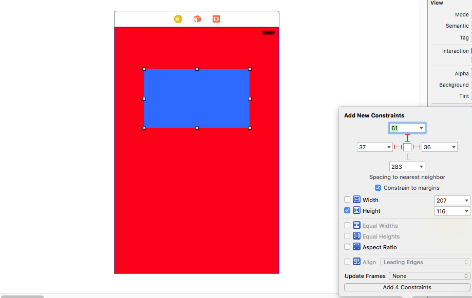
Next we select the constant we want to change the value in other size classes.
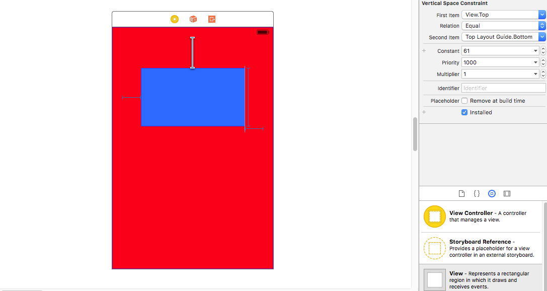
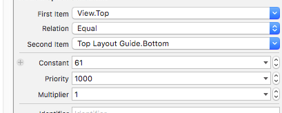
Now comes the tricky part. In the attribute inspector after selecting the constant, you can see the value of the constant. Right beside you can see the PLUS (+) sign, left of the "constant".
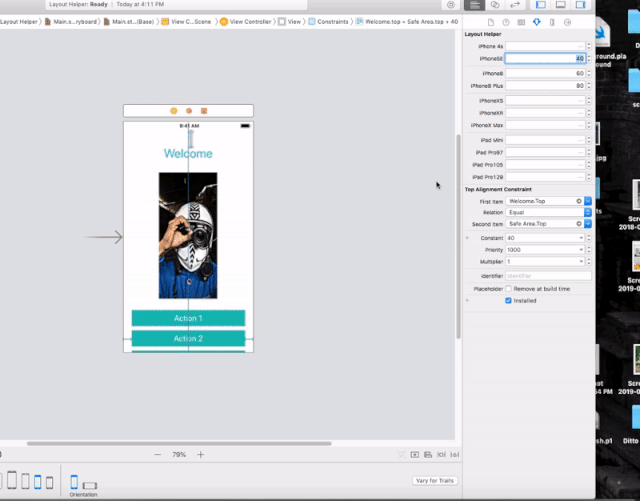
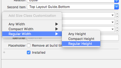
Click on it and select your size class that you want. Here i have selected Regular Height Regular Width i.e for iPad sizes.
Next we give it a new value. So the constant, which normally is of value 61, will function as 10 when rendered in a size class of iPad size classes.
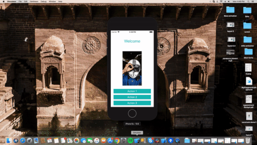
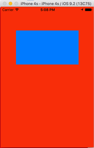
Here is the output --
iPhone 4:
iPad Air:
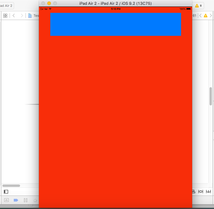
As you can see, the same constants has different value in runtime corresponding to different size classes.
Hope my explanation helped you.
Finally, I`ve found the solution which works in my case.
- I put the transparent view and added Align Center X/Y to Superview(background image) with the needed offset in the way which it suits my frame for posters(on the background image)- Constraints for the transparent view
- Then I attach Equal width/height to my Superview(background image) for that transparent view and change multiplier in equal width(manually I picked 0.61)
- After that, I landed my 1 poster. I also centered both vertically and horizontally with offset and used this set of constraints- Proportional width to Superview, Aspect ratio.
- And the last I disposed my second poster with this constraints- Leading space to Poster1, Align CenterY to Poster1(with the offset in my case) and Equal width/height. Constraints for the Poster 1/2
As the result, I have really adaptive Autolayout which works almost great on iPhones 5-6-6+