Custom circle button
AngryTool for custom android button
You can make any kind of custom android button with this tool site... i make circle and square button with round corner with this toolsite.. Visit it may be i will help you
Use xml drawable like this:
Save the following contents as round_button.xml in drawable folder
<?xml version="1.0" encoding="utf-8"?>
<selector xmlns:android="http://schemas.android.com/apk/res/android">
    <item android:state_pressed="false">
        <shape android:shape="oval">
            <solid android:color="#fa09ad"/>
        </shape>
    </item>
    <item android:state_pressed="true">
        <shape android:shape="oval">
            <solid android:color="#c20586"/>
        </shape>
    </item>
</selector>
Android Material Effect: Although FloatingActionButton is a better option, If you want to do it using xml selector, create a folder drawable-v21 in res and save another round_button.xml there with following xml
<?xml version="1.0" encoding="utf-8"?>
<ripple xmlns:android="http://schemas.android.com/apk/res/android"
    android:color="#c20586">
    <item>
        <shape android:shape="oval">
            <solid android:color="#fa09ad"/>
        </shape>
    </item>
</ripple>
And set it as background of Button in xml like this:
<Button
android:layout_width="50dp"
android:layout_height="50dp"
android:background="@drawable/round_button"
android:gravity="center_vertical|center_horizontal"
android:text="hello"
android:textColor="#fff" />
Important:
- If you want it to show all these states (enabled, disabled, highlighted etc), you will use selector as described here.
- You've to keep both files in order to make the drawable backward-compatible. Otherwise, you'll face weird exceptions in previous android version.
Markushi wrote a circle button widget with amazing effects. Click here!

With the official Material Components library you can use the MaterialButton applying a Widget.MaterialComponents.Button.Icon style.
Something like:
   <com.google.android.material.button.MaterialButton
            android:layout_width="48dp"
            android:layout_height="48dp"
            style="@style/Widget.MaterialComponents.Button.Icon"
            app:icon="@drawable/ic_add"
            app:iconSize="24dp"
            app:iconPadding="0dp"
            android:insetLeft="0dp"
            android:insetTop="0dp"
            android:insetRight="0dp"
            android:insetBottom="0dp"
            app:shapeAppearanceOverlay="@style/ShapeAppearanceOverlay.MyApp.Button.Rounded"
            />
Currently the app:iconPadding="0dp",android:insetLeft,android:insetTop,android:insetRight,android:insetBottom attributes are needed to center the icon on the button avoiding extra padding space.
Use the app:shapeAppearanceOverlay attribute to get rounded corners. In this case you will have a circle.
  <style name="ShapeAppearanceOverlay.MyApp.Button.Rounded" parent="">
    <item name="cornerFamily">rounded</item>
    <item name="cornerSize">50%</item>
  </style>
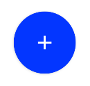
The final result:

With jetpack compose you can use:
    Button(
        onClick = { /* Do something! */ },
        modifier = Modifier.width(48.dp).height(48.dp),
        shape = CircleShape
    ) {
        Icon(Icons.Filled.Add, "")
    }