CSS transition effect makes image blurry / moves image 1px, in Chrome?
You need to apply 3d transform to the element, so it will get its own composite layer. For instance:
.element{
    -webkit-transform: translateZ(0);
    transform: translateZ(0);
}
or
.element{
    -webkit-transform: translate3d(0,0,0);
    transform: translate3d(0,0,0);
}
More about layer creation criteria you can read right here: Accelerated Rendering in Chrome
An explanation:
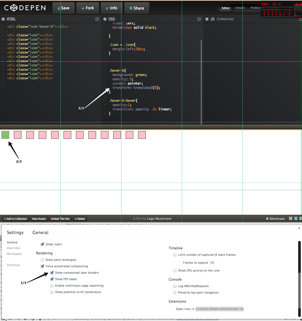
Examples (hover green box):
- Problem: Transition may cause blink effect on sibling elements (OSx Lion, Chrome 30)
- Solution: An element on its own composite layer
When you use any transition on your element it cause browser to recalculate styles, then re-layout your content even if transition property is visual (in my examples it is an opacity) and finaly paint an element:
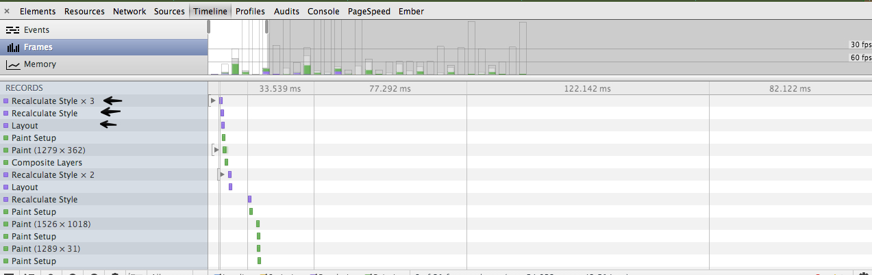
The issue here is re-layout of the content that can make an effect of "dancing" or "blinking" elements on the page while transition happens. If you will go to settings, check "Show composite layers" checkbox and then apply 3d transform to an element, you will see that it gets it's own layer which outlined with orange border.
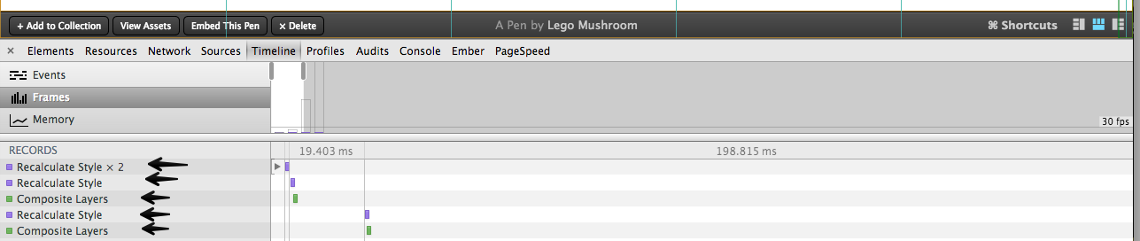
After element gets its own layer, browser just needs to composite layers on transition without re-layout or even paint operations so problem have to be solved:
2020 update
- If you have issues with blurry images, be sure to check answers from below as well, especially the
image-renderingCSS property. - For best practice accessibility and SEO wise you could replace the background image with an
<img>tag using object-fit CSS property.
Original answer
Try this in your CSS:
.your-class-name {
    /* ... */
    -webkit-backface-visibility: hidden;
    -webkit-transform: translateZ(0) scale(1, 1);
}
What this does is it makes the division to behave "more 2D".
- Backface is drawn as a default to allow flipping things with rotate and such. There's no need to that if you only move left, right, up, down, scale or rotate (counter-)clockwise.
- Translate Z-axis to always have a zero value.
- Chrome now handles
backface-visibilityandtransformwithout the-webkit-prefix. I currently don't know how this affects other browsers rendering (FF, IE), so use the non-prefixed versions with caution.
Had the same problem with embeded youtube iframe (Translations were used for centering iframe element). None of the solutions above worked until tried reset css filters and magic happened.
Structure:
<div class="translate">
     <iframe/>
</div>
Style [before]
.translate {
  transform: translateX(-50%);
  -webkit-transform: translateX(-50%);
}
Style [after]
.translate {
  transform: translateX(-50%);
  -webkit-transform: translateX(-50%);
  filter: blur(0);
  -webkit-filter: blur(0);
}