CSS grid with padding overflows container
When you do padding of an HTML element it displaces the content (actually creates space) with respect to its border 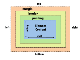
When you do 10% padding-left to your footer, the content displaces by 10% from the left border. But you have 25% and 65% grid ratio which totals to 90%. The rest of 10% is background.
To resolve this issue use a ratio of 25% and 75% or any ratio which totals to 100%. Still the padding will cause the total width to overflow by 10%. So set the width of the footer to 90% that must resolve the overflow problem.
.footer {
	background-color: #2D1975;
	width: 90%;
	height: 350px;
	display: grid;
    padding-left:10%;
    	grid-template-columns: 25% 75%;
    }

    .footerGridLogo {
    	background-color: red;
    }

    .footerGridQuestions {
    	background-color: green;
    }
<div class="footer">
<div class="footerGridLogo">
</div>
<div class="footerGridQuestions">
</div>
</div>I fixed css-grid / padding problems adding next code to css:
*, *::before, *::after {
  box-sizing: border-box;
}
This is box-sizing.
The default value is content-box, which means that padding and border values are added to the width.
You can change this to border-box, which includes padding and border in the width.
Here is a common approach, from this article:
html {
  box-sizing: border-box;
}

*,
*:before,
*:after {
  box-sizing: inherit;
}

.footer {
  background-color: #2D1975;
  width: 100%;
  height: 350px;
  display: grid;
  padding-left: 10%;
  grid-template-columns: 25% 65%;
}

.footerGridLogo {
  background-color: red;
}

.footerGridQuestions {
  background-color: green;
}
<div class="footer">
<div class="footerGridLogo">
</div>
<div class="footerGridQuestions">
</div>
</div>First, instead of using percentage units use fr units. These units represent leftover space and are factored in after fixed lengths (such as padding) have been rendered.
So instead of this:
grid-template-columns: 30% 70%
Try this:
grid-template-columns: 3fr 7fr
More details:
- The difference between percentage and fr units in CSS Grid Layout
Second, remove the width: 100% on the container.
.footer {
  background-color: #2D1975;
  width: 100%; <---------- remove
  height: 350px;
  display: grid;
  padding-left: 10%;
  grid-template-columns: 25% 65%;
}
When you set the .footer to display: grid it becomes (or remains) a block-level element. Such elements automatically occupy the full width of the parent.
However, if you add width: 100% to a block-level element it then adds any padding, margin and border to the calculation, resulting in an overflow. So just remove it.
Third, this whole problem can be avoided if you add the padding-left to the logo itself, and not to the grid container or grid item.