Changing the color of a button in SwiftUI based on disabled or not
I guess you want this:
You can add a computed property for the button color, and pass the property to the button's foregroundColor modifier. You can also use a single padding modifier around the HStack instead of separate paddings on its subviews.
struct ContentView : View {
@State var chatMessage: String = ""
var body: some View {
HStack {
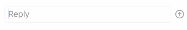
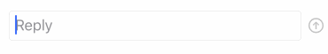
TextField($chatMessage, placeholder: Text("Reply"))
.textFieldStyle(.roundedBorder)
Button(action: sendMessage) {
Image(systemName: "arrow.up.circle")
.foregroundColor(buttonColor)
}
.disabled(!chatMessageIsValid)
}
.padding([.leading, .trailing], 10)
}
var chatMessageIsValid: Bool {
return !chatMessage.isEmpty
}
var buttonColor: Color {
return chatMessageIsValid ? .accentColor : .gray
}
func sendMessage() {
chatMessage = ""
}
}
However, you shouldn't use the foregroundColor modifier at all here. You should use the accentColor modifier. Using accentColor has two benefits:
The
Imagewill automatically use the environment'saccentColorwhen theButtonis enabled, and gray when theButtonis disabled. You don't have to compute the color at all.You can set the
accentColorin the environment high up in yourViewhierarchy, and it will trickle down to all descendants. This makes it easy to set a uniform accent color for your whole interface.
In the following example, I put the accentColor modifier on the HStack. In a real app, you would probably set it on the root view of your entire app:
struct ContentView : View {
    @State var chatMessage: String = ""

    var body: some View {
        HStack {
            TextField($chatMessage, placeholder: Text("Reply"))
                .textFieldStyle(.roundedBorder)
            Button(action: sendMessage) {
                Image(systemName: "arrow.up.circle")
            }
                .disabled(!chatMessageIsValid)
        }
            .padding([.leading, .trailing], 10)
            .accentColor(.orange)
    }

    var chatMessageIsValid: Bool {
        return !chatMessage.isEmpty
    }

    func sendMessage() {
        chatMessage = ""
    }
}
Also, Matt's idea of extracting the send button into its own type is probably smart. It makes it easy to do nifty things like animating it when the user clicks it:
Here's the code:
struct ContentView : View {
    @State var chatMessage: String = ""

    var body: some View {
        HStack {
            TextField($chatMessage, placeholder: Text("Reply"))
                .textFieldStyle(.roundedBorder)
            SendButton(action: sendMessage, isDisabled: chatMessage.isEmpty)
        }
            .padding([.leading, .trailing], 10)
            .accentColor(.orange)
    }

    func sendMessage() {
        chatMessage = ""
    }
}

struct SendButton: View {
    let action: () -> ()
    let isDisabled: Bool

    var body: some View {
            Button(action: {
                withAnimation {
                    self.action()
                    self.clickCount += 1
                }
            }) {
                Image(systemName: "arrow.up.circle")
                    .rotationEffect(.radians(2 * Double.pi * clickCount))
                    .animation(.basic(curve: .easeOut))
            }
                .disabled(isDisabled)
    }

    @State private var clickCount: Double = 0
}
With these various solutions, you can use the \.isEnabled environment property instead of creating custom button styles or passing in disabled booleans yourself.
@Environment(\.isEnabled) private var isEnabled