Building a 4 corners-colors CSS3 gradient
HIGH QUALITY and PORTABLE
In that answer I compare three solutions - but I found fourth solution which produce HIGH quality image and works on Chrome, Safari, Firefox and Edge - here it is:
.myDiv {
    width: 256px; height: 256px;
    background-size: 100% 100%;
    background-image: url("data:image/svg+xml;utf8,%3Csvg preserveAspectRatio='none' viewBox='0 0 1 1' version='1.1' xmlns='http://www.w3.org/2000/svg'%3E%3Cdefs%3E%3ClinearGradient id='g'%3E%3Cstop offset='0' stop-color='%23fff' stop-opacity='0'%3E%3C/stop%3E%3Cstop offset='1' stop-color='%23fff' stop-opacity='1'%3E%3C/stop%3E%3C/linearGradient%3E%3Cmask id='m'%3E%3Crect x='0' y='0' width='1' height='1' fill='url(%23g)'%3E%3C/rect%3E%3C/mask%3E%3ClinearGradient id='a' gradientTransform='rotate(90)'%3E%3Cstop offset='0' stop-color='magenta'%3E%3C/stop%3E%3Cstop offset='1' stop-color='white'%3E%3C/stop%3E%3C/linearGradient%3E%3ClinearGradient id='b' gradientTransform='rotate(90)'%3E%3Cstop offset='0' stop-color='yellow'%3E%3C/stop%3E%3Cstop offset='1' stop-color='red'%3E%3C/stop%3E%3C/linearGradient%3E%3C/defs%3E%3Crect x='0' y='0' width='1' height='1' fill='url(%23a)' mask='url(%23m)'%3E%3C/rect%3E%3Crect x='0' y='0' width='1' height='1' fill='url(%23b)' mask='url(%23m)' transform='translate(1,1) rotate(180)'%3E%3C/rect%3E%3C/svg%3E");
}
<div class="myDiv"></div>In this solution we inject SVG dataurl image into CSS style. We can freely change width and height in myDiv (to allow it we use in svg preserveAspectRatio='none', and additionaly background-size: 100% 100%; for firefox support). Colors used inside svg are magenta, white, yellow, red and can be changed to any css-format color. To have compatibility with MS Edge, in solution SVG we change following characters: " to ', < to %3C, > to %3E and # to %23 (info from here).

editable example here. Svg background generator here.
SIMPLE
Just use this background style for your div element:
.myDiv {
  width: 256px;
  height: 256px;
  background: linear-gradient(to top left, white, rgba(255, 153, 150, 0), red), linear-gradient(to top right, yellow, rgba(255, 153, 150, 0), magenta) rgba(255, 153, 150, 1);
}
<div class="myDiv"></div>Where rgba(255, 153, 150, _ ) is the color in the div center and we use it at bottom with a=1 and in gradients with a=0 for Safari compatibility (for other browsers in gradients we can change rgba(255, 153, 150, 0) to transparetn 50%) .
Working, easy to edit example here. Idea source here.
MEDIUM
We need to add and style div :after pseudo element:
.myDiv {
  width: 256px;
  height: 256px;
  background: linear-gradient(to bottom, red, yellow);
}

.myDiv::after {
  content: "";
  position: absolute;
  width: inherit;
  height: inherit;
  background: linear-gradient(to bottom, magenta, white);
  -webkit-mask-image: linear-gradient(to left, white, transparent);
}
<div class="myDiv"></div>Working, easy to edit example here. Idea from TheDarkln answer (i made pure css version).
COMPLEX
.myDivC{
    overflow: hidden;
    background: linear-gradient(45deg, yellow, magenta);
    width:256px; height:256px;
    position:relative;
    z-index:1;
}

.myDivC:before,.myDivC:after{
    content:'';
    position:absolute;
    width:100%;
    height:100%;
}
.myDivC:before{
    background: red;
    box-shadow: 0 0 140px 64px red;
    z-index:2;
    top: -96%;
    left: -72%;
    opacity: 0.8;
}
.myDivC:after {
    background: white;
    z-index: 3;
    bottom: -96%;
    right: -72%;
    box-shadow: 0 0 100px 64px white;
    opacity: 1;
    border-radius: 100%;
}
<div class="myDivC"></div>Box shadow and more pseud-elements - easy to edit code here. Idea from Gildas.Tambo answer (I choose second solution - first has artefacts "black shadow" on bottom left corner, other solutions not works on Edge).
TEST
It was tested versions:
simple - on Safari (low but acceptable quality), Chrome, Firefox and Edge
medium - on Safari, Chrome, Firefox (not works on Edge).
complex - Chrome, Edge. In Safari and Firefox has "red-box' artefact on left top corner - which can be reduce by change in
.myDivC:before{ ... top: -96% ...}totop: -100%but we loose red intensity a little (here),
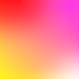
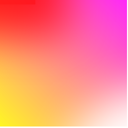
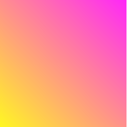
Below is comparison for 3 versions on chrome:

In simple solution we se more "linearity", the medium has the best quality. The complex quality is lower: asymetry and artefact red rectangle in left upper corner - this can be more clear to see when we change yellow to black in all solutions - here:

Conclusion
- Simple version - works everywhere however gives little bit lower (linear) quality than other solutions (especially on Safari)
- Medium version - gives the best quality but not work on Edge
- Complex version - works everywhere witch quality better than simple but worse than medium version, but code is very unhandy and needs more time to prepare, test and maintain.
UPDATE
Recently I develop solution which has both: high quality and is portable - here.
By employing mask-image along with linear gradients, we can accomplish a seamless, 4-colored-corners gradient that only requires an ::after pseudo element.
HTML
<div id="quad">
</div>
SASS
@mixin QuadVertexColors($v0, $v1, $v2, $v3) {

  background: linear-gradient(to bottom, $v0, $v2);

  &::after {

    content: "";
    position: absolute;
    width: inherit;
    height: inherit;
    background: linear-gradient(to bottom, $v1, $v3);
    -webkit-mask-image: linear-gradient(to left, white, transparent);
  }
}

body {

  background-color: #111111;
  padding: 0;
  margin: 0;

  #quad {

    $size: 100vh;

    width: $size;
    height: $size;

    @include QuadVertexColors(red, magenta, yellow, white);
  }
}
CodePen Demo
in your case
Method 1:
jsFiddle Demo
div{
overflow: hidden;
background: #f06;
background: linear-gradient(45deg, #fff722, #ff26f9);
min-height: 100%;
width: 256px;
height: 256px;
position: relative;
z-index: 1;
box-shadow: inset -20px 0 38px -18px #ff26f9,inset -3px -13px 65px -18px yellow;
}

div:before,div:after{
    content:'';
    position:absolute;
    width:100%;
    height:100%;
}
div:before{
    background: red;
    box-shadow: 0 0 140px 64px red;
    z-index:2;
    top: -96%;
left: -72%;
    opacity: 0.8;
}
div:after {
background: white;
z-index: 3;
bottom: -96%;
right: -72%;
box-shadow: 0 0 140px 64px white;
opacity: 1;
border-radius: 100%;
}
Method 2:
div{
overflow: hidden;
background: #f06;
background: linear-gradient(45deg, #fff722, #ff26f9);
min-height: 100%;
width:256px;
height:256px;
position:relative;
    z-index:1;
}

div:before,div:after{
    content:'';
    position:absolute;
    width:100%;
    height:100%;
}
div:before{
    background: red;
    box-shadow: 0 0 140px 64px red;
    z-index:2;
    top: -96%;
left: -72%;
    opacity: 0.8;
}
div:after {
background: white;
z-index: 3;
bottom: -96%;
right: -72%;
box-shadow: 0 0 140px 64px white;
opacity: 1;
border-radius: 100%;
}
jsFiddle Demo
Method 3: multiple background:
div{
background: #f06;
background: linear-gradient(45deg, #fff722, #ff26f9),linear-gradient(142deg, transparent, white),linear-gradient(108deg, red, transparent);
min-height: 100%;
width:256px;
height:256px;
position:relative;
    z-index:1;
}
jsFiddle Demo
Method 4: pseudo element
div{
background: #f06;
background: linear-gradient(45deg, #fff722, #ff26f9);
min-height: 100%;
width:256px;
height:256px;
position:relative;
    z-index:1;
}

div:before,div:after{
    content:'';
    position:absolute;
    width:100%;
    height:100%;
    opacity: 0.8;
}
div:before{
    background: linear-gradient(108deg, red, transparent);
    z-index:2;
    top:0;
    left:0;
}
div:after{
    background: linear-gradient(142deg, transparent, white);
    z-index:3;
    bottom:0;
    right:0;
}
the markup:
<div></div>
jsFiddle Demo
Method 5:
div{
overflow: hidden;
background: #f06;
background: linear-gradient(45deg, #fff722, #ff26f9);
min-height: 100%;
width:256px;
height:256px;
position:relative;
    z-index:1;
}

div:before,div:after{
    content:'';
    position:absolute;
    width:100%;
    height:100%;
}
div:before{
    background: linear-gradient(108deg, red, transparent);
    z-index:2;
    top:0;
    left:0;
    opacity: 0.8;
}
div:after {
background: white;
z-index: 3;
bottom: -96%;
right: -72%;
box-shadow: 0 0 110px 54px white;
opacity: 1;
border-radius: 100%;
}
jsFiddle Demo
Update: many thanks to Ana-Maria Tudor <3
body{
position:fixed;
top:0;
right:0;
bottom:0;
left:0;
}

body:before {
  content: '';
  position:absolute;
  top:0;
  right:0;
  bottom:0;
  left:0;
  display: block;
  width: 100%;
  height: 600px;
  border-radius: 0%;
  background:
    radial-gradient(circle at 50% 0,
         rgba(255,0,0,.5), rgba(255,0,0,0) 70.71%),
    radial-gradient(circle at 6.7% 75%,
         rgba(0,0,255,.5), rgba(0,0,255,0) 70.71%),
    radial-gradient(circle at 93.3% 75%,
         rgba(0,255,0,.5), rgba(0,255,0,0) 70.71%);
}
jsFiddle Demo