Why em instead of px?
The reason I asked this question was that I forgot how to use em's as it was a while I was hacking happily in CSS. People didn't notice that I kept the question general as I wasn't talking about sizing fonts per se. I was more interested in how to define styles on any given block element on the page.
As Henrik Paul and others pointed out em is proportional to the font-size used in the element. It's a common practice to define sizes on block elements in px, however, sizing up fonts in browsers usually breaks this design. Resizing fonts is commonly done with the shortcut keys Ctrl++ or Ctrl+-. So a good practice is to use em's instead.
Using px to define the width
Here is an illustrating example. Say we have a div-tag that we want to turn into a stylish date box, we may have HTML-code that looks like this:
<div class="date-box">
    <p class="month">July</p>
    <p class="day">4</p>
</div>
A simple implementation would defining the width of the date-box class in px:
* { margin: 0; padding: 0; }

p.month { font-size: 10pt; }

p.day { font-size: 24pt; font-weight: bold; }

div.date-box {
    background-color: #DD2222;
    font-family: Arial, sans-serif;
    color: white;
    width: 50px;
}
The problem
However, if we want to size the text up in our browser the design will break. The text will also bleed outside the box which is almost the same what happens with SO's design as flodin points out. This is because the box will remain the same size in width as it is locked to 50px.
Using em instead
A smarter way is to define the width in ems instead:
div.date-box {
    background-color: #DD2222;
    font-family: Arial, sans-serif;
    color: white;
    width: 2.5em;
}

* { margin: 0; padding: 0; font-size: 10pt; }

// Initial width of date-box = 10 pt x 2.5 em = 25 pt
// Will also work if you used px instead of pt
That way you have a fluid design on the date-box, i.e. the box will size up together with the text in proportion to the font-size defined for the date-box. In this example, the font-size is defined in * as 10pt and will size up 2.5 times to that font size. So when you're sizing the fonts in the browser, the box will have 2.5 times the size of that font-size.
It is wrong to say that one is a better choice than the other (or both wouldn't have been given their own purpose in the spec). It may even be worth noting that Stack Overflow makes extensive use of px units. It is not the poor choice that the question suggests it is.
Definition of units
px is an absolute unit of measurement (like in, pt, or cm) that also happens to be 1/96 of an in unit (more on why later). Because it is an absolute measurement, it may be used any time you want to define something to be a particular size, rather than being proportional to something else like the size of the browser window or the font size.
Like all the other absolute units, px units don't scale according to the width of the browser window. Thus, if your entire page design uses absolute units such as px rather than %, it won't adapt to the width of the browser. This is not inherently good or bad, just a choice that the designer needs to make between adhering to an exact size and being inflexible versus stretching but in the process not adhering to an exact size. It would be typical for a site to have a mix of fixed-size and flexible-sized objects.
Fixed size elements often need to be incorporated into the page - such as advertising banners, logos or icons. This ensures you almost always need at least some px-based measurements in a design. Images, for example, will (by default) be scaled such that each pixel is 1px in size, so if you are designing around an image you'll need px units. It is also very useful for precise font sizing, and for border widths, where due to rounding it makes the most sense to use px units for the majority of screens.
All absolute measurements are rigidly related to each other; that is, 1in is always 96px, just as 1in is always 72pt. (Note that 1in is almost never actually a physical inch when talking about screen-based media). All absolute measurements assume a nominal screen resolution of 96ppi and a nominal viewing distance of a desktop monitor, and on such a screen one px will be equal to one physical pixel on the screen and one in will be equal to 96 physical pixels. On screens that differ significantly in either pixel density or viewing distance, or if the user has zoomed the page using the browser's zoom function, px will no longer necessarily relate to physical pixels.
em is not an absolute unit - it is a unit that is relative to the currently chosen font size. Unless you have overridden the font style by setting your font size with an absolute unit (such as px or pt), this will be affected by the choice of fonts in the user's browser or OS if they have made one, so it does not make sense to use em as a general unit of length except where you specifically want it to scale as the font size scales.
Use em when you specifically want the size of something to depend on the current font size.
rem is like em, but it's relative to the base font size of the document (specifically, of the root element), rather than the font size given to the current element.
% is also a relative unit, in this case, relative to either the height or width of a parent element. They are a good alternative to px units for things like the total width of a design if your design does not rely on specific pixel sizes to set its size.
Using % units in your design allows your design to adapt to the width of the screen/device, whereas using an absolute unit such as px does not.
vh, vw, vmin, and vmax are relative units like %, but they are relative to the size of the viewport (size of the viewable area of the window) rather than of the parent element. Respectively, they are relative to the viewport's height, width, smaller of the two, and greater of the two.
I have a small laptop with a high resolution and have to run Firefox in 120% text zoom to be able to read without squinting.
Many sites have problems with this. The layout becomes all garbled, text in buttons is cut in half or disappears entirely. Even stackoverflow.com suffers from it:
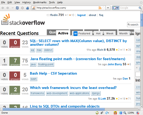
Note how the top buttons and the page tabs overlap. If they would have used em units instead of px, there would not have been a problem.