What’s the etiquette on using diagrams that need color to be understood?
The concern with color figures for grey scale printing is less of an issue these days, when pretty much all displays are in color, so the reader can always check which color is which even if the document is printed in grayscale. (Many journals no longer insist that the figures should display well when printed in grayscale.)
The issue with color blind readers is more substantial. Best practice ("etiquette") is to
- Avoid ambiguous color combinations: green & brown, blue & purple, green & blue, light green & yellow, blue & grey, green & grey, green & black;
- Use a high enough contrast, which most color blind people can still distinguish.
- Use textures instead of / in addition to colors;
- Add a label or graphical element to distinguish different colors.
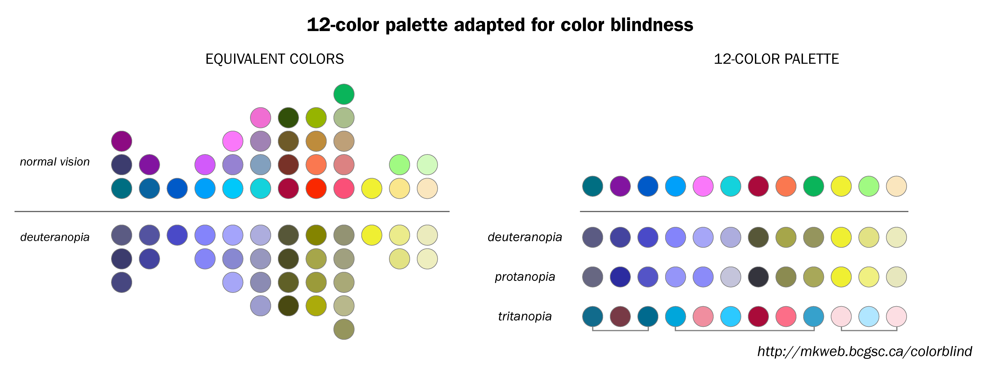
Here is a color-blind safe palette:
I can share my own experience. To make the diagrams with colored edges we use different line styles (dashed, dotted, bold, normal). We post the color version in the arxiv. When people print it b/w, the style of the lines still can be distinguished. Of course we explain in the text writing something like this: red line (dashed)... .Some journals publish color pictures in online versions. Few journals publish color pictures on paper.
For other types of diagram you can fill the regions with different filling style, AND use color. The regions will differ both in color and in b/w print.
As a complement to Carlo Beenakker's very good answer, I suggest to have a look at the palettes proposed by Paul Tol. He purports to answer the very questions you asked. You can find his work summarised on his webpage, which includes a link to his detailed technical note on colour schemes.