What is the difference among col-lg-*, col-md-* and col-sm-* in Bootstrap?
From Twitter Bootstrap documentation:
- small grid (≥ 768px) =
.col-sm-*, - medium grid (≥ 992px) =
.col-md-*, - large grid (≥ 1200px) =
.col-lg-*.
Updated 2020...
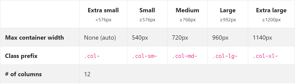
Bootstrap 5
In Bootstrap 5 (alpha) there is a new -xxl- size:
col-* - 0 (xs)col-sm-* - 576pxcol-md-* - 768pxcol-lg-* - 992pxcol-xl-* - 1200pxcol-xxl-* - 1400px
Bootstrap 5 Grid Demo
Bootstrap 4
In Bootstrap 4 there is a new -xl- size, see this demo. Also the -xs- infix has been removed, so smallest columns are simply col-1, col-2.. col-12, etc..
col-* - 0 (xs)col-sm-* - 576pxcol-md-* - 768pxcol-lg-* - 992pxcol-xl-* - 1200px
Bootstrap 4 Grid Demo
Additionally, Bootstrap 4 includes new auto-layout columns. These also have responsive breakpoints (col, col-sm, col-md, etc..), but don't have defined % widths. Therefore, the auto-layout columns fill equal width across the row.
Bootstrap 3
The Bootstrap 3 grid comes in 4 tiers (or "breakpoints")...
- Extra small (for smartphones
.col-xs-*) - Small (for tablets
.col-sm-*) - Medium (for laptops
.col-md-*) - Large (for laptops/desktops
.col-lg-*).
These grid sizes enable you to control grid behavior on different widths. The different tiers are controlled by CSS media queries.
So in Bootstrap's 12-column grid...
col-sm-3 is 3 of 12 columns wide (25%) on a typical small device width (> 768 pixels)
col-md-3 is 3 of 12 columns wide (25%) on a typical medium device width (> 992 pixels)
The smaller tier (xs, sm or md) also defines the size for larger screen widths. So, for the same size column on all tiers, just set the width for the smallest viewport...
<div class="col-lg-3 col-md-3 col-sm-3">..</div> is the same as,
<div class="col-sm-3">..</div>
Larger tiers are implied. Because col-sm-3 means 3 units on sm-and-up, unless specifically overridden by a larger tier that uses a different size.
xs(default) > overridden by sm > overridden by md > overridden by lg
Combine the classes to use change column widths on different grid sizes. This creates a responsive layout.
<div class="col-md-3 col-sm-6">..</div>
The sm, md and lg grids will all "stack" vertically on screens/viewports less than 768 pixels. This is where the xs grid fits in. Columns that use the col-xs-* classes will not stack vertically, and continue to scale down on the smallest screens.
Resize your browser using this demo and you'll see the grid scaling effects.
This article explains more about how the Bootstrap grid
The bootstrap docs do explain it, but it still took me a while to get it. It makes more sense when I explain it to myself in one of two ways:
If you think of the columns starting out horizontally, then you can choose when you want them to stack.
For example, if you start with columns: A B C
You decide when should they stack to be like this:
A
B
C
If you choose col-lg, then the columns will stack when the width is < 1200px.
If you choose col-md, then the columns will stack when the width is < 992px.
If you choose col-sm, then the columns will stack when the width is < 768px.
If you choose col-xs, then the columns will never stack.
On the other hand, if you think of the columns starting out stacked, then you can choose at what point they become horizontal:
If you choose col-sm, then the columns will become horizontal when the width is >= 768px.
If you choose col-md, then the columns will become horizontal when the width is >= 992px.
If you choose col-lg, then the columns will become horizontal when the width is >= 1200px.
Let's un-complicate Bootstrap!

Notice how the col-sm occupies the 100% width (in other terms breaks into new line) below 576px but col doesn't. You can notice the current width at the top center in gif.
Here comes the code:
<div class="container">
    <div class="row">
        <div class="col">col</div>
        <div class="col">col</div>
        <div class="col">col</div>
    </div>
    <div class="row">
        <div class="col-sm">col-sm</div>
        <div class="col-sm">col-sm</div>
        <div class="col-sm">col-sm</div>
    </div>
</div>
Bootstrap by default aligns all the columns(col) in a single row with equal width. In this case three col will occupy 100%/3 width each, whatever the screen size. You can notice that in gif.
Now what if we want to render only one column per line i.e give 100% width to each column but for smaller screens only? Now comes the col-xx classes!
I used col-sm because I wanted to break the columns into separate lines below 576px. These 4 col-xx classes are provided by Bootstrap for different display devices like mobiles, tablets, laptops, large monitors etc.
So,col-sm would break below 576px, col-md would break below 768px, col-lg would break below 992px and col-xl would break below 1200px
Note that there's no
col-xsclass in bootstrap 4.
This pretty much sums-up. You can go back to work.
But there's bit more to it. Now comes the col-* and col-xx-* for customizing width.
Remember in the above example I mentioned that col or col-xx takes the equal width in a row. So if we want to give more width to a specific col we can do this.
Bootstrap row is divided into 12 parts, so in above example there were 3 col so each one takes 12/3 = 4 part. You can consider these parts as a way to measure width.
We could also write that in format col-* i.e. col-4 like this :
<div class="row">
  <div class="col-4">col</div>
  <div class="col-4">col</div>
  <div class="col-4">col</div>
</div>
And it would've made no difference because by default bootstrap gives equal width to col (4 + 4 + 4 = 12).
But, what if we want to give 7 parts to 1st col, 3 parts to 2nd col and rest 2 parts (12-7-3 = 2) to 3rd col (7+3+2 so total is 12), we can simply do this:
<div class="row">
  <div class="col-7">col-7</div>
  <div class="col-3">col-3</div>
  <div class="col-2">col-2</div>
</div>
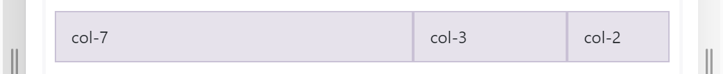
and you can customize the width of col-xx-* classes also.
<div class="row">
    <div class="col-sm-7">col-sm-7</div>
    <div class="col-sm-3">col-sm-3</div>
    <div class="col-sm-2">col-sm-2</div>
</div>
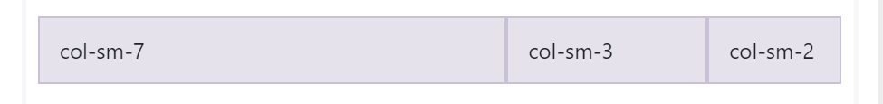
How does it look in the action?

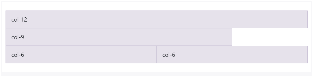
What if sum of col is more than 12? Then the col will shift/adjust to below line. Yes, there can be any number of columns for a row!
<div class="row">
        <div class="col-12">col-12</div>
        <div class="col-9">col-9</div>
        <div class="col-6">col-6</div>
        <div class="col-6">col-6</div>
    </div>
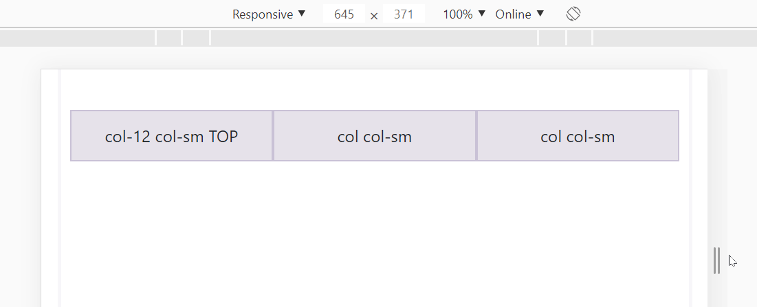
What if we want 3 columns in a row for large screens but split these columns into 2 rows for small screens?
<div class="row">
    <div class="col-12 col-sm">col-12 col-sm TOP</div>
    <div class="col col-sm">col col-sm</div>
    <div class="col col-sm">col col-sm</div>
</div>
You can play around here: https://jsfiddle.net/JerryGoyal/6vqno0Lm/