Use images instead of radio buttons
Keep radio buttons hidden, and on clicking of images, select them using JavaScript and style your image so that it look like selected. Here is the markup -
<div id="radio-button-wrapper">
    <span class="image-radio">
        <input name="any-name" style="display:none" type="radio"/>
        <img src="...">
    </span>
    <span class="image-radio">
        <input name="any-name" style="display:none" type="radio"/>
        <img src="...">
    </span>
</div>
and JS
 $(".image-radio img").click(function(){
     $(this).prev().attr('checked',true);
 })
CSS
span.image-radio input[type="radio"]:checked + img{
    border:1px solid red;
}
Example:
Heads up! This solution is CSS-only.
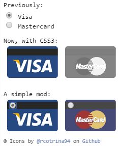
I recommend you take advantage of CSS3 to do that, by hidding the by-default input radio button with CSS3 rules:
.options input{
    margin:0;padding:0;
    -webkit-appearance:none;
       -moz-appearance:none;
            appearance:none;
}
I just make an example a few days ago.
- JSFiddle
- How to use images for radio-buttons - Gist
- Wrap radio and image in
<label> - Hide radio button (Don't use
display:noneorvisibility:hiddensince such will impact accessibility) - Target the image next to the hidden radio using Adjacent sibling selector
+ - Don’t forget to provide alternative text in the
altattribute, especially since it functions as the radio button’s label
/* HIDE RADIO */
[type=radio] {
  position: absolute;
  opacity: 0;
  width: 0;
  height: 0;
}

/* IMAGE STYLES */
[type=radio] + img {
  cursor: pointer;
}

/* CHECKED STYLES */
[type=radio]:checked + img {
  outline: 2px solid #f00;
}
<label>
<input type="radio" name="test" value="small" checked>
<img src="https://via.placeholder.com/40x60/0bf/fff&text=A" alt="Option 1">
</label>
<label>
<input type="radio" name="test" value="big">
<img src="https://via.placeholder.com/40x60/b0f/fff&text=B" alt="Option 2">
</label>Don't forget to add a class to your labels and in CSS use that class instead.
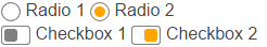
Custom styles and animations
Here's an advanced version using the <i> element and the ::after pseudo-element:
body{color:#444;font:100%/1.4 sans-serif;}


/* CUSTOM RADIO & CHECKBOXES
   http://stackoverflow.com/a/17541916/383904 */
.rad,
.ckb{
  cursor: pointer;
  user-select: none;
  -webkit-user-select: none;
  -webkit-touch-callout: none;
}
.rad > input,
.ckb > input{ /* HIDE ORG RADIO & CHECKBOX */
  position: absolute;
  opacity: 0;
  width: 0;
  height: 0;
}
/* RADIO & CHECKBOX STYLES */
/* DEFAULT <i> STYLE */
.rad > i,
.ckb > i{
  display: inline-block;
  vertical-align: middle;
  height: 16px;
  transition: 0.2s;
  box-shadow: inset 0 0 0 8px #fff;
  border: 1px solid gray;
  background: gray;
}
.rad > i {
  width:  16px;
  border-radius: 50%;
}
.ckb > i {
  width: 25px;
  border-radius: 3px;
}
.rad:hover > i{ /* HOVER <i> STYLE */
  box-shadow: inset 0 0 0 3px #fff;
  background: gray;
}
.rad > input:focus + i { /* FOCUS <i> STYLE */
  outline: 1px solid blue;
}
.rad > input:checked + i{ /* (RADIO CHECKED) <i> STYLE */
  box-shadow: inset 0 0 0 3px #fff;
  background: orange;
}
/* CHECKBOX */
.ckb > input + i::after{
  content: "";
  display: block;
  height: 12px;
  width:  12px;
  margin: 2px;
  border-radius: inherit;
  transition: inherit;
  background: gray;
}
.ckb > input:focus + i {
  outline: 1px solid blue;
}
.ckb > input:checked + i::after{ /* (RADIO CHECKED) <i> STYLE */
  margin-left: 11px;
  background:  orange;
}
<label class="rad">
<input type="radio" name="rad1" value="a">
<i></i> Radio 1
</label>
<label class="rad">
<input type="radio" name="rad1" value="b" checked>
<i></i> Radio 2
</label>
<br>
<label class="ckb">
<input type="checkbox" name="ckb1" value="a" checked>
<i aria-hidden="true"></i> Checkbox 1
</label>
<label class="ckb">
<input type="checkbox" name="ckb2" value="b">
<i aria-hidden="true"></i> Checkbox 2
</label>You can use CSS for that.
HTML (only for demo, it is customizable)
<div class="button">
    <input type="radio" name="a" value="a" id="a" />
    <label for="a">a</label>
</div>
<div class="button">
    <input type="radio" name="a" value="b" id="b" />
    <label for="b">b</label>
</div>
<div class="button">
    <input type="radio" name="a" value="c" id="c" />
    <label for="c">c</label>
</div>
...
CSS
input[type="radio"] {
    display: none;
}
input[type="radio"]:checked + label {
    border: 1px solid red;
}
jsFiddle