Transparent half circle cut out of a div
You can do it really easily with a radial gradient.
DEMO
Result:
HTML:
<div class='shape'></div>
Relevant CSS:
.shape {
  margin: 0 auto;
  width: 10em; height: 16em;
  /* WebKit browsers, old syntax */
  background: -webkit-radial-gradient(50% 0, circle, transparent 30%, black 30%);

  /* IE10, current versions of Firefox and Opera */
  background: radial-gradient(circle at 50% 0, transparent 30%, black 30%);
}
See http://caniuse.com/#feat=css-gradients for detailed info on compatibility.
Using SVG:
Here is an alternate solution using SVG (though you haven't tagged it). Advantages of using SVG are:
- It has better browser support when compared to radial-gradients.
- SVG can support images inside the shape unlike the box-shadow approach.
While SVG is not supported by <= IE8 whereas box-shadow is, fallbacks can be provided.
svg {
  height: 150px;
  width: 150px;
}
polygon {
  fill: black;
}

/* Just for demo */

body {
  background-image: radial-gradient(circle, #3F9CBA 0%, #153346 100%);
}
<!-- Sample 1 - Using Clip Path -->
<svg viewBox='0 0 100 100' preserveAspectRatio='none'>
<defs>
<clipPath id='clipper'>
<path d='M0,0 a50,50 0 1,0 100,0 l 0,100 -100,0' />
</clipPath>
</defs>
<polygon points='0,0 100,0 100,100 0,100' clip-path='url(#clipper)' />
</svg>
<!-- Sample 2 - Using Path -->
<svg viewBox='0 0 100 100' preserveAspectRatio='none'>
<pattern id='bg' width='100' height='100' patternUnits='userSpaceOnUse'>
<image xlink:href='http://lorempixel.com/100/100/nature/1' height='100' width='100' />
</pattern>
<path d='M0,0 a50,50 0 1,0 100,0 l 0,100 -100,0 0,-100' fill='url(#bg)' />
</svg>Using CSS:
CSS also has clip-path specifications and we can try something like in the below snippet.
.shape {
  position: relative;
  width: 100px;
  height: 100px;
  background-color: purple;
}
.shape:after {
  position: absolute;
  content: '';
  top: 0px;
  left: 0px;
  height: 100%;
  width: 100%;
  background: white;
  -webkit-clip-path: ellipse(50% 20% at 50% 0%);
  clip-path: ellipse(50% 20% at 50% 5%);
}

.shape.image{
  background: url(http://lorempixel.com/100/100);
}

#shape-2 {
  width: 100px;
  height: 100px;
  background-color: purple;
  -webkit-clip-path: ellipse(50% 20% at 50% 20%);
  clip-path: ellipse(50% 20% at 50% 20%);
}

/* Just for demo */

.shape{
  float: left;
  margin: 20px;
}
#shape-2 {
  margin: 150px 20px 0px;
}
<div class="shape"></div>
<div class="shape image"></div>
<br/>
<div id="shape-2"></div>But unlike SVG clip-path, the pure CSS version (that is, without using an inline or external SVG) doesn't seem to be able to support a path. It only supports shapes and so in this case, if you use the clip-path on the parent directly it would just produce an ellipse (like shown in the snippet). To overcome this, we would have to put the clip-path on a child (or a pseudo element) and this would mean that the clipped area would not be transparent.
Using Canvas:
The same can be done using Canvas also. Canvas commands are pretty similar to SVG and their advantages are also pretty similar. However, Canvas are raster based and hence doesn't scale as well as SVG does.
window.onload = function() {
  /* Canvas example with path */
  var canvas = document.getElementById('canvas');
  if (canvas.getContext) {
    var ctx = canvas.getContext('2d');
    var img = new Image();
    img.src = 'http://lorempixel.com/150/300';
    ctx.beginPath();
    ctx.moveTo(110, 0);
    ctx.arc(60, 0, 50, 0, 3.14, false);
    ctx.lineTo(10, 145);
    ctx.lineTo(110, 145);
    ctx.closePath();
    ctx.fill();
    /* Use below for using image as a fill */
    /*img.onload = function(){
        var ptrn = ctx.createPattern(img,'no-repeat');
        ctx.fillStyle = ptrn;
        ctx.fill();
    }*/
  }

  /* Canvas example with clip path */
  var canvasClip = document.getElementById('canvas-clip');
  if (canvasClip.getContext) {
    var ctxClip = canvasClip.getContext('2d');
    ctxClip.beginPath();
    ctxClip.moveTo(10, 145);
    ctxClip.lineTo(10, 0);
    ctxClip.arc(60, 0, 50, 0, Math.PI * 2, true);
    ctxClip.lineTo(110, 145);
    ctxClip.lineTo(10, 145);
    ctxClip.clip();
    ctxClip.fillStyle = 'tomato';
    ctxClip.fill();
  }
}
canvas {
height: 150px;
width: 300px;
}
/* Just for demo */
body {
background-image: radial-gradient(circle, #3F9CBA 0%, #153346 100%);
}<canvas id='canvas'></canvas>
<canvas id='canvas-clip'></canvas>Using Masks:
This shape can be created by using CSS (or) SVG masks also. CSS masks have very poor support and work currently only in Webkit powered browsers but SVG masks have much better support and should work in IE9+.
/* CSS Mask */

.shape {
  width: 150px;
  height: 150px;
  background-color: black;
  -webkit-mask-image: radial-gradient(circle closest-corner at 50% 0%, transparent 98%, white 99%);
  mask-image: radial-gradient(circle closest-corner at 50% 0%, transparent 98%, white 99%);
}

/* End of CSS Mask */

svg {
  height: 150px;
  width: 150px;
}
polygon#shape {
  fill: black;
  mask: url(#masker);
}
/* Just for demo */

body {
  background-image: radial-gradient(circle, #3F9CBA 0%, #153346 100%);
}
<!-- CSS Mask -->
<div class='shape'></div>
<!-- SVG Mask -->
<svg viewBox='0 0 100 100' preserveAspectRatio='none'>
<defs>
<mask id='masker' x='0' y='0' width='100' height='100'>
<polygon points='0,0 100,0 100,100 0,100' fill='#fff' />
<circle r='50' cx='50' cy='0' fill='#000' />
</mask>
</defs>
<polygon points='0,0 100,0 100,100 0,100' id='shape' />
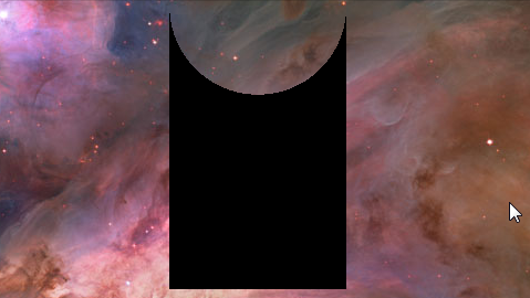
</svg>You can use box-shadows to make the transparent cut out circle :
body {
  background: url(http://i.imgur.com/qi5FGET.jpg) no-repeat;
  background-size: cover;
}
div {
  display: inline-block;
  width: 300px; height: 300px;
  position: relative;
  overflow: hidden;
}
div:before {
  content: '';
  position: absolute;
  bottom: 50%;
  width: 100%; height: 100%;
  border-radius: 100%;
  box-shadow: 0px 300px 0px 300px #000;
}
.transparent {
  opacity: 0.5;
}
<div></div>
<div class="transparent"></div>
This can be responsive with percentage lengths:
body {
  background: url(http://lorempixel.com/output/people-q-c-640-480-1.jpg) no-repeat;
  background-size: cover;
}
div {
  width: 40%; height: 300px;
  position: relative;
  overflow: hidden;
}
div:before {
  content: '';
  position: absolute;
  bottom: 50%;
  width: 100%; height: 100%;
  border-radius: 100%;
  box-shadow: 0px 300px 0px 300px #000;
}
.transparent {
  opacity: 0.5;
}
<div class="transparent"></div>May be can do it with CSS :after pseudo property like this:
body {
  background: green;
}

.rect {
  height: 100px;
  width: 100px;
  background: rgba(0, 0, 0, 0.5);
  position: relative;
  margin-top: 100px;
  margin-left: 100px;
}

.circle {
  display: block;
  width: 100px;
  height: 50px;
  top: -50px;
  left: 0;
  overflow: hidden;
  position: absolute;
}

.circle:after {
  content: '';
  width: 100px;
  height: 100px;
  -moz-border-radius: 100px;
  -webkit-border-radius: 100px;
  border-radius: 100px;
  background: rgba(0, 0, 0, 0);
  position: absolute;
  top: -100px;
  left: -40px;
  border: 40px solid rgba(0, 0, 0, 0.5);
}
<div class="rect"> <span class="circle"></span></div>View on JSFiddle