SwiftUI: Global Overlay That Can Be Triggered From Any View
I modified Matteo Pacini's great answer, above, incorporating comments to have the Toast fade in and fade out after a delay. I also modified the View extension to be a bit more generic, and to accept a trailing closure similar to the way .sheet works.
ContentView.swift:
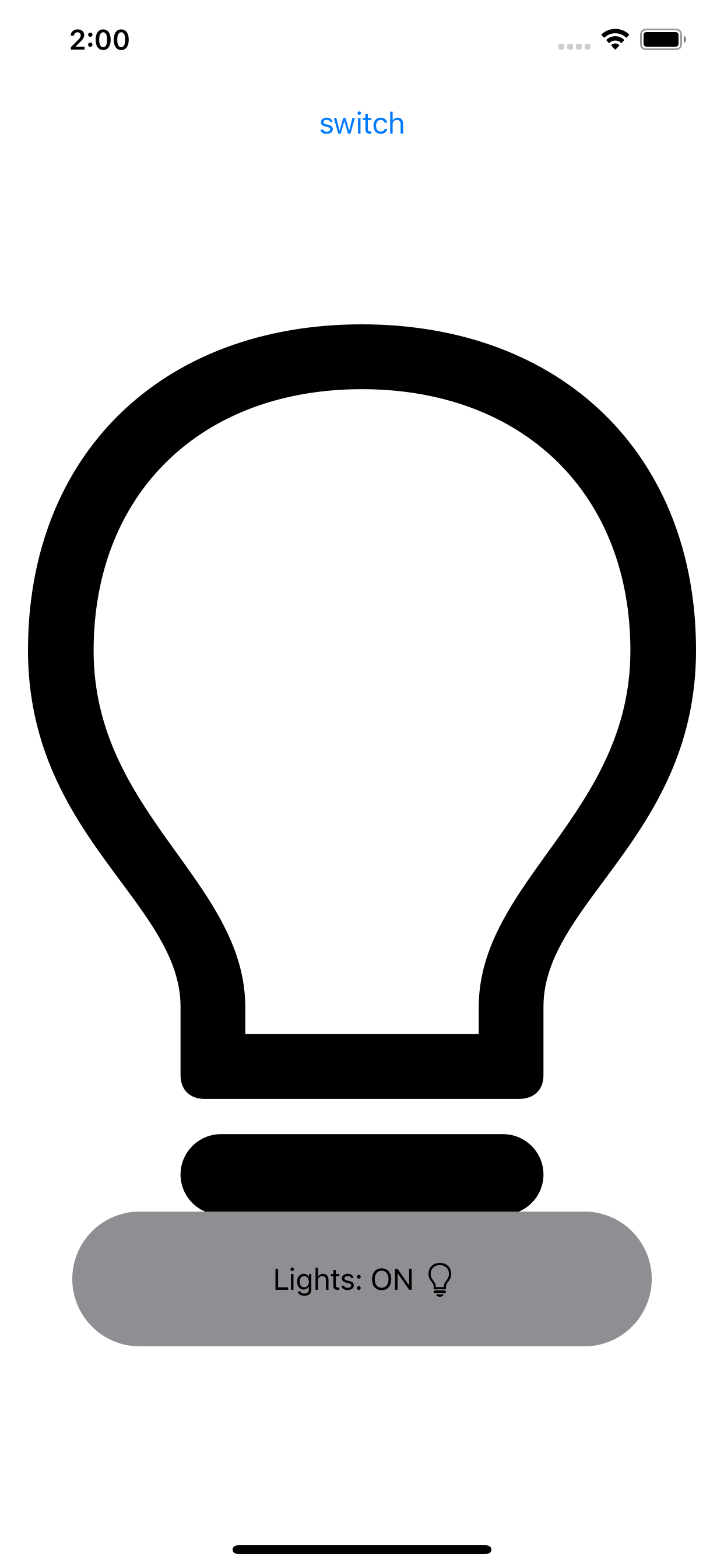
struct ContentView: View {
    @State private var lightsOn: Bool = false
    @State private var showToast: Bool = false

    var body: some View {
        VStack {
            Button(action: {
                if (!self.showToast) {
                    self.lightsOn.toggle()

                    withAnimation {
                        self.showToast = true
                    }
                }
            }){
                Text("switch")
            } //Button
            .padding(.top)

            Image(systemName: self.lightsOn ? "lightbulb" : "lightbulb.fill")
                .resizable()
                .aspectRatio(contentMode: .fit)
                .padding(.all)
                .toast(isPresented: self.$showToast) {
                    HStack {
                        Text("Lights: \(self.lightsOn ? "ON" : "OFF")")
                        Image(systemName: self.lightsOn ? "lightbulb" : "lightbulb.fill")
                    } //HStack
                } //toast
        } //VStack
    } //body
} //ContentView
View+Toast.swift:
extension View {
    func toast<Content>(isPresented: Binding<Bool>, content: @escaping () -> Content) -> some View where Content: View {
        Toast(
            isPresented: isPresented,
            presenter: { self },
            content: content
        )
    }
}
Toast.swift:
struct Toast<Presenting, Content>: View where Presenting: View, Content: View {
    @Binding var isPresented: Bool
    let presenter: () -> Presenting
    let content: () -> Content
    let delay: TimeInterval = 2

    var body: some View {
        if self.isPresented {
            DispatchQueue.main.asyncAfter(deadline: .now() + self.delay) {
                withAnimation {
                    self.isPresented = false
                }
            }
        }

        return GeometryReader { geometry in
            ZStack(alignment: .bottom) {
                self.presenter()

                ZStack {
                    Capsule()
                        .fill(Color.gray)

                    self.content()
                } //ZStack (inner)
                .frame(width: geometry.size.width / 1.25, height: geometry.size.height / 10)
                .opacity(self.isPresented ? 1 : 0)
            } //ZStack (outer)
            .padding(.bottom)
        } //GeometryReader
    } //body
} //Toast
With this you could toast Text, or an Image (or both, as shown below), or any other View.
It's quite easy - and entertaining - to build a "toast" in SwiftUI!
Let's do it!
struct Toast<Presenting>: View where Presenting: View {

    /// The binding that decides the appropriate drawing in the body.
    @Binding var isShowing: Bool
    /// The view that will be "presenting" this toast
    let presenting: () -> Presenting
    /// The text to show
    let text: Text

    var body: some View {

        GeometryReader { geometry in

            ZStack(alignment: .center) {

                self.presenting()
                    .blur(radius: self.isShowing ? 1 : 0)

                VStack {
                    self.text
                }
                .frame(width: geometry.size.width / 2,
                       height: geometry.size.height / 5)
                .background(Color.secondary.colorInvert())
                .foregroundColor(Color.primary)
                .cornerRadius(20)
                .transition(.slide)
                .opacity(self.isShowing ? 1 : 0)

            }

        }

    }

}
Explanation of the body:
GeometryReadergives us the preferred size of the superview , thus allowing the perfect sizing for ourToast.ZStackstacks views on top of each other.- The logic is trivial: if the toast is not supposed to be seen (
isShowing == false), then we render thepresentingview. If the toast has to be presented (isShowing == true), then we render thepresentingview with a little bit of blur - because we can - and we create our toast next. - The toast is just a
VStackwith aText, with custom frame sizing, some design bells and whistles (colors and corner radius), and a defaultslidetransition.
I added this method on View to make the Toast creation easier:
extension View {

    func toast(isShowing: Binding<Bool>, text: Text) -> some View {
        Toast(isShowing: isShowing,
              presenting: { self },
              text: text)
    }

}
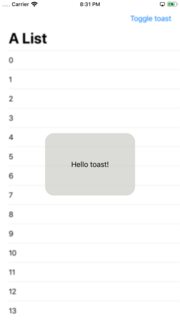
And a little demo on how to use it:
struct ContentView: View {

    @State var showToast: Bool = false

    var body: some View {
        NavigationView {
            List(0..<100) { item in
                Text("\(item)")
            }
            .navigationBarTitle(Text("A List"), displayMode: .large)
            .navigationBarItems(trailing: Button(action: {
                withAnimation {
                    self.showToast.toggle()
                }
            }){
                Text("Toggle toast")
            })
        }
        .toast(isShowing: $showToast, text: Text("Hello toast!"))
    }

}
I used a NavigationView to make sure the view fills the entire screen, so the Toast is sized and positioned correctly.
The withAnimation block ensures the Toast transition is applied.
How it looks:
It's easy to extend the Toast with the power of SwiftUI DSL.
The Text property can easily become a @ViewBuilder closure to accomodate the most extravagant of the layouts.
To add it to your content view:
struct ContentView : View {
    @State private var liked: Bool = false

    var body: some View {
        VStack {
            LikeButton(liked: $liked)
        }
        // make it bigger by using "frame" or wrapping it in "NavigationView"
        .toast(isShowing: $liked, text: Text("Hello toast!"))
    }
}
How to hide the toast afte 2 seconds (as requested):
Append this code after .transition(.slide) in the toast VStack.
.onAppear {
    DispatchQueue.main.asyncAfter(deadline: .now() + 2) {
      withAnimation {
        self.isShowing = false
      }
    }
}
Tested on Xcode 11.1