SwiftUI create image slider with dots as indicators
There is no built-in method for this in SwiftUI this year. I'm sure a system-standard implementation will come along in the future.
In the short term, you have two options. As Asperi noted, Apple's own tutorials have a section on wrapping the PageViewController from UIKit for use in SwiftUI (see Interfacing with UIKit).
The second option is to roll your own. It's entirely possible to make something similar in SwiftUI. Here's a proof of concept, where the index can be changed by swipe or by binding:
struct PagingView<Content>: View where Content: View {

    @Binding var index: Int
    let maxIndex: Int
    let content: () -> Content

    @State private var offset = CGFloat.zero
    @State private var dragging = false

    init(index: Binding<Int>, maxIndex: Int, @ViewBuilder content: @escaping () -> Content) {
        self._index = index
        self.maxIndex = maxIndex
        self.content = content
    }

    var body: some View {
        ZStack(alignment: .bottomTrailing) {
            GeometryReader { geometry in
                ScrollView(.horizontal, showsIndicators: false) {
                    HStack(spacing: 0) {
                        self.content()
                            .frame(width: geometry.size.width, height: geometry.size.height)
                            .clipped()
                    }
                }
                .content.offset(x: self.offset(in: geometry), y: 0)
                .frame(width: geometry.size.width, alignment: .leading)
                .gesture(
                    DragGesture().onChanged { value in
                        self.dragging = true
                        self.offset = -CGFloat(self.index) * geometry.size.width + value.translation.width
                    }
                    .onEnded { value in
                        let predictedEndOffset = -CGFloat(self.index) * geometry.size.width + value.predictedEndTranslation.width
                        let predictedIndex = Int(round(predictedEndOffset / -geometry.size.width))
                        self.index = self.clampedIndex(from: predictedIndex)
                        withAnimation(.easeOut) {
                            self.dragging = false
                        }
                    }
                )
            }
            .clipped()

            PageControl(index: $index, maxIndex: maxIndex)
        }
    }

    func offset(in geometry: GeometryProxy) -> CGFloat {
        if self.dragging {
            return max(min(self.offset, 0), -CGFloat(self.maxIndex) * geometry.size.width)
        } else {
            return -CGFloat(self.index) * geometry.size.width
        }
    }

    func clampedIndex(from predictedIndex: Int) -> Int {
        let newIndex = min(max(predictedIndex, self.index - 1), self.index + 1)
        guard newIndex >= 0 else { return 0 }
        guard newIndex <= maxIndex else { return maxIndex }
        return newIndex
    }
}

struct PageControl: View {
    @Binding var index: Int
    let maxIndex: Int

    var body: some View {
        HStack(spacing: 8) {
            ForEach(0...maxIndex, id: \.self) { index in
                Circle()
                    .fill(index == self.index ? Color.white : Color.gray)
                    .frame(width: 8, height: 8)
            }
        }
        .padding(15)
    }
}
and a demo
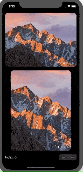
struct ContentView: View {
    @State var index = 0

    var images = ["10-12", "10-13", "10-14", "10-15"]

    var body: some View {
        VStack(spacing: 20) {
            PagingView(index: $index.animation(), maxIndex: images.count - 1) {
                ForEach(self.images, id: \.self) { imageName in
                    Image(imageName)
                        .resizable()
                        .scaledToFill()
                }
            }
            .aspectRatio(4/3, contentMode: .fit)
            .clipShape(RoundedRectangle(cornerRadius: 15))

            PagingView(index: $index.animation(), maxIndex: images.count - 1) {
                ForEach(self.images, id: \.self) { imageName in
                    Image(imageName)
                        .resizable()
                        .scaledToFill()
                }
            }
            .aspectRatio(3/4, contentMode: .fit)
            .clipShape(RoundedRectangle(cornerRadius: 15))

            Stepper("Index: \(index)", value: $index.animation(.easeInOut), in: 0...images.count-1)
                .font(Font.body.monospacedDigit())
        }
        .padding()
    }
}
Two notes:
- The GIF animation does a really poor job of showing how smooth the animation is, as I had to drop the framerate and compress heavily due to file size limits. It looks great on simulator or a real device
- The drag gesture in the simulator feels clunky, but it works really well on a physical device.
You can easily achieve this by below code
struct ContentView: View {
    public let timer = Timer.publish(every: 3, on: .main, in: .common).autoconnect()
    @State private var selection = 0

    ///  images with these names are placed  in my assets
    let images = ["1","2","3","4","5"]

    var body: some View {

        ZStack{

            Color.black

            TabView(selection : $selection){

                ForEach(0..<5){ i in
                    Image("\(images[i])")
                        .resizable()
                        .aspectRatio(contentMode: .fit)
                }


            }.tabViewStyle(PageTabViewStyle())
            .indexViewStyle(PageIndexViewStyle(backgroundDisplayMode: .always))
            .onReceive(timer, perform: { _ in

                withAnimation{
                    print("selection is",selection)
                    selection = selection < 5 ? selection + 1 : 0
                }
            })
        }
    }
}