Styling radio buttons into a square
input[type=radio] {
  padding: 0.5em;
  -webkit-appearance: none;
  outline: 0.1em solid black;
  outline-offset: 0.1em;
}

input[type=radio]:checked {
  display: inline-block;
  background-color: #000;
}
<label for="radioA"><input type="radio" name="radio1" value="A"/> A</label><br>
<label for="radioB"><input type="radio" name="radio1" value="B"/> B</label><br>
<label for="radioC"><input type="radio" name="radio1" value="C"/> C</label><br>
<label for="radioD"><input type="radio" name="radio1" value="D"/> D</label>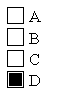
You dont need to style a radio button. Just use a div:
Example in a fiddle: http://jsfiddle.net/kLGf4/2/
html:
 <section>
    <header>
         <h1>Perfered Method of Contact</h1>

    </header>
    <div> <span>Choice 1</span>

        <div class="square-radio square-radio--clicked">
             <div class="square-radio--content"></div>
        </div>
    </div>
    <div> <span>Choice 2</span>

        <div class="square-radio">
            <div class="square-radio--content"></div>
        </div>
    </div>
</section>
css:
.square-radio {
    border: 1px solid black;
    margin: 2px;
    width: 40px;
    height: 40px;
    position: relative;

}
.square-radio--clicked .square-radio--content{
    margin: auto;
    position: absolute;
    left: 0;
    right: 0;
    top: 0;
    bottom: 0;
    background-color: black;
    width: 20px;
    height: 20px;
}
js:
$(document).ready(function () {
    $(document).on("click", ".square-radio", function () {
        $(this).toggleClass("square-radio--clicked");
    });
});
This can be done quite easily with only CSS, no need for JS. The basic concept is to style an element that is a sibling of the input, creating a "fake" radio button:
/*
 * Hide the inputs.
 */

input {
  display: none;
}


/*
 * Then, style the label so it looks like however you want.
 * Here's a quick rundown of how I did it here:
 */


/*
 * Some basic positioning styles, and we give it the pointer cursor to show
 * that it's clickable
 */

label {
  display: inline-block;
  padding: 5px 10px;
  cursor: pointer;
}


/*
 * With how I decided to build this, the position: relative is super important.
 * We're going to position a pseudo element within this element(As it is the containing box)
 */

label span {
  position: relative;
  line-height: 22px;
}


/*
 * Because we're using pseudo elements, a content property is required to make them appear.
 */

label span:before,
label span:after {
  content: '';
}


/*
 * We are using the :before peudo elemnt as the actual button,
 * then we'll position the :after over it. You could also use a background-image,
 * font-icon, or really anything if you want different styles.
 * For the specific style we're going for, this approach is simply the easiest, but
 * once you understand the concept you can really do it however you like.
 */

label span:before {
  border: 1px solid #222021;
  width: 20px;
  height: 20px;
  margin-right: 10px;
  display: inline-block;
  vertical-align: top;
}

label span:after {
  background: #222021;
  width: 14px;
  height: 14px;
  position: absolute;
  top: 2px;
  left: 4px;
  transition: 300ms;
  opacity: 0;
}

/*
 * This is the most important part of this whole file, if you understand what's happening here
 * you can really make this in so many different ways.
 *
 * We start by selecting the input inside of the label, with "label input". From there we use the
 * ":checked" selector to *only* select the input when it is checked. We then use the immediate sibling
 * selector(+) to select the span, and then it's pseudo element :after(What we are using to mark the button)
 * Because we already styled the :after, all we have to do is set the opacity to 1, making it fade in.
 */
label input:checked+span:after {
  opacity: 1;
}


/*
 * A little styling for the demo
 */

body {
  background: #fbfbfb;
  font-family: Arial;
  font-weight: bold;
  color: rgba(0, 0, 0, 0.7);
}
<label>
<input type="radio" name="radio">
<span>EMAIL</span>
</label>
<label>
<input type="radio" name="radio">
<span>PHONE</span>
</label>Check the code comments for a more in-depth explanation, but here's the basics:
Start by creating a <label> as the wrapper. We use a label because events triggered on it will also be triggered on the associated input:
<label></label>
Add a input to it:
<label>
    <input type="radio" name="demo">
</label>
Remember that radio buttons have to have the same name to be grouped. Now we throw a <span> after the input, so we have something to target in our CSS.
<label>
    <input type="radio" name="demo">
    <span></span>
</label>
And the HTML is all set. Check the CSS for the explanation there, it'll be easier to understand.
Here is the simplest I know of, a pure CSS solution requiring no labels or scripting. A couple of vendor prefixes are required for full compatibility:
input[type='radio'] {
  box-sizing: border-box;
  appearance: none;
  background: white;
  outline: 2px solid #333;
  border: 3px solid white;
  width: 16px;
  height: 16px;
}

input[type='radio']:checked {
  background: #333;
}
As noted above, the box-sizing and appearance properties should be vendor-prefixed:
-webkit-box-sizing: border-box;
-moz-box-sizing: border-box;
box-sizing: border-box;

-webkit-appearance: none;
-moz-appearance: none;
appearance: none;