Speech bubble with arrow
SVG
This does not pass a hit-test as the transparent border is also clickable
This can be done using the pointer-events in svg.pointer-events:visibleFill; Will only select the part where there is paint.
This example uses filter_box-shadow and is not supported by IE.
Also uses two shapes.
html,
body {
  margin: 0;
  padding: 0;
}
.bubble {
  width: 150px;
  height: 150px;
  -webkit-filter: drop-shadow(5px 5px 0px #aaa);
  filter: drop-shadow(5px 5px 0px #aaa);
}
.bubble-shape {
  fill: #1e1;
}
.shape-text {
  color: black;
}
<svg class="bubble" viewBox="0 0 110 110" xmlns="http://www.w3.org/2000/svg" preserveAspectRatio="none">
<g class="bubble-shape" style="cursor:pointer; pointer-events:visibleFill;">
<rect x="10" y="10" width="90" height="90" rx="15" ry="15" />
<polygon points="20,94 40,94 30,105" />
</g>
</svg>
This example uses one path
Should be fully supported by IE.
html,
body {
  margin: 0;
  padding: 0;
}
.bubble {
  width: 150px;
  height: 150px;
}
.bubble-shape {
  stroke-width: 15;
  stroke: #ddd;
  fill: #1e1;
}
.shape-text {
  color: black;
}
<svg class="bubble" viewBox="-70 -10 390 370" xmlns="http://www.w3.org/2000/svg" preserveAspectRatio="none">
<g style="cursor:pointer; pointer-events:visible;">
<path class="bubble-shape" d="m 0,0 250,0 c 25,0 50,20 50,50 l 0,225 c 0,25 -25,50 -50,50 l -175,0 -25,20 -20,-20 -40,0 c -25,0 -50,-25 -50,-50 l 0,-225 C -50,25 -50,0 0,0 Z" />
</g>
</svg>
In order to achieve this, you should consider altering your markup in order to make your html more efficient. This can be achieved using a pseudo element. I'll address each point individually, and put it all together at the end of my answer.
First of all,
Use pseudo elements to avoid extra elements
You could use a pseudo element to remove the extra .triangle div. This not only reduces your div numbers, but also helps with positioning as you can use the top: left: right: and bottom: css properties in order to position according to your main element. This can be seen below:
.oneAndOnlyDiv {
  height: 100px;
  width: 200px;
  border: 3px solid gray;
  background: lightgray;
  position: relative;
}
.oneAndOnlyDiv:before {
  content: "";
  position: absolute;
  top: 100%;
  left: 20px;
  width: 0;
  border-top: 20px solid black;
  border-left: 20px solid transparent;
  border-right: 20px solid transparent;
}
<div class="oneAndOnlyDiv">Main div</div>Hit testing
In order to create your "hit test", you may wish to use a rotated element instead of a border hack.
Something like:
div {
  height: 100px;
  width: 200px;
  background: gray;
  position: relative;
  cursor:pointer;
}
div:before {
  content: "";
  position: absolute;
  top: 100%;
  left: 20px;
  height: 20px;
  width: 20px;
  background: black;
  transform: rotate(45deg);
  transform-origin:top right;
}
<div>Only element</div>or use a skewed pseudo element:
div {
  height: 100px;
  width: 200px;
  background: gray;
  position: relative;
  cursor:pointer;
}
div:before {
  content: "";
  position: absolute;
  top: 90%;
  left: 20px;
  height: 30%;
  width: 20px;
  background: black;
  transform: skewY(-45deg);
  transform-origin:bottom left;
  z-index:-1;
}
<div>Only element</div>which will show the pointer only when the square or main element is hovered. But hang on, that messes up the positioning? how can you deal with that?
There are a few solutions to that. One of which is to use the calc CSS property.
div {
  height: 100px;
  width: 200px;
  background: gray;
  position: relative;
  cursor:pointer;
}
div:before {
  content: "";
  position: absolute;
  top: -webkit-calc(100% - 10px); /*may require prefix for old browser support*/
  top: calc(100% - 10px); /*i.e. half the height*/
  left: 20px;
  height: 20px;
  width: 20px;
  background: gray;
  transform: rotate(45deg);
}
<div>Only element</div>Adding a border
You can add a border quite easily now, simply by adding a border declaration to the main element, and setting the border-bottom and border-right of the pseudo element to inherit
Border
div {
  height: 100px;
  width: 200px;
  background: gray;
  position: relative;
  cursor:pointer;
  border:3px double black;
}
div:before {
  content: "";
  position: absolute;
  top: -webkit-calc(100% - 10px); /*may require prefix for old browser support*/
  top: calc(100% - 10px); /*i.e. half the height*/
  left: 20px;
  height: 20px;
  width: 20px;
  background: gray;
  transform: rotate(45deg);
  border-bottom:inherit;
  border-right:inherit;
  box-shadow:inherit;
}
<div>Only element</div>Box Shadow:
In order to have a box shadow, I've used the :after pseudo element in order to hide the box shadow over the other pseudo, making the element seem as one single element.
div {
  height: 100px;
  width: 200px;
  background: gray;
  position: relative;
  cursor:pointer;
  box-shadow: 5px 5px 10px 2px black;
}
div:before,div:after {
  content: "";
  position: absolute;
  top: -webkit-calc(100% - 10px); /*may require prefix for old browser support*/
  top: calc(100% - 10px); /*i.e. half the height*/
  left: 20px;
  height: 20px;
  width: 20px;
  background: gray;
  transform: rotate(45deg);
z-index:-1;
  box-shadow:inherit;
}
div:after{
  box-shadow:none;
  z-index:8;
  }
<div>Only element</div>Putting it all together
You can also add a border radius to your message box or speech bubble by again, using the border-radius property:
div {
  height: 100px;
  width: 200px;
  background: gray;
  position: relative;
  cursor:pointer;
  border:3px double black;
  border-radius:10px;
}
div:before {
  content: "";
  position: absolute;
  top: -webkit-calc(100% - 10px); /*may require prefix for old browser support*/
  top: calc(100% - 10px); /*i.e. half the height*/
  left: 20px;
  height: 20px;
  width: 20px;
  background: gray;
  transform: rotate(45deg);
  border-bottom:inherit;
  border-right:inherit;
  box-shadow:inherit;
}
<div>Only element</div>This even allows you to create not only a triangle, but how about a circle instead?
div {
  height: 100px;
  width: 200px;
  background: gray;
  position: relative;
  cursor:pointer;
  border:3px double black;
  border-radius:10px;
}
div:before {
  content: "";
  position: absolute;
  top: -webkit-calc(100% - 13px); /*may require prefix for old browser support*/
  top: calc(100% - 13px); /*i.e. half the height + border*/
  left: 20px;
  height: 20px;
  width: 20px;
  background: gray;
  transform: rotate(45deg);
  border:3px double transparent;
  border-bottom:inherit;
  border-right:inherit;
  box-shadow:inherit;
  border-radius:50%;
}
<div>Only element</div>If you are having issues with content overflowing and being 'hidden' behind this pseudo element, and you aren't fussed about having a border, you could use a negative z-index which will solve this issue.
Don't like using 'magic numbers'?
If you don't like the idea of using a calc value, in which the positioning in my answer is currently using (whilst working), you may wish to use transform:translate(50%)
This would be a much better approach, since:
- You do not need to know the size of the border, nor half the width
- You will be making your message box/ bubble a lot more dynamic in its positioning, and would support further sizings.
div {
  height: 100px;
  width: 200px;
  background: gray;
  position: relative;
  cursor: pointer;
  border: 3px double black;
  border-radius: 10px;
}
div:before {
  content: "";
  position: absolute;
  top: 100%;
  left: 30px;
  height: 20px;
  width: 20px;
  background: gray;
  box-sizing:border-box;
  transform: rotate(45deg) translate(-50%);
  border-bottom: inherit;
  border-right: inherit;
  box-shadow: inherit;
}
<div>Only element</div>Want to move it? You can!
div {
  height: 100px;
  width: 200px;
  background: gray;
  position: relative;
  cursor: pointer;
  border: 3px double black;
  border-radius: 10px;
}
div:before {
  content: "";
  position: absolute;
  top: 100%;
  left: 10%;
  height: 20px;
  width: 20px;
  background: gray;
  box-sizing: border-box;
  transform: rotate(45deg) translate(-50%);
  border-bottom: inherit;
  border-right: inherit;
  box-shadow: inherit;
  transition: all 0.8s;
}
div:hover:before {
  left: 90%;
}
<div>Only element</div>Want it one the right?
div {
  height: 100px;
  width: 200px;
  background: gray;
  position: relative;
  cursor: pointer;
  border: 3px double black;
  border-radius: 10px;
}
div:before {
  content: "";
  position: absolute;
  top: 15%;
  left: 100%;
  height: 20px;
  width: 20px;
  background: gray;
  box-sizing:border-box;
  transform: rotate(45deg) translate(-50%);
  border-top: inherit;
  border-right: inherit;
  box-shadow: inherit;
  transition:all 0.8s;
}
div:hover:before{
  top:80%;
  }
<div>Only Element</div>Want it to be a different shape of triangle?
div {
  height: 100px;
  width: 200px;
  background: gray;
  position: relative;
  cursor: pointer;
  border-radius: 10px;
}
div:before {
  content: "";
  position: absolute;
  top: 70%;
  left: 100%;
  height: 20px;
  width: 20px;
  background: gray;
  box-sizing:border-box;
  transform:  translate(-50%) skewX(45deg);
  box-shadow: inherit;
  transition:all 0.8s;
  z-index:-1;
}
div:hover:before{
  transform:  translate(-50%);
  border-radius:50%;
  top:20%;
  }
<div>Only Element</div>We can rely on clip-path and drop-shadow filter to easily achieve this:
.box {
  margin: 50px;
  width: 200px;
  height: 100px;
  border-radius: 15px;
  background: red;
  position: relative;
  filter:  /* the more shadow you add the thicker the border will be */
    drop-shadow(0px 0px 1px green)
    drop-shadow(0px 0px 1px green)
    drop-shadow(0px 0px 1px green)
    drop-shadow(0px 0px 1px green)
    drop-shadow(0px 0px 1px green)
    drop-shadow(0px 0px 1px green);
}

.box::before {
  content: "";
  position: absolute;
  top: 100%;
  left: 20%;
  height: 30px;
  width: 50px;
  background: inherit;
  clip-path: polygon(0 0, 100% 0, 50% 100%);
}

.box:hover {
  background:blue;
}

body {
  background:linear-gradient(to right, pink,grey);
}
<div class="box"></div>We can extend this basic example to consider any kind of position and triangle shape:
.box {
  margin: 30px;
  width: 150px;
  height: 80px;
  display:inline-block;
  border-radius: 15px;
  background: red;
  position: relative;
  filter:  /* the more shadow you add the thicker the border will be */
    drop-shadow(0px 0px 1px green)
    drop-shadow(0px 0px 1px green)
    drop-shadow(0px 0px 1px green)
    drop-shadow(0px 0px 1px green)
    drop-shadow(0px 0px 1px green)
    drop-shadow(0px 0px 1px green);
}

.box::before {
  content: "";
  position: absolute;
  height: var(--h,20px);
  width: var(--w,30px);
  background: inherit;
  transform:scale(var(--x,1),var(--y,1));
}

.box.p-bottom::before{
  top: 100%;
  clip-path: polygon(0 0, 100% 0, 50% 100%);
}
.box.p-bottom.alt::before{
  clip-path: polygon(0 0, 100% 0, 100% 100%);
}
.box.p-top::before{
  bottom: 100%;
  clip-path: polygon(0 100%, 100% 100%, 50% 0);
}
.box.p-top.alt::before{
  clip-path: polygon(0 100%, 100% 100%, 100% 0);
}
.box.p-left::before{
  right: 100%;
  clip-path: polygon(100% 0, 100% 100%,0% 50%);
}
.box.p-left.alt::before{
  clip-path: polygon(100% 0, 100% 100%,0% 100%);
}
.box.p-right::before{
  left: 100%;
  clip-path: polygon(0% 0, 0% 100%,100% 50%);
}
.box.p-right.alt::before{
  clip-path: polygon(0% 0, 0% 100%,100% 100%);
}

.box.right::before{
  right:var(--p,20px);
}
.box.left::before {
  left:var(--p,20px);
}
.box.top::before{
  top:var(--p,20px);
}
.box.bottom::before {
  bottom:var(--p,20px);
}


.box:hover {
  background:blue;
}

body {
  background:linear-gradient(to right, pink,grey);
}
<div class="box p-bottom right"></div>
<div class="box p-bottom right alt"></div>
<div class="box p-bottom right alt" style="--x:-1"></div>
<div class="box p-top left"></div>
<div class="box p-top right" style="--p:40%"></div>
<div class="box p-top right alt" style="--p:40%"></div>
<div class="box p-left top"></div>
<div class="box p-left top alt"></div>
<div class="box p-right bottom" style="--w:20px;"></div>
<div class="box p-right bottom" style="--p:30px;--w:20px;--h:30px"></div>
<div class="box p-right bottom alt" style="--p:30px;--w:20px;--h:30px"></div>
<div class="box p-right bottom alt" style="--p:30px;--w:20px;--h:30px;--y:-1"></div>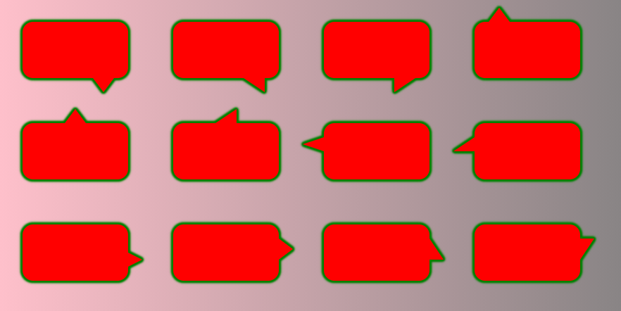
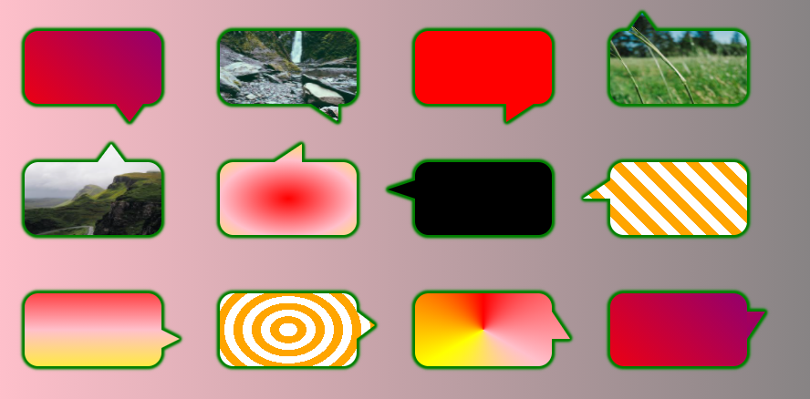
We can also consider any kind of background for the whole shape. The trick work for a fixed width/height. The idea is to create a background having the same size for both the main and pseudo element then we simply adjust the position of the one inside the pseudo element to match the one of the parent (to have a perfect overlap)
.box {
  --h:20px;
  --w:30px;
  --p:20px;

  margin: 30px;
  width: 150px;
  height: 80px;
  display:inline-block;
  border-radius: 15px;
  background:
    var(--back,linear-gradient(45deg,red,purple))
    center/
    calc(150px + 2*var(--w)) calc(80px + 2*var(--h));
  position: relative;
  filter:  /* the more shadow you add the thicker the border will be */
    drop-shadow(0px 0px 1px green)
    drop-shadow(0px 0px 1px green)
    drop-shadow(0px 0px 1px green)
    drop-shadow(0px 0px 1px green)
    drop-shadow(0px 0px 1px green)
    drop-shadow(0px 0px 1px green);
}

.box::before {
  content: "";
  position: absolute;
  height: var(--h);
  width: var(--w);
  background: inherit;
  transform:scale(var(--x,1),var(--y,1));
  background-position:var(--b1) 0 var(--b2);
}

.box.p-bottom::before{
  top: 100%;
  clip-path: polygon(0 0, 100% 0, 50% 100%);
  --b1:bottom;
}
.box.p-bottom.alt::before{
  clip-path: polygon(0 0, 100% 0, 100% 100%);
}
.box.p-top::before{
  bottom: 100%;
  clip-path: polygon(0 100%, 100% 100%, 50% 0);
  --b1:top;
}
.box.p-top.alt::before{
  clip-path: polygon(0 100%, 100% 100%, 100% 0);
}
.box.p-left::before{
  right: 100%;
  clip-path: polygon(100% 0, 100% 100%,0% 50%);
  --b1:left;
}
.box.p-left.alt::before{
  clip-path: polygon(100% 0, 100% 100%,0% 100%);
}
.box.p-right::before{
  left: 100%;
  clip-path: polygon(0% 0, 0% 100%,100% 50%);
  --b1:right;
}
.box.p-right.alt::before{
  clip-path: polygon(0% 0, 0% 100%,100% 100%);
}

.box.right::before{
  right:var(--p);
  --b2:right calc(-1*var(--p) - var(--w));
}
.box.left::before {
  left:var(--p);
  --b2:left  calc(-1*var(--p) - var(--w));
}
.box.top::before{
  top:var(--p);
  --b2:top  calc(-1*var(--p) - var(--h));
}
.box.bottom::before {
  bottom:var(--p);
  --b2:bottom  calc(-1*var(--p) - var(--h));
}

body {
  background:linear-gradient(to right, pink,grey);
}
<div class="box p-bottom right"></div>
<div class="box p-bottom right alt" style="--back:url(https://picsum.photos/id/15/400/300)"></div>
<div class="box p-bottom right alt" style="--x:-1;--back:red"></div>
<div class="box p-top left" style="--back:url(https://picsum.photos/id/18/400/300)"></div>
<div class="box p-top right" style="--p:40px;--back:url(https://picsum.photos/id/1018/400/300)"></div>
<div class="box p-top right alt" style="--p:60px;--back:radial-gradient(red,pink,yellow)"></div>
<div class="box p-left top" style="--back:black"></div>
<div class="box p-left top alt" style="--back:repeating-linear-gradient(45deg,#fff 0 10px,orange 0 20px)"></div>
<div class="box p-right bottom" style="--w:20px;--back:linear-gradient(red,pink,yellow)"></div>
<div class="box p-right bottom" style="--p:30px;--w:20px;--h:30px;--back:repeating-radial-gradient(#fff 0 10px,orange 0 20px)"></div>
<div class="box p-right bottom alt" style="--p:30px;--w:20px;--h:30px;--back:conic-gradient(red,pink,yellow,red)"></div>
<div class="box p-right bottom alt" style="--p:30px;--w:20px;--h:30px;--y:-1;"></div>