Show line / separator view in SwiftUI
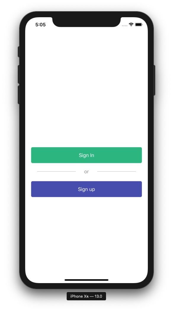
If anyone is interested a divider, text, divider, looking like this:
LabelledDivider code
struct LabelledDivider: View {

    let label: String
    let horizontalPadding: CGFloat
    let color: Color

    init(label: String, horizontalPadding: CGFloat = 20, color: Color = .gray) {
        self.label = label
        self.horizontalPadding = horizontalPadding
        self.color = color
    }

    var body: some View {
        HStack {
            line
            Text(label).foregroundColor(color)
            line
        }
    }

    var line: some View {
        VStack { Divider().background(color) }.padding(horizontalPadding)
    }
}
It's kind of ugly but I had to put the Dividers into a VStack to make them horizontal, otherwise, they will be vertical, due to HStack. Please let me know if you managed to simplify this :)
Also maybe using and stored properties for LabelledDivider might not be the most SwiftUI-y solution, so I'm open to improvements.
Example usage
This is the code that results in the screenshot seen above:
struct GetStartedView: View {
    var body: some View {
        NavigationView {
            VStack {

                NavigationLink(destination: SignInView()) {
                    Text("Sign In").buttonStyleEmerald()
                }

                LabelledDivider(label: "or")

                NavigationLink(destination: SignUpView()) {
                    Text("Sign up").buttonStyleSaphire()
                }

            }.padding(20)
        }
    }
}
ButtonStyle
For sake of completness, I also include buttonStyle view modifiers:
struct ButtonStyle: ViewModifier {

    private let color: Color
    private let enabled: () -> Bool
    init(color: Color, enabled: @escaping () -> Bool = { true }) {
        self.color = color
        self.enabled = enabled
    }

    dynamic func body(content: Content) -> some View {
        content
            .padding()
            .frame(minWidth: 0, maxWidth: .infinity, alignment: .center)
            .foregroundColor(Color.white)
            .background(enabled() ? color : Color.black)
            .cornerRadius(5)
    }
}

extension View {
    dynamic func buttonStyleEmerald(enabled: @escaping () -> Bool = { true }) -> some View {
        ModifiedContent(content: self, modifier: ButtonStyle(color: Color.emerald, enabled: enabled))
    }

    dynamic func buttonStyleSaphire(enabled: @escaping () -> Bool = { true }) -> some View {
        ModifiedContent(content: self, modifier: ButtonStyle(color: Color.saphire, enabled: enabled))
    }

}
Edit: Please note that Color.saphire and Color.emerald are custom declared colors:
extension Color {
    static var emerald:     Color { .rgb(036, 180, 126) }
    static var forest:      Color { .rgb(062, 207, 142) }
}

extension Color {
    static func rgb(_ red: UInt8, _ green: UInt8, _ blue: UInt8) -> Color {
        func value(_ raw: UInt8) -> Double {
            return Double(raw)/Double(255)
        }
        return Color(
            red: value(red),
            green: value(green),
            blue: value(blue)
        )
    }
}
You can just draw a line by using Color. If you want to change the line width or padding, you can use frame or padding like other SwiftUI Components.
//Horizontal Line in VStack
VStack{
    Color.gray.frame(height: 1 / UIScreen.main.scale)
}
//Vertical Line in HStack
HStack{
    Color.gray.frame(width: 1 / UIScreen.main.scale)
}
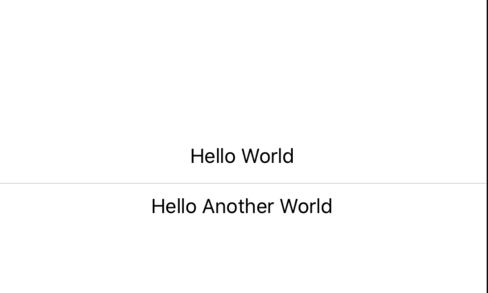
Use a Divider:
A visual element that can be used to separate other content.
Example:
struct ContentView : View {
    var body: some View {
        VStack {
            Text("Hello World")
            Divider()
            Text("Hello Another World")
        }
    }
}
Output: