Round Specific Corners SwiftUI
Using as a custom modifier
You can use it like a normal modifier:
.cornerRadius(20, corners: [.topLeft, .bottomRight])
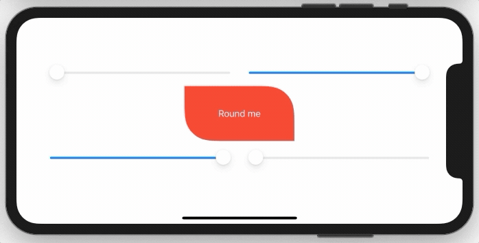
Demo
You need to implement a simple extension on View like this:
extension View {
    func cornerRadius(_ radius: CGFloat, corners: UIRectCorner) -> some View {
        clipShape( RoundedCorner(radius: radius, corners: corners) )
    }
}
And here is the struct behind this:
struct RoundedCorner: Shape {

    var radius: CGFloat = .infinity
    var corners: UIRectCorner = .allCorners

    func path(in rect: CGRect) -> Path {
        let path = UIBezierPath(roundedRect: rect, byRoundingCorners: corners, cornerRadii: CGSize(width: radius, height: radius))
        return Path(path.cgPath)
    }
}
You can also use the shape directly as a clipping mask.
Sample Project:
There are two options, you can use a View with a Path, or you can create a custom Shape. In both cases you can use them standalone, or in a .background(RoundedCorders(...))
Option 1: Using Path + GeometryReader
(more info on GeometryReader: https://swiftui-lab.com/geometryreader-to-the-rescue/)
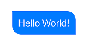
struct ContentView : View {
    var body: some View {

        Text("Hello World!")
            .foregroundColor(.white)
            .font(.largeTitle)
            .padding(20)
            .background(RoundedCorners(color: .blue, tl: 0, tr: 30, bl: 30, br: 0))
    }
}
struct RoundedCorners: View {
    var color: Color = .blue
    var tl: CGFloat = 0.0
    var tr: CGFloat = 0.0
    var bl: CGFloat = 0.0
    var br: CGFloat = 0.0

    var body: some View {
        GeometryReader { geometry in
            Path { path in

                let w = geometry.size.width
                let h = geometry.size.height

                // Make sure we do not exceed the size of the rectangle
                let tr = min(min(self.tr, h/2), w/2)
                let tl = min(min(self.tl, h/2), w/2)
                let bl = min(min(self.bl, h/2), w/2)
                let br = min(min(self.br, h/2), w/2)

                path.move(to: CGPoint(x: w / 2.0, y: 0))
                path.addLine(to: CGPoint(x: w - tr, y: 0))
                path.addArc(center: CGPoint(x: w - tr, y: tr), radius: tr, startAngle: Angle(degrees: -90), endAngle: Angle(degrees: 0), clockwise: false)
                path.addLine(to: CGPoint(x: w, y: h - br))
                path.addArc(center: CGPoint(x: w - br, y: h - br), radius: br, startAngle: Angle(degrees: 0), endAngle: Angle(degrees: 90), clockwise: false)
                path.addLine(to: CGPoint(x: bl, y: h))
                path.addArc(center: CGPoint(x: bl, y: h - bl), radius: bl, startAngle: Angle(degrees: 90), endAngle: Angle(degrees: 180), clockwise: false)
                path.addLine(to: CGPoint(x: 0, y: tl))
                path.addArc(center: CGPoint(x: tl, y: tl), radius: tl, startAngle: Angle(degrees: 180), endAngle: Angle(degrees: 270), clockwise: false)
                path.closeSubpath()
            }
            .fill(self.color)
        }
    }
}
Option 2: Custom Shape
struct ContentView : View {
    var body: some View {

        Text("Hello World!")
            .foregroundColor(.white)
            .font(.largeTitle)
            .padding(20)
            .background(RoundedCorners(tl: 0, tr: 30, bl: 30, br: 0).fill(Color.blue))
    }
}

struct RoundedCorners: Shape {
    var tl: CGFloat = 0.0
    var tr: CGFloat = 0.0
    var bl: CGFloat = 0.0
    var br: CGFloat = 0.0

    func path(in rect: CGRect) -> Path {
        var path = Path()

        let w = rect.size.width
        let h = rect.size.height

        // Make sure we do not exceed the size of the rectangle
        let tr = min(min(self.tr, h/2), w/2)
        let tl = min(min(self.tl, h/2), w/2)
        let bl = min(min(self.bl, h/2), w/2)
        let br = min(min(self.br, h/2), w/2)

        path.move(to: CGPoint(x: w / 2.0, y: 0))
        path.addLine(to: CGPoint(x: w - tr, y: 0))
        path.addArc(center: CGPoint(x: w - tr, y: tr), radius: tr,
                    startAngle: Angle(degrees: -90), endAngle: Angle(degrees: 0), clockwise: false)

        path.addLine(to: CGPoint(x: w, y: h - br))
        path.addArc(center: CGPoint(x: w - br, y: h - br), radius: br,
                    startAngle: Angle(degrees: 0), endAngle: Angle(degrees: 90), clockwise: false)

        path.addLine(to: CGPoint(x: bl, y: h))
        path.addArc(center: CGPoint(x: bl, y: h - bl), radius: bl,
                    startAngle: Angle(degrees: 90), endAngle: Angle(degrees: 180), clockwise: false)

        path.addLine(to: CGPoint(x: 0, y: tl))
        path.addArc(center: CGPoint(x: tl, y: tl), radius: tl,
                    startAngle: Angle(degrees: 180), endAngle: Angle(degrees: 270), clockwise: false)
        path.closeSubpath()

        return path
    }
}
View Modifiers made it easy:
struct CornerRadiusStyle: ViewModifier {
    var radius: CGFloat
    var corners: UIRectCorner

    struct CornerRadiusShape: Shape {

        var radius = CGFloat.infinity
        var corners = UIRectCorner.allCorners

        func path(in rect: CGRect) -> Path {
            let path = UIBezierPath(roundedRect: rect, byRoundingCorners: corners, cornerRadii: CGSize(width: radius, height: radius))
            return Path(path.cgPath)
        }
    }

    func body(content: Content) -> some View {
        content
            .clipShape(CornerRadiusShape(radius: radius, corners: corners))
    }
}

extension View {
    func cornerRadius(_ radius: CGFloat, corners: UIRectCorner) -> some View {
        ModifiedContent(content: self, modifier: CornerRadiusStyle(radius: radius, corners: corners))
    }
}
Example:
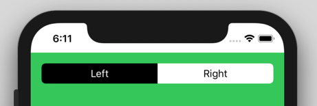
//left Button
.cornerRadius(6, corners: [.topLeft, .bottomLeft])

//right Button
.cornerRadius(6, corners: [.topRight, .bottomRight])