Round button with text and icon in flutter
Screenshot:

SizedBox.fromSize(
  size: Size(56, 56), // button width and height
  child: ClipOval(
    child: Material(
      color: Colors.orange, // button color
      child: InkWell(
        splashColor: Colors.green, // splash color
        onTap: () {}, // button pressed
        child: Column(
          mainAxisAlignment: MainAxisAlignment.center,
          children: <Widget>[
            Icon(Icons.call), // icon
            Text("Call"), // text
          ],
        ),
      ),
    ),
  ),
)
Use Column or Row in a Button child, Row for horizontal button, Column for vertical, and dont forget to contain it with the size you need:
Container(
  width: 120.0,
  height: 30.0,
  child: RaisedButton(
    color: Color(0XFFFF0000),
    child: Row(
      children: <Widget>[
        Text('Play this song', style: TextStyle(color: Colors.white),),
        Icon(Icons.play_arrow, color: Colors.white,),
      ],
    ),
  ),
),
You can achieve that by using a FlatButton that contains a Column (for showing a text below the icon) or a Row (for text next to the icon), and then having an Icon Widget and a Text widget as children.
Here's an example:
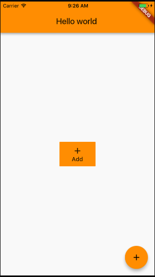
class MyPage extends StatelessWidget {

  @override
  Widget build(BuildContext context) =>
      Scaffold(
        appBar: AppBar(
          title: Text("Hello world"),
        ),
        body: Center(
          child: Column(
            mainAxisAlignment: MainAxisAlignment.center,
            children: <Widget>[
              FlatButton(
                onPressed: () => {},
                color: Colors.orange,
                padding: EdgeInsets.all(10.0),
                child: Column( // Replace with a Row for horizontal icon + text
                  children: <Widget>[
                    Icon(Icons.add),
                    Text("Add")
                  ],
                ),
              ),
            ],
          ),
        ),
        floatingActionButton: FloatingActionButton(
          onPressed: () => {},
          tooltip: 'Increment',
          child: Icon(Icons.add),
        ),
      );
}
This will produce the following:
EDIT 1: With Flutter 1.20 release Flutter Team did breaking changes introducing new buttons. So the below mentioned button types are deprecated. Use TextButton instead of FlatButton and ElevatedButton instead of RaisedButton.
TextButton.icon(onPressed: null, icon: null, label: null);
Elevated.icon(onPressed: null, icon: null, label: null);
See breaking changes for buttons and their themes here
Note: FlatButton and RaisedButton is DEPRECATED
You can simply use named constructors for creating different types of buttons with icons. For instance
FlatButton.icon(onPressed: null, icon: null, label: null);
RaisedButton.icon(onPressed: null, icon: null, label: null);
But if you have specfic requirements then you can always create custom button with different layouts or simply wrap a widget in GestureDetector.