Rotate and translate
Something that may get missed: in my chaining project, it turns out a space separated list also needs a space separated semicolon at the end.
In other words, this doesn't work:
transform: translate(50%, 50%) rotate(90deg);
But this does:
transform: translate(50%, 50%) rotate(90deg) ; /*has a space before ";" */
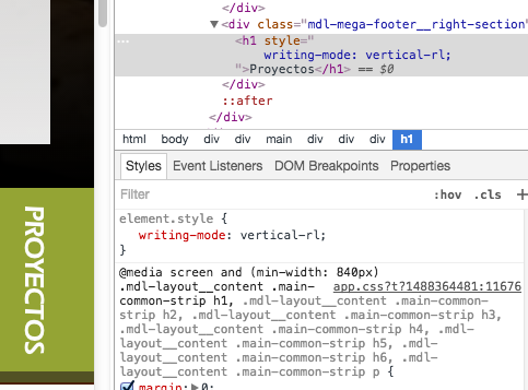
There is no need for that, as you can use css 'writing-mode' with values 'vertical-lr' or 'vertical-rl' as desired.
.item {
  writing-mode: vertical-rl;
}
Be careful on the "order of execution" in CSS3 chains! The order is right to left, not left to right.
transformation: translate(0,10%) rotate(25deg);
The rotate operation is done first, then the translate.
See: CSS3 transform order matters: rightmost operation first
The reason is because you are using the transform property twice. Due to CSS rules with the cascade, the last declaration wins if they have the same specificity. As both transform declarations are in the same rule set, this is the case.
What it is doing is this:
- rotate the text 90 degrees. Ok.
- translate 50% by 50%. Ok, this is same property as step one, so do this step and ignore step 1.
See http://jsfiddle.net/Lx76Y/ and open it in the debugger to see the first declaration overwritten
As the translate is overwriting the rotate, you have to combine them in the same declaration instead: http://jsfiddle.net/Lx76Y/1/
To do this you use a space separated list of transforms:
#rotatedtext {
    transform-origin: left;
    transform: translate(50%, 50%) rotate(90deg) ;
}
Remember that they are specified in a chain, so the translate is applied first, then the rotate after that.