Responsive Bootstrap Datatable not collapsing columns at the correct point
Add Div with class "table-responsive" before table start and delete width = "100%" from table tag ,
<div class="panel panel-primary" style="margin: 50px;">
<div class="panel-heading">
    <h3 class="panel-title">Panel title</h3>
</div>
<div class="panel-body">
    <div style="width: 100%; padding-left: -10px; border: 1px solid red;">
    <div class="table-responsive">  <-- add this div
        <table id="example" class="table table-striped table-hover dt-responsive display nowrap" cellspacing="0"> <-- remove width from this
            <thead>
            <tr>
                <th>Name</th>
                <th>Position</th>
                <th>Office</th>
                <th>Extn.</th>
                <th>Start date</th>
                <th>Salary</th>
            </tr>
            </thead>
        </table>
        </div>
    </div>
</div>
For me the problem got fixed when I put the table container div inside a bootstrap row div.
<div class="row">
 <div class="table-responsive">
   ... //table here
 </div>
</div>
The reason for this was that datatables bootstrap version was adding some col-* to toolbar (in my case) which were falling as direct children under another parent col-. The col- ideally should be children of row rather than col (as far as I understand).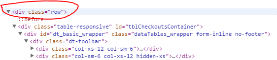
i know this post is old, for anyone trying to get this done simply do this
<table id="example" class="display" cellspacing="0" width="100%"></table>
add width="100%" it should take it and make it responsive without any configuration of such
check out Fiddle Working