Rendering a React component inside a Bootstrap popover
Bootstrap doesn't make it easy to render a dynamic component within a popover. If the popover you want to present is static, you can simply use React's renderComponentToString which takes a component and returns a string of HTML through a callback:
var html = React.renderComponentToString(<MusicList />);
$(this.getDOMNode()).popover({
    html: true,
    content: html
});
However, if your component has any interactivity, that strategy won't work because React never has a chance to attach event handlers (or run any of your custom lifecycle methods). Indeed, Bootstrap doesn't provide the proper hooks to make your popover content dynamic.
That said, it's possible to make this work by patching Bootstrap. I've created a live demo that has dynamic popover content:
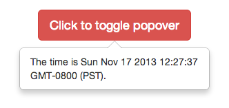
http://jsfiddle.net/spicyj/q6hj7/
Note that the current time is rendered within the popover by a React component that updates every second.
How was this popover created?
I patched Bootstrap popover's setContent method to take a React component in addition to an HTML or text string. Instead of using jQuery's html or text methods, I use React.renderComponent:
// Patch Bootstrap popover to take a React component instead of a
// plain HTML string
$.extend($.fn.popover.Constructor.DEFAULTS, {react: false});
var oldSetContent = $.fn.popover.Constructor.prototype.setContent;
$.fn.popover.Constructor.prototype.setContent = function() {
    if (!this.options.react) {
        return oldSetContent.call(this);
    }

    var $tip = this.tip();
    var title = this.getTitle();
    var content = this.getContent();

    $tip.removeClass('fade top bottom left right in');

    // If we've already rendered, there's no need to render again
    if (!$tip.find('.popover-content').html()) {
        // Render title, if any
        var $title = $tip.find('.popover-title');
        if (title) {
            React.renderComponent(title, $title[0]);
        } else {
            $title.hide();
        }

        React.renderComponent(content,  $tip.find('.popover-content')[0]);
    }
};
Now it's possible for you to write
$(this.getDOMNode()).popover({
    react: true,
    content: <MusicList />
});
in your componentDidMount method and have it render properly. If you look in the linked JSFiddle, you'll see a general-purpose <BsPopover /> wrapper I made that takes care of all the Bootstrap calls for you, including properly cleaning up the popover components once the wrapper component is removed from the DOM.
There is a new library called React-Bootstrap that is undergoing rapid development.
https://react-bootstrap.github.io/components.html#popovers
If you include this module you have the ability to make the popover its own component that you can save in a variable and then use in your render function.
Their example:
const positionerInstance = (
<ButtonToolbar>
<OverlayTrigger trigger="click" placement="bottom" overlay={<Popover title="Popover bottom"><strong>Holy guacamole!</strong> Check this info.</Popover>}>
<Button bsStyle="default">Click</Button>
</OverlayTrigger>
<OverlayTrigger trigger="hover" placement="bottom" overlay={<Popover title="Popover bottom"><strong>Holy guacamole!</strong> Check this info.</Popover>}>
<Button bsStyle="default">Hover</Button>
</OverlayTrigger>
<OverlayTrigger trigger="focus" placement="bottom" overlay={<Popover title="Popover bottom"><strong>Holy guacamole!</strong> Check this info.</Popover>}>
<Button bsStyle="default">Focus</Button>
</OverlayTrigger>
<OverlayTrigger trigger="click" rootClose placement="bottom" overlay={<Popover title="Popover bottom"><strong>Holy guacamole!</strong> Check this info.</Popover>}>
<Button bsStyle="default">Click + rootClose</Button>
</OverlayTrigger>
</ButtonToolbar>
);
React.render(positionerInstance, mountNode);
my code:
showMoreDetails: function(obj, columns){
var popOver = (
<Popover>
<table>
{
columns.map(col =>
<tr>
<td style={{textAlign:'right', padding:5}}>
{col.label}:
</td>
<td style={{padding:5}}>
{obj[col.key]}
</td>
</tr>
)
}
</table>
</Popover>
);
return(
<OverlayTrigger trigger='click' rootClose placement='left' overlay={popOver}>
<div className="popover-more">more...</div>
</OverlayTrigger>
);
},