Positioning View using anchor point
this code takes care of the font metrics, and position text as you asked (If I properly understood your requirements :-))
import SwiftUI
import PlaygroundSupport


struct BaseLine: ViewModifier {
    let alignment: HorizontalAlignment
    @State private var ref = CGSize.zero
    private var align: CGFloat {
        switch alignment {
        case .leading:
            return 1
        case .center:
            return 0
        case .trailing:
            return -1
        default:
            return 0
        }
    }
    func body(content: Content) -> some View {
        ZStack {
            Circle().frame(width: 0, height: 0, alignment: .center)
        content.alignmentGuide(VerticalAlignment.center) { (d) -> CGFloat in
            DispatchQueue.main.async {
                self.ref.height =  d[VerticalAlignment.center] - d[.lastTextBaseline]
                self.ref.width = d.width / 2
            }
            return d[VerticalAlignment.center]
        }
        .offset(x: align * ref.width, y: ref.height)
        }
    }
}

struct ContentView: View {
    var body: some View {
        ZStack {

            Cross(size: 20, color: Color.red).position(x: 200, y: 200)
            Cross(size: 20, color: Color.red).position(x: 200, y: 250)
            Cross(size: 20, color: Color.red).position(x: 200, y: 300)
            Cross(size: 20, color: Color.red).position(x: 200, y: 350)


            Text("WORLD").font(.title).border(Color.gray).modifier(BaseLine(alignment: .trailing))
                .rotationEffect(.degrees(45))
                .position(x: 200, y: 200)

            Text("Y").font(.system(size: 150)).border(Color.gray).modifier(BaseLine(alignment: .center))
            .rotationEffect(.degrees(45))
            .position(x: 200, y: 250)

            Text("Y").font(.system(size: 150)).border(Color.gray).modifier(BaseLine(alignment: .leading))
            .rotationEffect(.degrees(45))
            .position(x: 200, y: 350)

            Text("WORLD").font(.title).border(Color.gray).modifier(BaseLine(alignment: .leading))
                .rotationEffect(.degrees(225))
                .position(x: 200, y: 300)

        }
    }
}

struct Cross: View {
    let size: CGFloat
    var color = Color.clear
    var body: some View {
            Path { p in
                p.move(to: CGPoint(x: size / 2, y: 0))
                p.addLine(to: CGPoint(x: size / 2, y: size))
                p.move(to: CGPoint(x: 0, y: size / 2))
                p.addLine(to: CGPoint(x: size, y: size / 2))
            }
            .stroke().foregroundColor(color)
            .frame(width: size, height: size, alignment: .center)
    }
}

PlaygroundPage.current.setLiveView(ContentView())

So, as far as I can tell, alignment guides can't be used in this way – yet. Hopefully this will be coming soon, but in the meantime we can do a little padding and overlay trickery to get the desired effect.
Caveats
- You will need to have some way of retrieving the font metrics – I'm using
CTFontto initialise myFontinstances and retrieving metrics that way. - As far as I can tell, Playgrounds aren't always representative of how a SwiftUI layout will be laid out on the device, and certain inconsistencies arise. One that I've identified is that the
displayScaleenvironment value (and the derivedpixelLengthvalue) is not set correctly by default in playgrounds and even previews. Therefore, you have to set this manually in these environments if you want a representative layout (FB7280058).
Overview
We're going to combine a number of SwiftUI features to get the outcome we want here. Specifically, transforms, overlays and the GeometryReader view.
First, we'll align the baseline of our glyph to the baseline of our view. If we have the font's metrics we can use the font's 'descent' to shift our glyph down a little so it sits flush with the baseline – we can use the padding view modifier to help us with this.
Next, we're going to overlay our glyph view with a duplicate view. Why? Because within an overlay we're able to grab the exact metrics of the view underneath. In fact, our overlay will be the only view the user sees, the original view will only be utilised for its metrics.
A couple of simple transforms will position our overlay where we want it, and we'll then hide the view that sits underneath to complete the effect.
Step 1: Set up
First, we're going to need some additional properties to help with our calculations. In a proper project you could organise this into a view modifier or similar, but for conciseness we'll add them to our existing view.
@Environment(\.pixelLength) var pixelLength: CGFloat
@Environment(\.displayScale) var displayScale: CGFloat
We'll also need a our font initialised as a CTFont so we can grab its metrics:
let baseFont: CTFont = {
    let desc = CTFontDescriptorCreateWithNameAndSize("SFProDisplay-Medium" as CFString, 0)
    return CTFontCreateWithFontDescriptor(desc, 48, nil)
}()
Then some calculations. This calculates some EdgeInsets for a text view that will have the effect of moving the text view's baseline to the bottom edge of the enclosing padding view:
var textPadding: EdgeInsets {
    let baselineShift = (displayScale * baseFont.descent).rounded(.down) / displayScale
    let baselineOffsetInsets = EdgeInsets(top: baselineShift, leading: 0, bottom: -baselineShift, trailing: 0)
    return baselineOffsetInsets
}
We'll also add a couple of helper properties to CTFont:
extension CTFont {
    var ascent: CGFloat { CTFontGetAscent(self) }
    var descent: CGFloat { CTFontGetDescent(self) }
}
And finally we create a new helper function to generate our Text views that uses the CTFont we defined above:
private func glyphView(for text: String) -> some View {
    Text(verbatim: text)
        .font(Font(baseFont))
}
Step 2: Adopt our glyphView(_:) in our main body call
This step is simple and has us adopt the glyphView(_:) helper function we define above:
var body: some View {
    ZStack {
        ForEach(locations) { run in
            self.glyphView(for: run.string)
                .border(Color.green, width: self.pixelLength)
                .position(run.point)

            Circle()  // Added to show where `position` is
                .frame(maxWidth: 5)
                .foregroundColor(.red)
                .position(run.point)
        }
    }
}
This gets us here:

Step 3: Baseline shift
Next we shift the baseline of our text view so that it sits flush with the bottom of our enclosing padding view. This is just a case of adding a padding modifier to our new glyphView(_:)function that utilises the padding calculation we define above.
private func glyphView(for text: String) -> some View {
    Text(verbatim: text)
        .font(Font(baseFont))
        .padding(textPadding) // Added padding modifier
}

Notice how the glyphs are now sitting flush with the bottom of their enclosing views.
Step 4: Add an overlay
We need to get the metrics of our glyph so that we are able to accurately place it. However, we can't get those metrics until we've laid out our view. One way around this is to duplicate our view and use one view as a source of metrics that is otherwise hidden, and then present a duplicate view that we position using the metrics we've gathered.
We can do this with the overlay modifier together with a GeometryReader view. And we'll also add a purple border and make our overlay text blue to differentiate it from the previous step.
self.glyphView(for: run.string)
    .border(Color.green, width: self.pixelLength)
    .overlay(GeometryReader { geometry in
        self.glyphView(for: run.string)
            .foregroundColor(.blue)
            .border(Color.purple, width: self.pixelLength)
    })
    .position(run.point)

Step 5: Translate
Making use of the metrics we now have available for us to use, we can shift our overlay up and to the right so that the bottom left corner of the glyph view sits on our red positioning spot.
self.glyphView(for: run.string)
    .border(Color.green, width: self.pixelLength)
    .overlay(GeometryReader { geometry in
        self.glyphView(for: run.string)
            .foregroundColor(.blue)
            .border(Color.purple, width: self.pixelLength)
            .transformEffect(.init(translationX: geometry.size.width / 2, y: -geometry.size.height / 2))
    })
    .position(run.point)

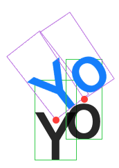
Step 6: Rotate
Now we have our view in position we can finally rotate.
self.glyphView(for: run.string)
    .border(Color.green, width: self.pixelLength)
    .overlay(GeometryReader { geometry in
        self.glyphView(for: run.string)
            .foregroundColor(.blue)
            .border(Color.purple, width: self.pixelLength)
            .transformEffect(.init(translationX: geometry.size.width / 2, y: -geometry.size.height / 2))
            .rotationEffect(.radians(run.angle))
    })
    .position(run.point)
Step 7: Hide our workings out
Last step is to hide our source view and set our overlay glyph to its proper colour:
self.glyphView(for: run.string)
    .border(Color.green, width: self.pixelLength)
    .hidden()
    .overlay(GeometryReader { geometry in
        self.glyphView(for: run.string)
            .foregroundColor(.black)
            .border(Color.purple, width: self.pixelLength)
            .transformEffect(.init(translationX: geometry.size.width / 2, y: -geometry.size.height / 2))
            .rotationEffect(.radians(run.angle))
    })
    .position(run.point)

The final code
//: A Cocoa based Playground to present user interface

import SwiftUI
import PlaygroundSupport

struct Location: Identifiable {
    let id = UUID()
    let point: CGPoint
    let angle: Double
    let string: String
}

let locations = [
    Location(point: CGPoint(x: 54.48386479999999, y: 296.4645408), angle: -0.6605166885682314, string: "Y"),
    Location(point: CGPoint(x: 74.99159120000002, y: 281.6336352), angle: -0.589411952788817, string: "o"),
]

struct ContentView: View {

    @Environment(\.pixelLength) var pixelLength: CGFloat
    @Environment(\.displayScale) var displayScale: CGFloat

    let baseFont: CTFont = {
        let desc = CTFontDescriptorCreateWithNameAndSize("SFProDisplay-Medium" as CFString, 0)
        return CTFontCreateWithFontDescriptor(desc, 48, nil)
    }()

    var textPadding: EdgeInsets {
        let baselineShift = (displayScale * baseFont.descent).rounded(.down) / displayScale
        let baselineOffsetInsets = EdgeInsets(top: baselineShift, leading: 0, bottom: -baselineShift, trailing: 0)
        return baselineOffsetInsets
    }

    var body: some View {
        ZStack {
            ForEach(locations) { run in
                self.glyphView(for: run.string)
                    .border(Color.green, width: self.pixelLength)
                    .hidden()
                    .overlay(GeometryReader { geometry in
                        self.glyphView(for: run.string)
                            .foregroundColor(.black)
                            .border(Color.purple, width: self.pixelLength)
                            .transformEffect(.init(translationX: geometry.size.width / 2, y: -geometry.size.height / 2))
                            .rotationEffect(.radians(run.angle))
                    })
                    .position(run.point)

                Circle()  // Added to show where `position` is
                    .frame(maxWidth: 5)
                    .foregroundColor(.red)
                    .position(run.point)
            }
        }
    }

    private func glyphView(for text: String) -> some View {
        Text(verbatim: text)
            .font(Font(baseFont))
            .padding(textPadding)
    }
}

private extension CTFont {
    var ascent: CGFloat { CTFontGetAscent(self) }
    var descent: CGFloat { CTFontGetDescent(self) }
}

PlaygroundPage.current.setLiveView(
    ContentView()
        .environment(\.displayScale, NSScreen.main?.backingScaleFactor ?? 1.0)
        .frame(width: 640, height: 480)
        .background(Color.white)
)
And that's it. It's not perfect, but until SwiftUI gives us an API that allows us to use alignment anchors to anchor our transforms, it might get us by!