opacity vs fill-opacity in svg
The difference is exactly what the name indicates :). fill-opacity is applicable only to the fill of the element (or in other words, just its background), stroke-opacity is applicable only to the stroke whereas the opacity is applicable to both.
The opacity is kind of a post-processing operation. That is, the element (or group) as a whole (the fill + stroke) is rendered and then the transparency is adjusted based on the opacity setting whereas the fill-opacity and stroke-opacity are intermediate steps, so the transparency is individually added to the stroke and fill. So when stroke-opacity and fill-opacity are used together, the result would still not be the same as using opacity (because the transparency on the fill will let the fill color show through wherever they overlap). You can see the difference visually in the first two elements below.
Also as indicated by Robert (in comments), fill-opacity doesn't apply to image whereas opacity does work.
svg {
  width: 100vw;
  height: 100vh;
}
body {
  background: url(http://lorempixel.com/600/600/nature/1);
  height: 100vh;
}
polygon {
  stroke-width: 3;
}
<svg viewBox='0 0 40 190'>
<polygon points='10,10 30,10 30,30 10,30' fill='steelblue' stroke='crimson' opacity='0.5' />
<polygon points='10,40 30,40 30,60 10,60' fill='steelblue' stroke='crimson' fill-opacity='0.5' stroke-opacity='0.5' />
<polygon points='10,70 30,70 30,90 10,90' fill='steelblue' stroke='crimson' fill-opacity='0.5' />
<polygon points='10,100 30,100 30,120 10,120' fill='steelblue' stroke='crimson' stroke-opacity='0.5' />
<image xlink:href='http://lorempixel.com/100/100/nature/3' x='8.5' y='130' width='23' height='23' stroke='crimson' opacity='0.5' />
<image xlink:href='http://lorempixel.com/100/100/nature/3' x='8.5' y='160' width='23' height='23' stroke='crimson' fill-opacity='0.5' />
</svg>In the CSS world you can think of it as something like in the below snippet. (Note that I am not saying they are equal, there are subtle differences between SVG and CSS. It is just an attempt to explain what those SVG attributes would translate to in CSS.)
div {
  height: 20vh;
  width: 20vh;
  margin: 30px auto;
  font-family: Verdana;
  font-size: 2vw;
}
div:nth-of-type(1) {
  opacity: 0.5;
  background: rgba(70, 130, 180, 1);
  border: .35vw solid rgba(220, 20, 60, 1);
}
div:nth-of-type(2) {
  background: rgba(70, 130, 180, 0.5);
  border: .35vw solid rgba(220, 20, 60, 1);
}
div:nth-of-type(3) {
  background: rgba(70, 130, 180, 1);
  border: .35vw solid rgba(220, 20, 60, 0.5);
}
body {
  background: url(http://lorempixel.com/600/600/nature/1);
  height: 100vh;
}
<div></div>
<div></div>
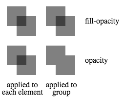
<div></div>In addition to affecting which parts of each individual element are affected (e.g. fill versus stroke) another difference is what happens when elements overlap within a group. opacity affects the transparency of the group as a whole while fill-opacity affects the transparency of the individual elements within the group. One consequence of this is that when elements within such a group overlap, there is a compounding effect in the region of overlap when fill-opacity is used but not when opacity is used. This is demonstrated in the image below when a (fill-)opacity of 0.5 is applied to either each element within a group or to the group itself.
<svg height="200">
  <g transform="translate(0, 0)">
    <rect x="10" y="10" width="40" height="40"   fill-opacity="0.5"/>
    <rect x="30" y="30" width="40" height="40"   fill-opacity="0.5"/>
  </g>
  <g transform="translate(80, 0)"                fill-opacity="0.5">
    <rect x="10" y="10" width="40" height="40"/>
    <rect x="30" y="30" width="40" height="40"/>
  </g>
  <g transform="translate(0, 80)">
    <rect x="10" y="10" width="40" height="40"        opacity="0.5"/>
    <rect x="30" y="30" width="40" height="40"        opacity="0.5"/>
  </g>
  <g transform="translate(80, 80)"                    opacity="0.5">
    <rect x="10" y="10" width="40" height="40"/>
    <rect x="30" y="30" width="40" height="40"/>
  </g>
  <text transform="translate(170,45)">fill-opacity</text>
  <text transform="translate(170,125)">opacity</text>
  <text transform="translate(10,175)">applied to</text>
  <text transform="translate(0,190)">each element</text>
  <text transform="translate(90,175)">applied to</text>
  <text transform="translate(103,190)">group</text>
</svg>
fill-opacity controls the opacity for the fill color. opacity controls the opacity of the entire thing.
Take a look at this demo: https://jsfiddle.net/DerekL/9mvrL66g/