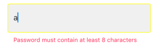
Not able to change TextField Border Color
Well, I really don't know why the color assigned to border does not work. But you can control the border color using other border properties of the textfield. They are:
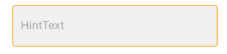
- disabledBorder: Is activated when enabled is set to false
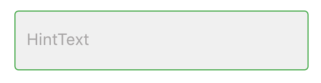
- enabledBorder: Is activated when enabled is set to true (by default enabled property of TextField is true)
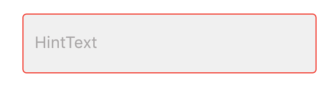
- errorBorder: Is activated when there is some error (i.e. a failed validate)
- focusedBorder: Is activated when we click/focus on the TextField.
- focusedErrorBorder: Is activated when there is error and we are currently focused on that TextField.
A code snippet is given below:
TextField(
enabled: false, // to trigger disabledBorder
decoration: InputDecoration(
filled: true,
fillColor: Color(0xFFF2F2F2),
focusedBorder: OutlineInputBorder(
borderRadius: BorderRadius.all(Radius.circular(4)),
borderSide: BorderSide(width: 1,color: Colors.red),
),
disabledBorder: OutlineInputBorder(
borderRadius: BorderRadius.all(Radius.circular(4)),
borderSide: BorderSide(width: 1,color: Colors.orange),
),
enabledBorder: OutlineInputBorder(
borderRadius: BorderRadius.all(Radius.circular(4)),
borderSide: BorderSide(width: 1,color: Colors.green),
),
border: OutlineInputBorder(
borderRadius: BorderRadius.all(Radius.circular(4)),
borderSide: BorderSide(width: 1,)
),
errorBorder: OutlineInputBorder(
borderRadius: BorderRadius.all(Radius.circular(4)),
borderSide: BorderSide(width: 1,color: Colors.black)
),
focusedErrorBorder: OutlineInputBorder(
borderRadius: BorderRadius.all(Radius.circular(4)),
borderSide: BorderSide(width: 1,color: Colors.yellowAccent)
),
hintText: "HintText",
hintStyle: TextStyle(fontSize: 16,color: Color(0xFFB3B1B1)),
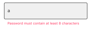
errorText: snapshot.error,
),
controller: _passwordController,
onChanged: _authenticationFormBloc.onPasswordChanged,
obscureText: false,
),
disabledBorder:
enabledBorder:
focusedBorder:
errorBorder:
errorFocusedBorder:
Hope it helps you.
The code in which you change the color of the primaryColor andprimaryColorDark does not change the color inicial of the border, only after tap the color stay black
The attribute that must be changed is hintColor
BorderSide should not be used for this, you need to change Theme.
To make the red color default to put the theme in MaterialApp(theme: ...) and to change the theme of a specific widget, such as changing the default red color to the yellow color of the widget, surrounds the widget with:
new Theme(
  data: new ThemeData(
    hintColor: Colors.yellow
  ),
  child: ...
)
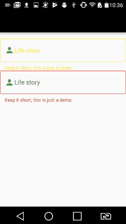
Below is the code and gif:
Note that if we define the primaryColor color as black, by tapping the widget it is selected with the color black
But to change the label and text inside the widget, we need to set the theme to InputDecorationTheme
The widget that starts with the yellow color has its own theme and the widget that starts with the red color has the default theme defined with the function buildTheme()
import 'package:flutter/material.dart';

void main() => runApp(new MyApp());

ThemeData buildTheme() {
  final ThemeData base = ThemeData();
  return base.copyWith(
    hintColor: Colors.red,
    primaryColor: Colors.black,
    inputDecorationTheme: InputDecorationTheme(
      hintStyle: TextStyle(
        color: Colors.blue,
      ),
      labelStyle: TextStyle(
        color: Colors.green,
      ),
    ),
  );
}

class MyApp extends StatelessWidget {
  @override
  Widget build(BuildContext context) {
    return new MaterialApp(
      theme: buildTheme(),
      home: new HomePage(),
    );
  }
}

class HomePage extends StatefulWidget {
  @override
  _HomePageState createState() => new _HomePageState();
}

class _HomePageState extends State<HomePage> {
  String xp = '0';

  @override
  Widget build(BuildContext context) {
    return new Scaffold(
      appBar: new AppBar(),
      body: new Container(
        padding: new EdgeInsets.only(top: 16.0),
        child: new ListView(
          children: <Widget>[
            new InkWell(
              onTap: () {},
              child: new Theme(
                data: new ThemeData(
                  hintColor: Colors.yellow
                ),
                child: new TextField(
                  decoration: new InputDecoration(
                      border: new OutlineInputBorder(),
                      hintText: 'Tell us about yourself',
                      helperText: 'Keep it short, this is just a demo.',
                      labelText: 'Life story',
                      prefixIcon: const Icon(Icons.person, color: Colors.green,),
                      prefixText: ' ',
                      suffixText: 'USD',
                      suffixStyle: const TextStyle(color: Colors.green)),
                )
              )
            ),
            new InkWell(
              onTap: () {},
              child: new TextField(
                decoration: new InputDecoration(
                    border: new OutlineInputBorder(
                      borderSide: new BorderSide(color: Colors.teal)
                    ),
                    hintText: 'Tell us about yourself',
                    helperText: 'Keep it short, this is just a demo.',
                    labelText: 'Life story',
                    prefixIcon: const Icon(Icons.person, color: Colors.green,),
                    prefixText: ' ',
                    suffixText: 'USD',
                    suffixStyle: const TextStyle(color: Colors.green)),
              )
            )
          ],
        ),
      )
    );
  }
}
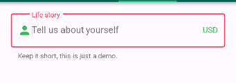
That is not changing due to the default theme set to the screen.
So just change them for the widget you are drawing by wrapping your TextField with new ThemeData()
child: new Theme(
          data: new ThemeData(
            primaryColor: Colors.redAccent,
            primaryColorDark: Colors.red,
          ),
          child: new TextField(
            decoration: new InputDecoration(
                border: new OutlineInputBorder(
                    borderSide: new BorderSide(color: Colors.teal)),
                hintText: 'Tell us about yourself',
                helperText: 'Keep it short, this is just a demo.',
                labelText: 'Life story',
                prefixIcon: const Icon(
                  Icons.person,
                  color: Colors.green,
                ),
                prefixText: ' ',
                suffixText: 'USD',
                suffixStyle: const TextStyle(color: Colors.green)),
          ),
        ));
The new way to do it is to use enabledBorder like this:
new TextField(
  decoration: new InputDecoration(
    enabledBorder: const OutlineInputBorder(
      borderSide: const BorderSide(color: Colors.grey, width: 0.0),
    ),
    focusedBorder: ...
    border: ...
  ),
)