Material Date Picker Custom Styling
About the fullscreen.
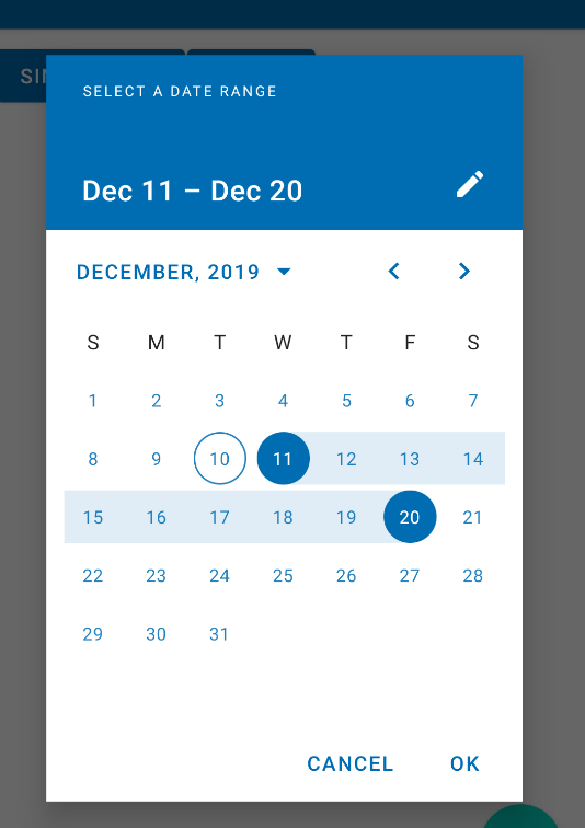
The range picker should cover the entire screen (default = dialog for single date, fullscreen for range). However you can change this behavior in your style.
You can use the setTheme method to apply a theme overlay:
//To apply a dialog
builder.setTheme(R.style.ThemeOverlay_MaterialComponents_MaterialCalendar);
//To apply the fullscreen:
builder.setTheme(R.style.ThemeOverlay_MaterialComponents_MaterialCalendar_Fullscreen);
Note: it requires at least the version 1.2.0-alpha01.
As alternative you can add in your app theme the materialCalendarFullscreenTheme attribute.
<style name="AppTheme" parent="Theme.MaterialComponents.DayNight">
   <item name="materialCalendarFullscreenTheme">@style/CustomThemeOverlay_MaterialCalendar_Fullscreen</item>
</style>
where:
  <style name="CustomThemeOverlay_MaterialCalendar_Fullscreen"
      parent="@style/ThemeOverlay.MaterialComponents.MaterialCalendar.Fullscreen">
    <item name="materialCalendarStyle">@style/Custom_MaterialCalendar.Fullscreen</item>
  </style>
Here you can override the value with the android:windowFullscreen attribute:
  <style name="Custom_MaterialCalendar.Fullscreen"
      parent="@style/Widget.MaterialComponents.MaterialCalendar.Fullscreen">
    <item name="android:windowFullscreen">false</item>
  </style>
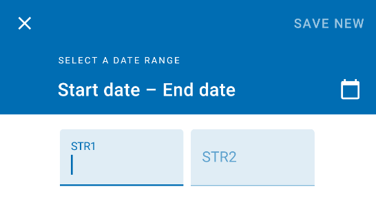
About the strings.
Currently there isn't a method to change the strings.
The only existing method is builder.setTitleText to change the title.
However you can override all the existing strings in your project, but this workaround can stop to run in the next releases. For example:
  <string name="mtrl_picker_save" description="Confirms the selection [CHAR_LIMIT=12]">....</string>
  <string name="mtrl_picker_text_input_date_range_start_hint" description="Label for the start date in a range selected by the user [CHAR_LIMIT=60]">...</string>
  <string name="mtrl_picker_text_input_date_range_end_hint" description="Label for the end date in a range selected by the user [CHAR_LIMIT=60]">...</string>
Here you can find all the strings used by the material calendar in the 1.2.0-alpha02.
Basically, you should play with styles. In your AppTheme add an item materialCalendarTheme with your custom style that inherits parent ThemeOverlay.MaterialComponents.MaterialCalendar, and change the style.
- Change text field - call
MaterialDatePicker.BuilderfunctionsetTitleText() - Make dialog not full screen - you can't change it for date range picker, the documentation says that it is fullscreen by default
Mobile date range pickers allow selection of a range of dates. They cover the entire screen.
Here's documentation https://material.io/components/pickers
Here's how I tweaked some colors to match my theme:
<style name="AppTheme" parent="Theme.MaterialComponents.Light">
    <item name="materialCalendarTheme">@style/ThemeMaterialCalendar</item>
</style>

<style name="ThemeMaterialCalendar" parent="ThemeOverlay.MaterialComponents.MaterialCalendar">
    <item name="buttonBarPositiveButtonStyle">@style/ThemeMaterialCalendarButton</item>
    <item name="buttonBarNegativeButtonStyle">@style/ThemeMaterialCalendarButton</item>
    <item name="materialButtonStyle">@style/ThemeMaterialCalendarTextButton</item>
</style>

<style name="ThemeMaterialCalendarButton" parent="Widget.MaterialComponents.Button.TextButton.Dialog">
    <item name="android:textColor">?themeTextColorPrimary</item>
</style>

<style name="ThemeMaterialCalendarTextButton" parent="Widget.MaterialComponents.Button.TextButton.Dialog.Flush">
    <item name="android:textColor">?themeTextColorPrimary</item>
    <item name="iconTint">?themeTextColorPrimary</item>
</style>