Justify buttons with Bootstrap v4
Indeed the nav-justify class is missing. You can add it yourself based on TB3's code for now:
SCSS code
// Justified button groups
// ----------------------

.btn-group-justified {
  display: table;
  width: 100%;
  table-layout: fixed;
  border-collapse: separate;
  .btn,
  .btn-group {
    float: none;
    display: table-cell;
    width: 1%;
    .btn {
      width: 100%;
    }
    .dropdown-menu {
      left: auto;
    }
  }
}
compiled CSS code
.btn-group-justified {
  display: table;
  width: 100%;
  table-layout: fixed;
  border-collapse: separate; }
  .btn-group-justified .btn,
  .btn-group-justified .btn-group {
    float: none;
    display: table-cell;
    width: 1%; }
    .btn-group-justified .btn .btn,
    .btn-group-justified .btn-group .btn {
      width: 100%; }
    .btn-group-justified .btn .dropdown-menu,
    .btn-group-justified .btn-group .dropdown-menu {
      left: auto; }
HTML
 <div class="btn-group btn-group-justified" role="group" aria-label="Justified button group">
   <a class="btn btn-primary" href="#" role="button">Left</a>
   <a class="btn btn-primary" href="#" role="button">Middle</a>
   <a class="btn btn-primary" href="#" role="button">Right</a>
 </div>
The above HTML code now will look like that shown in the figure beneath:

Handling borders
- Due to the specific HTML and CSS used to justify buttons (namely
display: table-cell), the borders between them are doubled. In regular button groups,margin-left: -1pxis used to stack the borders instead of removing them. However,margindoesn't work withdisplay: table-cell. As a result, depending on your customizations to Bootstrap, you may wish to remove or re-color the borders.
Links acting as buttons
- If the
<a>elements are used to act as buttons – triggering in-page functionality, rather than navigating to another document or section within the current page – they should also be given an appropriaterole="button".
Dropdowns
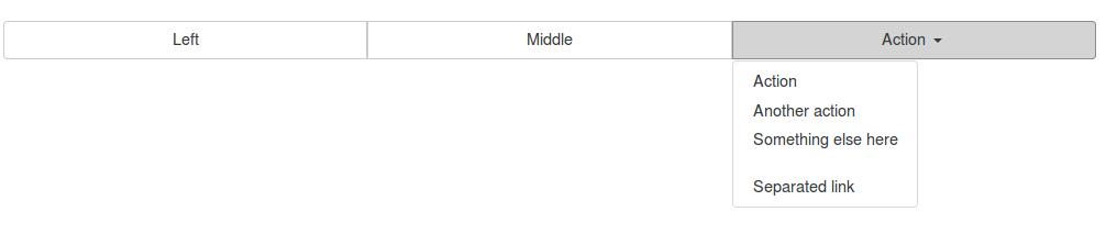
Use the following HTML code for dropdown buttons:
 <div class="btn-group btn-group-justified" role="group" aria-label="Justified button group with nested dropdown">
   <a class="btn btn-secondary" href="#" role="button">Left</a>
   <a class="btn btn-secondary" href="#" role="button">Middle</a>
    <div class="btn-group">
      <button type="button" class="btn btn-secondary dropdown-toggle" data-toggle="dropdown" aria-haspopup="true" aria-expanded="false">
        Action
      </button>
      <div class="dropdown-menu">
        <a class="dropdown-item" href="#">Action</a>
        <a class="dropdown-item" href="#">Another action</a>
        <a class="dropdown-item" href="#">Something else here</a>
        <div class="dropdown-divider"></div>
        <a class="dropdown-item" href="#">Separated link</a>
      </div>
    </div>
 </div>
The justified button group with dropdown button should look like that shown in the figure below:
With <button> elements
- To use justified button groups with
<button>elements, you must wrap each button in a button group. Most browsers don't properly apply our CSS for justification to<button>elements, but since we support button dropdowns, we can work around that.
HTML
 <div class="btn-group btn-group-justified" role="group" aria-label="Justified button group">
   <div class="btn-group" role="group">
     <button type="button" class="btn btn-secondary">Left</button>
   </div>
   <div class="btn-group" role="group">
     <button type="button" class="btn btn-secondary">Middle</button>
   </div>
   <div class="btn-group" role="group">
     <button type="button" class="btn btn-secondary">Right</button>
  </div>
 </div>
The above HTML code used to justified button groups with <button> elements should look like that shown in the figure beneath:

For anyone finding this after Bootstrap 4 Beta was released...
<div class="btn-group d-flex" role="group">
   <a href="" class="btn btn-secondary w-100">Previous</a>
   <a href="" class="btn btn-secondary w-100">Next</a>
</div>