Issue with Buttons in SwiftUI on MacOS
You can achieve the look you want by using a ButtonStyle and then specifying colors and other style attributes based on the configuration values being passed in.
It would be nice if there was a happy medium where you could inherit the default button radius, automatic width based on the text length and other attributes, but at least there is the ability to specify all the attributes and get the look you want.
Hope this helps!
import SwiftUI

struct BlueButtonStyle: ButtonStyle {
    func makeBody(configuration: Self.Configuration) -> some View {
        configuration.label
            .foregroundColor(configuration.isPressed ? Color.blue : Color.white)
            .background(configuration.isPressed ? Color.white : Color.blue)
            .cornerRadius(6.0)
            .padding()
    }
}

struct ContentView: View {
    var body: some View {
        VStack {
            Text("Hello World")
                .frame(maxWidth: .infinity, maxHeight: .infinity)

            Button(action: {
            }) {
                Text("Press")
                    .frame(maxWidth: 100, maxHeight: 24)
            }
            .buttonStyle(BlueButtonStyle())
        }
    }
}


struct ContentView_Previews: PreviewProvider {
    static var previews: some View {
        ContentView()
    }
}
Inspired by @Gene Z. Ragan 's great answer I've started with that answer and taken this a bit further:
Making the ButtonStyle a bit more flexible:
struct NiceButtonStyle: ButtonStyle {
  var foregroundColor: Color
  var backgroundColor: Color
  var pressedColor: Color

  func makeBody(configuration: Self.Configuration) -> some View {
    configuration.label
      .font(.headline)
      .padding(10)
      .foregroundColor(foregroundColor)
      .background(configuration.isPressed ? pressedColor : backgroundColor)
      .cornerRadius(5)
  }
}
and then some sugar to make it cleaner at the call site:
extension View {
  func niceButton(
    foregroundColor: Color = .white,
    backgroundColor: Color = .gray,
    pressedColor: Color = .accentColor
  ) -> some View {
    self.buttonStyle(
      NiceButtonStyle(
        foregroundColor: foregroundColor,
        backgroundColor: backgroundColor,
        pressedColor: pressedColor
      )
    )
  }
}
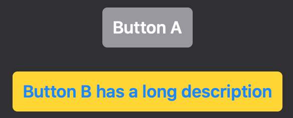
then means we can use default colouring: white foreground, grey background and accentedColor pressedColor
  Button(action: { } ) {
    Text("Button A")
  }
  .niceButton()
or we can customise the colours:
  Button(action: { } ) {
    Text("Button B has a long description")
  }
  .niceButton(
    foregroundColor: .blue,
    backgroundColor: .yellow,
    pressedColor: .orange
  )
And we get:
Thanks again Gene.
I raised this with Apple on the Feedback assistant to see if they had any useful thoughts.
Dialogue here:
I said:
If on MACOS with SwiftUI I do this:
  Button(action: { } ) {
    Text("Press")
    .padding()
    .background(Color.blue)
  }
I get a blue box with two grey bits sticking out the sides. Image attached. These are the two grey areas are the ends of a tappable button. but I would expect the button to be the shape of the blue area.
The same code works fine as expected on iOS.
(I did look at using .onTapGesture but this doesn't animate the button so that you know you've tapped it.)
Apple said:
iOS and macOS have different default ButtonStyles — iOS is borderless, macOS has that standard bezel effect.
It sounds like you’re trying to create a custom ButtonStyle (and so not have any system provided chrome). So you’ll want to create that, which can apply that blue background to the label of the button, and then apply that to your simple button with Text, e.g.
Button("Press"), action {}).buttonStyle(BluePaddingButtonStyle()
This will ensure that it has the same appearance on every platform you run it on.
I said:
Hi, Thanks for the explanation. I get what you are saying and I’m ok with the method I’ve come up with.
It still doesn’t seem right that:
  Button(action: { } ) {
    Text("Press")
    .padding()
    .background(Color.blue)
  }
should produce something so odd looking. I don’t understand why that bit of code couldn’t just produce a blue button.
As I say - it’s not a problem because I’ve worked around it but it currently doesn’t seem intuitive.
Apple said:
The provided content inside the ViewBuilder is used as the label of the button: not the entire button. The button will still come with the surrounding background, bezel, foreground styling, etc as described by it’s ButtonStyle. So if your button needs to have a very specific appearance, then it needs to customize that style: either to the BorderlessButtonStyle (though note that still does come with a specific foreground appearance style), or to a custom ButtonStyle.
My thoughts:
This did help me understand why it shows as it does but intuitively it still seems wrong !!!