Is it possible to use dynamic type sizes with a custom font in SwiftUI?
If you'd like to keep a SwiftUI-like style, you can extend Font for UIKit-compatible platforms:
import SwiftUI

extension Font {

    #if canImport(UIKit)

    static var myHeadline = Font.custom(
        "Your-Font-Name",
        size: UIFontMetrics(forTextStyle: .headline).scaledValue(for: 17)
    )

    #endif
}
Then, to use it:
Text("Hello World!")
    .font(.myHeadline)
Note that your custom fonts won't update unless you restart the application. This means that the canvas preview won't work either this way.
I'll be investigating this topic further as soon as I find time for it.
(Also, this should be a native feature. If there's Font.system(_ style: Font.TextStyle, design: Font.Design = .default), there should be Font.custom(_ name: String, style: Font.TextStyle) too. See FB6523689 in Feedback.)
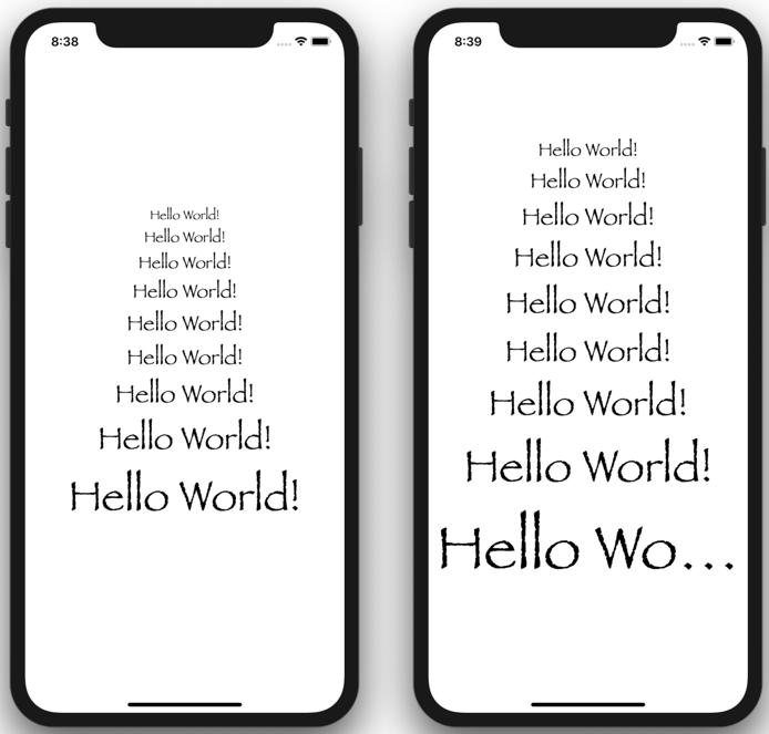
The way I would do it, is by creating a custom modifier that can be bound to the changes of the environment's size category:
Whenever you need to use Papyrus, you would use it like this:
Text("Hello World!").modifier(Papyrus())
or like this:
Text("Hello World!").modifier(Papyrus(.caption))
Text("Hello World!").modifier(Papyrus(.footnote))
Text("Hello World!").modifier(Papyrus(.subheadline))
Text("Hello World!").modifier(Papyrus(.callout))
Text("Hello World!").modifier(Papyrus())
Text("Hello World!").modifier(Papyrus(.body))
Text("Hello World!").modifier(Papyrus(.headline))
Text("Hello World!").modifier(Papyrus(.title))
Text("Hello World!").modifier(Papyrus(.largeTitle))
Your text will now dynamically change without further work. This is the same code, reacting to different text size preference:
And your Papyrus() implementation will look something like this. You'll need to figure out the right values for each category, this is just an example:
struct Papyrus: ViewModifier {
    @Environment(\.sizeCategory) var sizeCategory
    var textStyle: Font.TextStyle

    init(_ textStyle: Font.TextStyle = .body) {
        self.textStyle = textStyle
    }

    func body(content: Content) -> some View {
        content.font(getFont())
    }

    func getFont() -> Font {
        switch(sizeCategory) {
        case .extraSmall:
            return Font.custom("Papyrus", size: 16 * getStyleFactor())
        case .small:
            return Font.custom("Papyrus", size: 21 * getStyleFactor())
        case .medium:
            return Font.custom("Papyrus", size: 24 * getStyleFactor())
        case .large:
            return Font.custom("Papyrus", size: 28 * getStyleFactor())
        case .extraLarge:
            return Font.custom("Papyrus", size: 32 * getStyleFactor())
        case .extraExtraLarge:
            return Font.custom("Papyrus", size: 36 * getStyleFactor())
        case .extraExtraExtraLarge:
            return Font.custom("Papyrus", size: 40 * getStyleFactor())
        case .accessibilityMedium:
            return Font.custom("Papyrus", size: 48 * getStyleFactor())
        case .accessibilityLarge:
            return Font.custom("Papyrus", size: 52 * getStyleFactor())
        case .accessibilityExtraLarge:
            return Font.custom("Papyrus", size: 60 * getStyleFactor())
        case .accessibilityExtraExtraLarge:
            return Font.custom("Papyrus", size: 66 * getStyleFactor())
        case .accessibilityExtraExtraExtraLarge:
            return Font.custom("Papyrus", size: 72 * getStyleFactor())
        @unknown default:
            return Font.custom("Papyrus", size: 36 * getStyleFactor())
        }
    }

    func getStyleFactor() -> CGFloat {
        switch textStyle {
        case .caption:
            return 0.6
        case .footnote:
            return 0.7
        case .subheadline:
            return 0.8
        case .callout:
            return 0.9
        case .body:
            return 1.0
        case .headline:
            return 1.2
        case .title:
            return 1.5
        case .largeTitle:
            return 2.0
        @unknown default:
            return 1.0
        }
    }

}
UPDATE
I modified the implementation to accept a text style as parameter.
I stumbled upon a nice way to achieve this also via ViewModifier. I borrowed the base modifier from this Hacking With Swift's article on Dynamic Type and Custom Fonts. Here's the result:
import SwiftUI

@available(iOS 13, macCatalyst 13, tvOS 13, watchOS 6, *)
struct CustomFont: ViewModifier {
    @Environment(\.sizeCategory) var sizeCategory

    var name: String
    var style: UIFont.TextStyle
    var weight: Font.Weight = .regular

    func body(content: Content) -> some View {
        return content.font(Font.custom(
            name,
            size: UIFont.preferredFont(forTextStyle: style).pointSize)
            .weight(weight))
    }
}

@available(iOS 13, macCatalyst 13, tvOS 13, watchOS 6, *)
extension View {
    func customFont(
        name: String,
        style: UIFont.TextStyle,
        weight: Font.Weight = .regular) -> some View {
        return self.modifier(CustomFont(name: name, style: style, weight: weight))
    }
}
And usage:
Text("Hello World!")
    .customFont(name: "Georgia", style: .headline, weight: .bold)
This way you can stick to bundled Text Styles without needing to provide sizes explicitly. Should you want to do so, the font modifier already allow us to, and the scaling could be handled through one of the alternative approaches given to this question.
Also, please note that because the styling is applied within a ViewModifier conformant struct, which in turn responds to changes to the environment's sizeCategory, the views will reflect changes to the accessibility settings right upon switching back to your app; so there's no need to restart it.