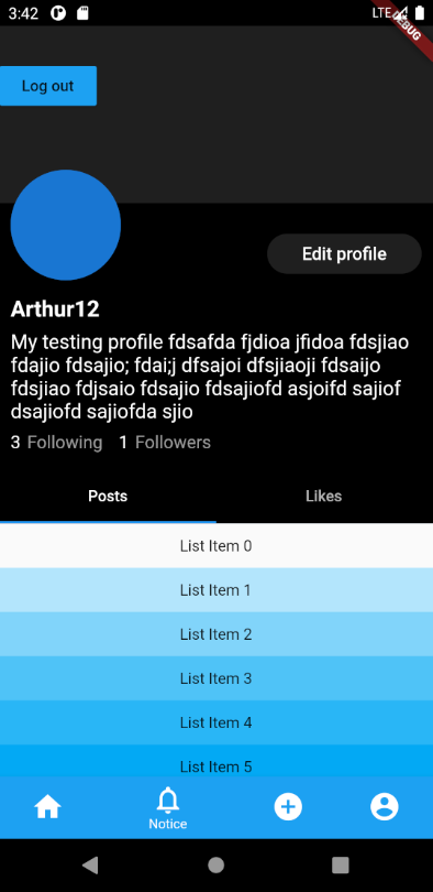
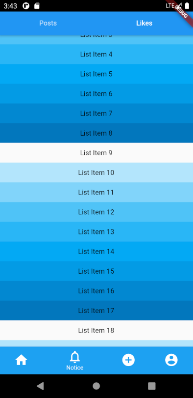
Instagram Profile Header Layout In Flutter
Another solution is that you could use a pinned SliverAppBar with FlexibleSpaceBar within DefaultTabController. Sample codes:
  Scaffold(
    body: DefaultTabController(
      length: 2,
      child: NestedScrollView(
        headerSliverBuilder: (context, value) {
          return [
            SliverAppBar(
              floating: true,
              pinned: true,
              bottom: TabBar(
                tabs: [
                  Tab(text: "Posts"),
                  Tab(text: "Likes"),
                ],
              ),
              expandedHeight: 450,
              flexibleSpace: FlexibleSpaceBar(
                collapseMode: CollapseMode.pin,
                background: Profile(), // This is where you build the profile part
              ),
            ),
          ];
        },
        body: TabBarView(
          children: [
            Container(
              child: ListView.builder(
                itemCount: 100,
                itemBuilder: (context, index) {
                  return Container(
                    height: 40,
                    alignment: Alignment.center,
                    color: Colors.lightBlue[100 * (index % 9)],
                    child: Text('List Item $index'),
                  );
                },
              ),
            ),
          ],
        ),
      ),
    ),
  ),
Before scrolling:
After scrolling:
You can achieve this behaviour using NestedScrollView with Scaffold.
As we need the widgets between the AppBar and TabBar to be dynamically built and scrolled until TabBar reaches AppBar, use the appBar property of the Scaffold to build your AppBar and use headerSliverBuilder to build other widgets of unknown heights. Use the body property of NestedScrollView to build your tab views.
This way the elements of the headerSliverBuilder would scroll away till the body reaches the bottom of the AppBar.
Might be a little confusing to understand with mere words, here is an example for you.
Code:
// InstaProfilePage
class InstaProfilePage extends StatefulWidget {
  @override
  _InstaProfilePageState createState() => _InstaProfilePageState();
}

class _InstaProfilePageState extends State<InstaProfilePage> {
  double get randHeight => Random().nextInt(100).toDouble();

  List<Widget> _randomChildren;

  // Children with random heights - You can build your widgets of unknown heights here
  // I'm just passing the context in case if any widgets built here needs  access to context based data like Theme or MediaQuery
  List<Widget> _randomHeightWidgets(BuildContext context) {
    _randomChildren ??= List.generate(3, (index) {
      final height = randHeight.clamp(
        50.0,
        MediaQuery.of(context).size.width, // simply using MediaQuery to demonstrate usage of context
      );
      return Container(
        color: Colors.primaries[index],
        height: height,
        child: Text('Random Height Child ${index + 1}'),
      );
    });

    return _randomChildren;
  }

  @override
  Widget build(BuildContext context) {
    return Scaffold(
      // Persistent AppBar that never scrolls
      appBar: AppBar(
        title: Text('AppBar'),
        elevation: 0.0,
      ),
      body: DefaultTabController(
        length: 2,
        child: NestedScrollView(
          // allows you to build a list of elements that would be scrolled away till the body reached the top
          headerSliverBuilder: (context, _) {
            return [
              SliverList(
                delegate: SliverChildListDelegate(
                  _randomHeightWidgets(context),
                ),
              ),
            ];
          },
          // You tab view goes here
          body: Column(
            children: <Widget>[
              TabBar(
                tabs: [
                  Tab(text: 'A'),
                  Tab(text: 'B'),
                ],
              ),
              Expanded(
                child: TabBarView(
                  children: [
                    GridView.count(
                      padding: EdgeInsets.zero,
                      crossAxisCount: 3,
                      children: Colors.primaries.map((color) {
                        return Container(color: color, height: 150.0);
                      }).toList(),
                    ),
                    ListView(
                      padding: EdgeInsets.zero,
                      children: Colors.primaries.map((color) {
                        return Container(color: color, height: 150.0);
                      }).toList(),
                    )
                  ],
                ),
              ),
            ],
          ),
        ),
      ),
    );
  }
}
Output:
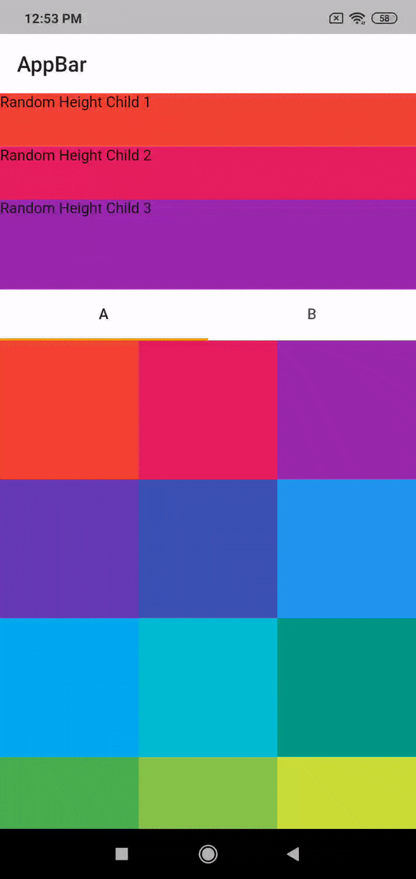
Hope this helps!