How to use a view (shimmer) as a placeholder for an imageView (Glide)
I've develop a library to easy add shimmer/skeleton loading effects. https://github.com/AgnaldoNP/AGSkeletonLoading
There is an explanation on the README.md about how to use it. You don't need to add a bunch of layouts to emulate the skeleton, it is automatically calculated. The layout used to show skeleton is the same show the content.
If you use SkeletonImageView on layout file, you'll just call startLoading() and stopLoading() to control the animation. I hope I have helped you
In my case i wanted a drawable with rounded corners as a placeholder which was not supported by the library and i found that you can achieve this using a ShapeableImageView from Google Material Designs.
1.Add the Google Material Designs Library into your dependencies
'com.google.android.material:material:1.2.1' with version 1.2.1 and above.
2.In your list item view define your ImageView to be a ShapeableImageView like below:
<com.google.android.material.imageview.ShapeableImageView
   android:id="@+id/shapeImageView"
   android:layout_width="70dp"
   android:layout_height="70dp"
   android:background="@android:color/holo_red_dark"
   app:layout_constraintStart_toStartOf="parent"
   app:layout_constraintTop_toTopOf="parent"/>
3.And in RecyclerView.ViewHolder class set the ShapeAppearanceModel of above ShapeableImageView to be CornerFamily.ROUNDED with the corner radius you want in pixels and load the ShimmerDrawable as a placeholder in Glide like below:
//initialize shimmer
val shimmer = Shimmer.ColorHighlightBuilder()
     .setBaseColor(ContextCompat.getColor(itemView.context, R.color.teal_200))
     .setBaseAlpha(0.7f)
     .setHighlightAlpha(0.7f)
     .setHighlightColor(ContextCompat.getColor(itemView.context, R.color.purple_700))
     .setDuration(1800)
     .setDirection(Shimmer.Direction.LEFT_TO_RIGHT)
     .setAutoStart(true)
     .build()

 //create ShimmerDrawable()
 val shimmerDrawable = ShimmerDrawable()
 shimmerDrawable.setShimmer(shimmer)

 //set the ShapeAppearanceModel to CornerFamily.ROUNDED and the radius in pixels
 val radius: Float = dpToPx(itemView.context, 15).toFloat();
 shapeImageView.setShapeAppearanceModel(shapeImageView.getShapeAppearanceModel()
                .toBuilder()
                .setAllCorners(CornerFamily.ROUNDED, radius)
                .build())

 //load url from Glide and add shimmerDrawable as placeholder
 Glide.with(itemView.context).load(item.url)
        .placeholder(shimmerDrawable)
        .into(shapeImageView)
with a helper class to convert the radius from dp to pixels
fun dpToPx(context: Context, dp: Int): Int {
  return (dp * context.resources.displayMetrics.density).toInt()
}
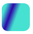
And the result of above will be:
Thanks to Mike's comment above: There is a ShimmerDrawable class where you can build a shimmer view as a drawbale which can be used in Glide:
private val shimmer = Shimmer.AlphaHighlightBuilder()// The attributes for a ShimmerDrawable is set by this builder
    .setDuration(1800) // how long the shimmering animation takes to do one full sweep
    .setBaseAlpha(0.7f) //the alpha of the underlying children
    .setHighlightAlpha(0.6f) // the shimmer alpha amount
    .setDirection(Shimmer.Direction.LEFT_TO_RIGHT)
    .setAutoStart(true)
    .build()

// This is the placeholder for the imageView
    val shimmerDrawable = ShimmerDrawable().apply {
        setShimmer(shimmer)
    }


Glide.with(image.context).load(url)
        .placeholder(shimmerDrawable)
        .error(context.getDrawable(R.drawable.placeholder))
        .into(image)