How to test a website for Retina on Windows without an actual Retina display?
about:config hack on Firefox
You actually can using Firefox:
- Go to "about:config"
- Find "layout.css.devPixelsPerPx
- Change it to your desired ratio (1 for normal, 2 for retina, etc. -1 seems to be Default.)
Screenshot: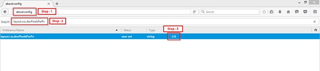
(source: staticflickr.com)
Refresh your page - boom, your media query has now kicked in! Hats off to Firefox for being awesome for web developing! Heads up, not only will the website now be boosted to twice the size, the Firefox UI will also be doubled. This doubling or zooming is necessary, as that's the only way you'll be able to examine all the pixels on a standard pixel ratio screen.
This works fine on Windows 7 with Firefox 21.0, and also on Mac OS X with Firefox 27.0.1.
If you're not using media queries and other more advanced logic (i.e. you're feeding everyone the HiDPI images), you can just zoom in with your browser to 200%. The Chrome emulation is a helpful tool as well as it kicks in media queries, but because it prevents zooming, you can't examine image quality.
Zooming on Firefox & Edge
Currently on Firefox and Edge, if you zoom it triggers dppx-based media queries. So this easier approach may be sufficient, but be aware that the functionality is reported as a "won't fix" bug for Firefox, so this could change.
In Google Chrome version "33.0.1720.0 Canary", you can now emulate devices like iPhone5 and others with a great set of parameters like "Device pixel ratio", "android font metrics" and "Viewport emulation".
There's no need for that Firefox hack anymore - hard to work with, anyway.
Thanks Google dev team! !:)