How to style the standard react-native android picker?
It can be styled via native android. See this and this.
Add the following code to /res/values/styles.xml
<style name="AppTheme" parent="Theme.AppCompat.Light.NoActionBar">
  <item name="android:spinnerItemStyle">@style/SpinnerItem</item>
  <item name="android:spinnerDropDownItemStyle">@style/SpinnerDropDownItem</item>
</style>

<style name="SpinnerItem" parent="Theme.AppCompat.Light.NoActionBar">
  <item name="android:fontFamily">sans-serif-light</item>
  <item name="android:textSize">18dp</item>
</style>

<style name="SpinnerDropDownItem" parent="Theme.AppCompat.Light.NoActionBar">
    <item name="android:textColor">#ffffff</item>
    <item name="android:textSize">18dp</item>
    <item name="android:fontFamily">sans-serif-light</item>
    <item name="android:gravity">center</item>
    <item name="android:background">@drawable/mydivider</item>
</style>
Create a file at res/drawable/mydivider.xml and add the following code
<shape xmlns:android="http://schemas.android.com/apk/res/android"
    android:shape="rectangle">
    <solid android:color="#29A1C9" />
    <corners android:radius="0.5dp" />
    <stroke
        android:color="#FFFFFF"
        android:width="0.1dp" />
</shape>
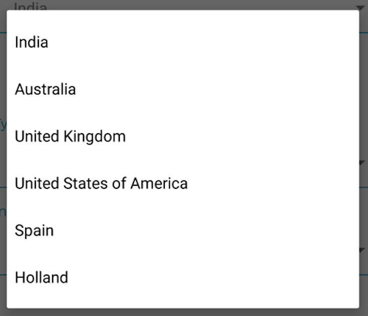
Before styling:
After styling: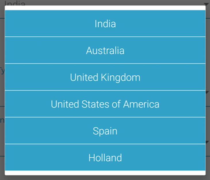
If you take a look at the style prop, it's the style for the Picker, not the Picker items.
You can also see from the docs that the Picker has itemStyle prop but it's iOS only. Styling the Android Picker items can be done via native Android only.
The question might be old but in case, you can use this to style the color:
<Item label="blue" color="blue" value="blue" />
For those who couldnt center texts in picker modal in @Abhishek Nalin answer use android:textAlignment="center"