How to style an HTML5 Progress Element as Circle/Pie with pure CSS
Well, that's an interesting challenge.
The element has quite some default styles applied to it, by the browser and even the OS.
<progress max="100" value="85"></progress>So first, we should get rid of the appearance property setting it to none
progress {
   -webkit-appearance: none;
   -moz-appearance:    none;
   appearance:         none;
}
<progress max="100" value="85"></progress>Then, additional styles are created by the browser stacking pseudo-elements. For instance, if you're looking at this answer in any webkit browser, the above snippet will still show a flat box with a green fill representing the progress.
Those pseudo-elements can be addressed in CSS too. Each browser has it's specific pseudo elements, which further complicates the issue.
Webkit stacks 3 pseudo elements, in the following hierarchy
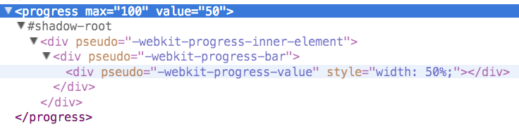
while Gecko and Trident use a single pseudo-element for the progress fill bars, ::-moz-progress-bar and ::-ms-fill, respectively.
progress {
/*gets rid of default appearance*/
   -webkit-appearance: none;
   -moz-appearance:    none;
   appearance:         none;
/*styles as any good ol' div would */
  border: 1px solid black;
  display:block;
  width:100px; height:100px;
  background:chartreuse;
}

/* gets rid of default pseudo-elements */
::-webkit-progress-inner-element {display:none}
/*for some reason, Firefox won't let the display or the content of this pseudo-element
set to none, so height:0 should do the trick. Maybe visibility:hidden too.*/
::-moz-progress-bar{height: 0;}
::-ms-fill {display:none; }
<progress max="100" value="85"></progress>That should leave us with the progress element styled as a good ol' div, which we can use for any of the circle progress bar methods linked above, while being awesome at semantics. We might even use the default additional pseudo elements and style them as needed instead of creating nested divs and such mumbo jumbo.
This is, of course highly experimental and non-standard, so shouldn't be used for production. The support is somewhat decent though, with all major players getting some form of the appearance property, and the three major engines supporting the styling of the pseudo elements... so maybe I'll take back my previous statement and change it for a "just got to be extra careful"
Trying to do this in pure CSS is quite hard, so I don't think than this is the correct technique to do it.
Anyway, just as a technical exercise, let's try it. (Tested only in Chrome !)
First of all the basis. We are going to divide the circle in 4 quadrants, and for each one we will need a different style. Here we have the styles, showing in color (green, red, blue, yellow) the useful range of the progress value element. The gray area is the rest of the element, unused.
.test {
  width: 100px;
  height: 100px;
  margin: 20px 10px 0px 20px;
  border-radius: 50%;
  background-image: radial-gradient(lightblue 62%, blue 40%);
  position: relative;
  display: inline-block;
}

.test div {
	height: 30%;
	transform-origin: left top;
    position: absolute;
    opacity: 0.5;
	ackground-color: green;
}

.inner1 {
	width: 25%;
	left: 50%;
    top: -20%;
	background-color: green;
	transform: rotate(45deg) scaleX(3.9598);
}

.inner2 {
	width: 50%;
	left: 190%;
    top: -20%;
	background-image: linear-gradient(to right,gray 50%, red 50%);
	transform: rotate(135deg) scaleX(3.9598);
}

.inner3 {
	width: 75%;
	left: 190%;
    top: 260%;
	background-image: linear-gradient(to right,gray 66%, blue 66%);
	transform: rotate(225deg) scaleX(3.9598);
}

.inner4 {
	width: 100%;
	left: -230%;
    top: 260%;
	background-image: linear-gradient(to right,gray 75%, yellow 66%);
	transform: rotate(315deg) scaleX(3.9598);
}
<div class="test">
<div class="inner1"></div>
</div>
<div class="test">
<div class="inner2"></div>
</div>
<div class="test">
<div class="inner3"></div>
</div>
<div class="test">
<div class="inner4"></div>
</div>Now, let's show a trick for creating the radial segments. This can be acomplished setting an element normal (at a right angle) to the user, and applying some perspective:
div {
	width: 300px;
	height: 300px;
	position: relative;
}

.container {
	perspective: 400px;
	margin: 40px 200px;
	border: solid 1px black;
}

.top {
    position: absolute;
    left: 0px;
    top: -100%;
    background-image: repeating-linear-gradient(to right, tomato 0px, white 20px);
    transform: rotateX(90deg);
    transform-origin: center bottom;
}

.right {
    position: absolute;
    left: 100%;
    top: 0px;
    background-image: repeating-linear-gradient( tomato 0px, white 20px);
    transform: rotateY(90deg);
    transform-origin: left center;
}

.bottom {
    position: absolute;
    left: 0px;
    bottom: 0px;
    background-image: repeating-linear-gradient(to right, tomato 0px, white 20px);
    transform: rotateX(90deg);
    transform-origin: center bottom;
}

.left {
    position: absolute;
    right: 100%;
    top: 0px;
    background-image: repeating-linear-gradient( tomato 0px, white 20px);
    transform: rotateY(-90deg);
    transform-origin: right center;
}
<div class="container">
<div class="top"></div>
<div class="right"></div>
<div class="bottom"></div>
<div class="left"></div>
</div>And now, just some boring selectors (it's difficult to target values in the range 20-29 and not targetting the value 2 at the same time).
A little bit of JS, but only to control the progress value. You can use both the input and the slider to change it.
function change () {
    var input = document.getElementById("input");
    var progress = document.getElementById("test");
    progress.value = input.value;
}

function changeNumber () {
    var input = document.getElementById("number");
    var progress = document.getElementById("test");
    progress.value = input.value;
}
.container {
width: 500px;
height: 500px;
overflow: hidden;
margin: 10px;
}
.test {
width: 200px;
height: 200px;
margin: 10px 10px;
border-radius: 50%;
background-image: radial-gradient(lightblue 62%, transparent 40%);
box-shadow: 0px 0px 0px 500px lightblue, inset 0px 0px 0px 2px lightblue;
}
.test::-webkit-progress-bar {
background-color: transparent;
position: relative;
border-radius: 50%;
perspective: 100px;
z-index: -1;
background-repeat: no-repeat;
}
.test[value^="2"]::-webkit-progress-bar,
.test[value^="3"]::-webkit-progress-bar
{
background-image: linear-gradient(red, red);
background-size: 50% 50%;
background-position: right top;
}
.test[value^="4"]::-webkit-progress-bar,
.test[value^="5"]::-webkit-progress-bar
{
background-image: linear-gradient(purple, purple);
background-size: 50% 100%;
background-position: right top;
}
.test[value^="6"]::-webkit-progress-bar,
.test[value^="7"]::-webkit-progress-bar,
.test[value="80"]::-webkit-progress-bar
{
background-image: linear-gradient(blue, blue), linear-gradient(blue, blue);
background-size: 50% 100%, 50% 50%;
background-position: right top, left bottom;
}
.test::-webkit-progress-bar,
.test[value="2"]::-webkit-progress-bar,
.test[value="3"]::-webkit-progress-bar,
.test[value="4"]::-webkit-progress-bar,
.test[value="5"]::-webkit-progress-bar,
.test[value="6"]::-webkit-progress-bar,
.test[value="7"]::-webkit-progress-bar,
.test[value="8"]::-webkit-progress-bar {
background-image: none;
}
.test::-webkit-progress-value {
background-color: green;
height: 30%;
transform-origin: left top;
z-index: -1;
position: absolute;
}
.test[value^="2"]::-webkit-progress-value,
.test[value^="3"]::-webkit-progress-value {
background-color: red;
top: -20%;
left: 190%;
transform: rotate(135deg) rotateX(-90deg) scaleX(3.9598);
}
.test[value^="4"]::-webkit-progress-value,
.test[value^="5"]::-webkit-progress-value {
background-color: purple;
left: 190%;
top: 260%;
transform: rotate(225deg) rotateX(-90deg) scaleX(3.9598);
}
.test[value^="6"]::-webkit-progress-value,
.test[value^="7"]::-webkit-progress-value,
.test[value="80"]::-webkit-progress-value {
background-color: blue;
left: -230%;
top: 260%;
transform: rotate(315deg) rotateX(-90deg) scaleX(3.9598);
}
.test::-webkit-progress-value,
.test[value="2"]::-webkit-progress-value,
.test[value="3"]::-webkit-progress-value,
.test[value="4"]::-webkit-progress-value,
.test[value="5"]::-webkit-progress-value,
.test[value="6"]::-webkit-progress-value,
.test[value="7"]::-webkit-progress-value,
.test[value="8"]::-webkit-progress-value
{
background-color: green;
left: 50%;
top: -20%;
transform: rotate(45deg) rotateX(-90deg) scaleX(3.9598);
}<input id="input" type="range" value="0" min="0" max="80" onchange="change()" oninput="change()"/>
<input id="number" type="number" value="0" min="0" max="80" step="1" oninput="changeNumber()"/>
<div class="container">
<progress class="test" id="test" max="80" value="0"></progress>
</div>There is a difficulty in the overflow: hidden; and a bug in Chrome. It isn't expected for it to work on the same element where perspective is applied, but it should work applied to the progress itself. It just works half of the time ...
Also, another idea, the style is much more simpler, and I could get it to extend to the full range, but anyway it's a starting point:
function change () {
    var input = document.getElementById("input");
    var progress = document.getElementById("test");
    progress.value = input.value;
}

function changeNumber () {
    var input = document.getElementById("number");
    var progress = document.getElementById("test");
    progress.value = input.value;
}
.test {
width: 400px;
height: 200px;
margin: 10px 10px;
border-radius: 9999px 9999px 0px 0px;
border: solid 1px red;
ackground-image: radial-gradient(lightblue 62%, transparent 40%);
ox-shadow: 0px 0px 0px 500px lightblue;
overflow: hidden;
}
.test::-webkit-progress-bar {
background-color: transparent;
position: relative;
border-radius: 50%;
perspective: 100px;
perspective-origin: center 300px;
z-index: -1;
background-repeat: no-repeat;
}
.test::-webkit-progress-value {
height: 300%;
transform-origin: center bottom;
bottom: -20%;
z-index: -1;
position: absolute;
background-image: linear-gradient(270deg, red 2px, tomato 30px);
transform: rotateX(-90deg) scaleX(1);
}<input id="input" type="range" value="0" min="0" max="80" onchange="change()" oninput="change()">
<input id="number" type="number" value="0" min="0" max="80" step="1" oninput="changeNumber()">
<progress class="test" id="test" max="80" value="20"></progress>Run my code and see the result
.loader {
 position: relative;
 height: 100px;
 width: 100px;
 display: flex;
 align-items: center;
 justify-content: center;
 color: red;
 margin:30px 30px;
 float:left;
}
.loader:before {
 content: "";
 background: white;
 position:absolute;
 z-index:100;
 width:98px;
 height:98px;
 border-radius:50%;
 margin:auto auto;
}
progress::-moz-progress-bar { background: transparent; }
progress::-webkit-progress-bar {background: transparent;}
progress::-moz-progress-value { background: red; }
progress::-webkit-progress-value { background: red; }
.circle {
 border-radius: 100%;
 overflow: hidden;
 padding:0;
}
.spin {
 animation: spin 2s linear infinite;
}
@keyframes spin {
  to {
    transform: rotate(360deg);
  }
}
html {
 height: 100%;
 display: flex;
}
body {
 margin: auto;
}
<progress max="100" value="95" class="spin circle loader"></progress>
<progress max="100" value="50" class="spin circle loader"></progress>
<progress max="100" value="10" class="spin circle loader"></progress>
Thanks to @G-Cyr, I used some part of one of his answers (here) and mixed it with my solution to make this answer faster.