How to specify line breaks in a multi-line flexbox layout?
From my perspective it is more semantic to use <hr> elements as line breaks between flex items.
.container {
  display: flex;
  flex-flow: wrap;
}

.container hr {
  width: 100%;
}
<div class="container">
<div>1</div>
<div>2</div>
<hr>
<div>3</div>
<div>2</div>
...
</div>Tested in Chrome 66, Firefox 60 and Safari 11.
You want a semantic linebreak?
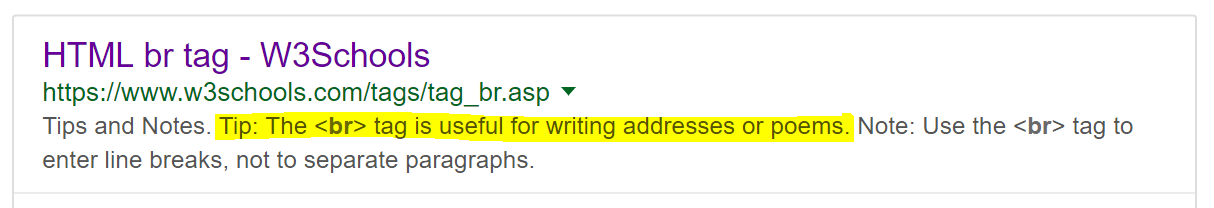
Then consider using <br>. W3Schools may suggest you that BR is just for writing poems (mine is coming soon) but you can change the style so it behaves as a 100% width block element that will push your content to the next line. If 'br' suggests a break then it seems more appropriate to me than using hr or a 100% div and makes the html more readable.
Insert the <br> where you need linebreaks and style it like this.
 // Use `>` to avoid styling `<br>` inside your boxes
 .container > br
 {
    width: 100%;
    content: '';
 }
You can disable <br> with media queries, by setting display: to block or none as appropriate (I've included an example of this but left it commented out).
You can use order: to set the order if needed too.
And you can put as many as you want, with different classes or names :-)
.container {
  background: tomato;
  display: flex;
  flex-flow: row wrap;
  justify-content: space-between;
}
.item {
  width: 100px;
  background: gold;
  height: 100px;
  border: 1px solid black;
  font-size: 30px;
  line-height: 100px;
  text-align: center;
  margin: 10px
}

.container > br
{
  width: 100%;
  content: '';
}

// .linebreak1
// {
//    display: none;
// }

// @media (min-width: 768px)
// {
//    .linebreak1
//    {
//       display: block;
//    }
// }
<div class="container">
<div class="item">1</div>
<div class="item">2</div>
<br class="linebreak1"/>
<div class="item">3</div>
<div class="item">4</div>
<div class="item">5</div>
<div class="item">6</div>
<div class="item">7</div>
<div class="item">8</div>
<div class="item">9</div>
<div class="item">10</div>
</div>No need to limit yourself to what W3Schools says:
The simplest and most reliable solution is inserting flex items at the right places. If they are wide enough (width: 100%), they will force a line break.
.container {
  background: tomato;
  display: flex;
  flex-flow: row wrap;
  align-content: space-between;
  justify-content: space-between;
}
.item {
  width: 100px;
  background: gold;
  height: 100px;
  border: 1px solid black;
  font-size: 30px;
  line-height: 100px;
  text-align: center;
  margin: 10px
}
.item:nth-child(4n - 1) {
  background: silver;
}
.line-break {
  width: 100%;
}
<div class="container">
<div class="item">1</div>
<div class="item">2</div>
<div class="item">3</div>
<div class="line-break"></div>
<div class="item">4</div>
<div class="item">5</div>
<div class="item">6</div>
<div class="line-break"></div>
<div class="item">7</div>
<div class="item">8</div>
<div class="item">9</div>
<div class="line-break"></div>
<div class="item">10</div>
</div>But that's ugly and not semantic. Instead, we could generate pseudo-elements inside the flex container, and use order to move them to the right places.
.container {
  background: tomato;
  display: flex;
  flex-flow: row wrap;
  align-content: space-between;
  justify-content: space-between;
}
.item {
  width: 100px;
  background: gold;
  height: 100px;
  border: 1px solid black;
  font-size: 30px;
  line-height: 100px;
  text-align: center;
  margin: 10px
}
.item:nth-child(3n) {
  background: silver;
}
.container::before, .container::after {
  content: '';
  width: 100%;
  order: 1;
}
.item:nth-child(n + 4) {
  order: 1;
}
.item:nth-child(n + 7) {
  order: 2;
}
<div class="container">
<div class="item">1</div>
<div class="item">2</div>
<div class="item">3</div>
<div class="item">4</div>
<div class="item">5</div>
<div class="item">6</div>
<div class="item">7</div>
<div class="item">8</div>
<div class="item">9</div>
</div>But there is a limitation: the flex container can only have a ::before and a ::after pseudo-element. That means you can only force 2 line breaks.
To solve that, you can generate the pseudo-elements inside the flex items instead of in the flex container. This way you won't be limited to 2. But those pseudo-elements won't be flex items, so they won't be able to force line breaks.
But luckily, CSS Display L3 has introduced display: contents (currently only supported by Firefox 37):
The element itself does not generate any boxes, but its children and pseudo-elements still generate boxes as normal. For the purposes of box generation and layout, the element must be treated as if it had been replaced with its children and pseudo-elements in the document tree.
So you can apply display: contents to the children of the flex container, and wrap the contents of each one inside an additional wrapper. Then, the flex items will be those additional wrappers and the pseudo-elements of the children.
.container {
  background: tomato;
  display: flex;
  flex-flow: row wrap;
  align-content: space-between;
  justify-content: space-between;
}
.item {
  display: contents;
}
.item > div {
  width: 100px;
  background: gold;
  height: 100px;
  border: 1px solid black;
  font-size: 30px;
  line-height: 100px;
  text-align: center;
  margin: 10px;
}
.item:nth-child(3n) > div {
  background: silver;
}
.item:nth-child(3n)::after {
  content: '';
  width: 100%;
}
<div class="container">
<div class="item"><div>1</div></div>
<div class="item"><div>2</div></div>
<div class="item"><div>3</div></div>
<div class="item"><div>4</div></div>
<div class="item"><div>5</div></div>
<div class="item"><div>6</div></div>
<div class="item"><div>7</div></div>
<div class="item"><div>8</div></div>
<div class="item"><div>9</div></div>
<div class="item"><div>10</div></div>
</div>Alternatively, according to an old version of the spec, Flexbox allowed forced breaks by using break-before, break-after or their old CSS 2.1 aliases:
.item:nth-child(3n) {
  page-break-after: always; /* CSS 2.1 syntax */
  break-after: always; /* CSS 3 syntax */
}
But these forced line breaks only work on Firefox, and I don't think they are supposed to work according to the current spec. The new proposed way (not implemented anywhere) is with wrap-before or wrap-after:
.item:nth-child(3n) {
  wrap-after: flex; /* New proposed syntax */
}
.container {
  background: tomato;
  display: flex;
  flex-flow: row wrap;
  align-content: space-between;
  justify-content: space-between;
}
.item {
  width: 100px;
  background: gold;
  height: 100px;
  border: 1px solid black;
  font-size: 30px;
  line-height: 100px;
  text-align: center;
  margin: 10px
}
.item:nth-child(3n) {
  page-break-after: always;
  break-after: always;
  wrap-after: flex;
  background: silver;
}
<div class="container">
<div class="item">1</div>
<div class="item">2</div>
<div class="item">3</div>
<div class="item">4</div>
<div class="item">5</div>
<div class="item">6</div>
<div class="item">7</div>
<div class="item">8</div>
<div class="item">9</div>
<div class="item">10</div>
</div>@Oriol has an excellent answer, sadly as of October 2017, neither display:contents, neither page-break-after is widely supported, better said it's about Firefox which supports this but not the other players, I have come up with the following "hack" which I consider better than hard coding in a break after every 3rd element, because that will make it very difficult to make the page mobile friendly.
As said it's a hack and the drawback is that you need to add quite a lot of extra elements for nothing, but it does the trick and works cross browser even on the dated IE11.
The "hack" is to simply add an additional element after each div, which is set to display:none and then used the css nth-child to decide which one of this should be actually made visible forcing a line brake like this:
.container {
  background: tomato;
  display: flex;
  flex-flow: row wrap;
  justify-content: space-between;
}
.item {
  width: 100px;
  background: gold;
  height: 100px;
  border: 1px solid black;
  font-size: 30px;
  line-height: 100px;
  text-align: center;
  margin: 10px
}
.item:nth-child(3n-1) {
  background: silver;
}
.breaker {
  display: none;
}
.breaker:nth-child(3n) {
  display: block;
  width: 100%;
  height: 0;
}
<div class="container">
<div class="item">1</div>
<p class="breaker"></p>
<div class="item">2</div>
<p class="breaker"></p>
<div class="item">3</div>
<p class="breaker"></p>
<div class="item">4</div>
<p class="breaker"></p>
<div class="item">5</div>
<p class="breaker"></p>
<div class="item">6</div>
<p class="breaker"></p>
<div class="item">7</div>
<p class="breaker"></p>
<div class="item">8</div>
<p class="breaker"></p>
<div class="item">9</div>
<p class="breaker"></p>
<div class="item">10</div>
<p class="breaker"></p>
</div>