How to remove Space at the bottom of TextField in flutter?
In my case the TextField would still not collapse even after using InputDecoration.collapsed().
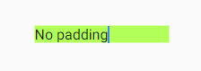
My version doesn't have any padding at all and takes the minimum size:
TextField(
  decoration: InputDecoration(
    contentPadding: EdgeInsets.all(0.0),
    isDense: true,
    border: InputBorder.none,
  ),
  minLines: 1,
  maxLines: 1,
);
Live preview: https://dartpad.dev/3f9149a1c8f5eec352c796e7585e233c
isDense will do the trick. uses less vertical space
TextField(
  decoration: InputDecoration(
    isDense: true,
  ),
);
You can use a collapsed InputDecoration for the decoration: property of the TextField.
  Future<Null> _selectNoteType(BuildContext context) async {

    InputDecoration decoration = const InputDecoration.collapsed()
      ..applyDefaults(Theme.of(context).inputDecorationTheme);

    switch (await showDialog<Null>(
        context: context,
        builder: (BuildContext context) {
          return new SimpleDialog(
            title: const Text('Select Note Type'),
            children: <Widget>[
              Padding(
                padding: const EdgeInsets.only(left: 8.0, right: 8.0),
                child: new TextField(
                  decoration: decoration,
                  keyboardType: TextInputType.text,
                  maxLines: 1,
                  style: new TextStyle(color: Colors.black, fontSize: 20.0),
                ),
              ),
              new SimpleDialogOption(
                  onPressed: () {}, child: const Text('Text')),
              new SimpleDialogOption(
                  onPressed: () {}, child: const Text('Checklist')),
            ],
          );
        })) {
    }
  }
But you must know the consequences of using a collapsed InputDecoration. From the documentation:
  /// Whether the decoration is the same size as the input field.
  ///
  /// A collapsed decoration cannot have [labelText], [errorText], an [icon].
  ///
  /// To create a collapsed input decoration, use [InputDecoration..collapsed].
  final bool isCollapsed;
And for the InputDecoration.collapse() constructor:
  /// Defines an [InputDecorator] that is the same size as the input field.
  ///
  /// This type of input decoration does not include a border by default.
  ///
  /// Sets the [isCollapsed] property to true.
  const InputDecoration.collapsed({