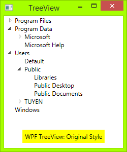
How to make WPF TreeView style as WinForms TreeView?
Let me answer my own question.
Code
All you need to do is a XAML file and a code behind:
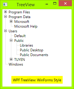
First you need draw Toggle Button: From Triangle button to Plus-Minus button: draw a rectangle with dark border, then draw two lines, one vertical line and one horizontal line. When TreeViewItem is expanded, the vertical line will hide:
<!-- Toggle Button -->
<Style x:Key="ExpandCollapseToggleStyle" TargetType="ToggleButton">
    <Setter Property="Focusable" Value="False"/>
    <Setter Property="Template">
        <Setter.Value>
            <ControlTemplate TargetType="ToggleButton">
                <Grid Width="15" Height="13" SnapsToDevicePixels="True">
<!-- Rectangle 9x9 pixels -->
                    <Rectangle Width="9" Height="9" Stroke="#919191" SnapsToDevicePixels="true">
                        <Rectangle.Fill>
                            <LinearGradientBrush EndPoint="0.5,2" StartPoint="0.5,0">
                                <GradientStop Color="White" Offset="0"/>
                                <GradientStop Color="Silver" Offset="0.5"/>
                                <GradientStop Color="LightGray" Offset="1"/>
                            </LinearGradientBrush>
                        </Rectangle.Fill>
                    </Rectangle>
<!-- Vertical line inside rectangle -->
                    <Rectangle x:Name="ExpandPath" Width="1" Height="5" Stroke="Black" SnapsToDevicePixels="true"/>
<!-- Horizontal line inside rectangle -->
                    <Rectangle Width="5" Height="1" Stroke="Black" SnapsToDevicePixels="true"/>
                </Grid>
                <ControlTemplate.Triggers>
                    <Trigger Property="IsChecked" Value="True">
                        <Setter Property="Visibility"  TargetName="ExpandPath" Value="Collapsed"/>
                    </Trigger>
                </ControlTemplate.Triggers>
            </ControlTemplate>
        </Setter.Value>
    </Setter>
</Style>
In above code, you can see a trigger, it will make the vertical line inside toggle button hide if item is expand, or show if its children collapsed.
Then, you need draw vertical and horizontal connecting lines between nodes: You need redesign TreeViewItem Control. Add these connecting lines:
<!-- Horizontal line -->
<Rectangle x:Name="HorLn" Margin="9,1,0,0" Height="1" Stroke="#DCDCDC" SnapsToDevicePixels="True"/>
<!-- Vertical line -->
<Rectangle x:Name="VerLn" Width="1" Stroke="#DCDCDC" Margin="0,0,1,0" Grid.RowSpan="2" SnapsToDevicePixels="true" Fill="White"/>
to your TreeViewItem template like this:
<!-- TreeViewItem -->
<Style x:Key="{x:Type TreeViewItem}" TargetType="{x:Type TreeViewItem}">
    <Setter Property="Template">
        <Setter.Value>
            <ControlTemplate TargetType="{x:Type TreeViewItem}">
                <Grid>
                    <Grid.ColumnDefinitions>
                        <ColumnDefinition MinWidth="19" Width="Auto"/>
                        <ColumnDefinition Width="Auto"/>
                        <ColumnDefinition Width="*"/>
                    </Grid.ColumnDefinitions>
                    <Grid.RowDefinitions>
                        <RowDefinition Height="Auto"/>
                        <RowDefinition/>
                    </Grid.RowDefinitions>

                    <!-- Connecting Lines -->
                    <!-- Horizontal line -->
                    <Rectangle x:Name="HorLn" Margin="9,1,0,0" Height="1" Stroke="#DCDCDC" SnapsToDevicePixels="True"/>
                    <!-- Vertical line -->
                    <Rectangle x:Name="VerLn" Width="1" Stroke="#DCDCDC" Margin="0,0,1,0" Grid.RowSpan="2" SnapsToDevicePixels="true" Fill="White"/>
                    <!-- Insert Toggle Button -->
                    <ToggleButton Margin="-1,0,0,0" x:Name="Expander" Style="{StaticResource ExpandCollapseToggleStyle}" IsChecked="{Binding Path=IsExpanded, RelativeSource={RelativeSource TemplatedParent}}" ClickMode="Press"/>
                    <Border Name="Bd" Grid.Column="1" Background="{TemplateBinding Background}" BorderBrush="{TemplateBinding BorderBrush}" BorderThickness="{TemplateBinding BorderThickness}" Padding="{TemplateBinding Padding}" SnapsToDevicePixels="True">
                        <ContentPresenter x:Name="PART_Header" ContentSource="Header" HorizontalAlignment="{TemplateBinding HorizontalContentAlignment}" MinWidth="20"/>
                    </Border>
                    <ItemsPresenter x:Name="ItemsHost" Grid.Row="1" Grid.Column="1" Grid.ColumnSpan="2"/>
                </Grid>
            </ControlTemplate>
        </Setter.Value>
    </Setter>
</Style>
Then you need put the class TreeViewLineConverter to your namespace. This Class will changes the connecting lines if the item is the last in the list:
using System;
using System.Windows;
using System.Windows.Controls;
using System.Windows.Data;

namespace TreeViewEx
{
    public partial class MainWindow : Window
    {
        public MainWindow()
        {
            InitializeComponent();
        }
    }

    class TreeViewLineConverter : IValueConverter
    {
        public object Convert(object value, Type targetType, object parameter, System.Globalization.CultureInfo culture)
        {
            TreeViewItem item = (TreeViewItem)value;
            ItemsControl ic = ItemsControl.ItemsControlFromItemContainer(item);
            return ic.ItemContainerGenerator.IndexFromContainer(item) == ic.Items.Count - 1;
        }

        public object ConvertBack(object value, Type targetType, object parameter, System.Globalization.CultureInfo culture)
        {
            return false;
        }
    }

}
Insert your namespace to your XAML, ie:
<Window x:Class="TreeViewEx.MainWindow"
        xmlns="http://schemas.microsoft.com/winfx/2006/xaml/presentation"
        xmlns:x="http://schemas.microsoft.com/winfx/2006/xaml"
        xmlns:local="clr-namespace:TreeViewEx"/>
Add this line to Window.Resources:
<local:TreeViewLineConverter x:Key="LineConverter"/>
Add trigger to TreeViewItem template, this trigger changes the connecting lines if the item is the last in the list:
<!-- This trigger changes the connecting lines if the item is the last in the list -->
<DataTrigger Binding="{Binding RelativeSource={RelativeSource Self}, Converter={StaticResource LineConverter}}" Value="true">
    <Setter TargetName="VerLn" Property="Height" Value="9"/>
    <Setter TargetName="VerLn" Property="VerticalAlignment" Value="Top"/>
</DataTrigger>
The TreeView will have WinForms style now. You can add more trigger to control behavie of TreeView if you want. The full trigger can found on attached file.
ToDo
In WinForms TreeView, the connecting lines is a dotted lines. To make these lines dotted, change:
<!-- Connecting Lines -->
<Rectangle x:Name="HorLn" Margin="9,1,0,0" Height="1" Stroke="#DCDCDC" SnapsToDevicePixels="True"/>
<Rectangle x:Name="VerLn" Width="1" Stroke="#DCDCDC" Margin="0,0,1,0" Grid.RowSpan="2" SnapsToDevicePixels="true" Fill="White"/>
To:
<!-- Connecting Lines -->
<Rectangle x:Name="HorLn" Margin="9,1,0,0" Height="1" Stroke="Blue" StrokeDashCap="Square" StrokeDashArray="0,2" StrokeDashOffset="1" SnapsToDevicePixels="True"/>
<Rectangle x:Name="VerLn" Width="1"  Stroke="Blue" StrokeDashCap="Square" StrokeDashArray="0,2" Margin="0,0,1,0" Grid.RowSpan="2" SnapsToDevicePixels="true" Fill="White"/>
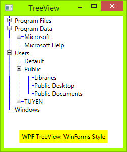
But it is not pretty, as you see. As I'm a newbie in WPF, I don't know to style these line perfectly.
Problem!
There is a problem with vertical line when you add a TreeViewItem into TreeView:
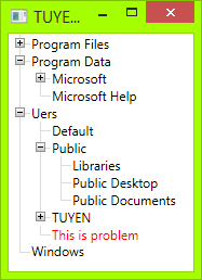
You may suggest me change Vertical Line size, but if you change the font size, too, it will not work.
Source code
You can download my source code here:
https://www.codeproject.com/Tips/673071/WPF-TreeView-with-WinForms-Style-Fomat
Reference
This is the code I refereced before I wrote my own: Social MSDN: Show TreeView nodes connected with dotted lines
Answer reworked a bit. Vertical line size is dynamic correlated with item height, and rectangles replaced with borders
<Style x:Key="ExpandCollapseToggleStyle" TargetType="ToggleButton">
    <Setter Property="Focusable" Value="False"/>
    <Setter Property="Template">
        <Setter.Value>
            <ControlTemplate TargetType="ToggleButton">
                <Grid Width="15" Height="13" SnapsToDevicePixels="True">
                    <Rectangle Width="9" Height="9" Stroke="#919191" SnapsToDevicePixels="true" Fill="White"/>
                    <Rectangle x:Name="ExpandPath" Width="1" Height="5" Stroke="Black" SnapsToDevicePixels="true"/>
                    <Rectangle Width="5" Height="1" Stroke="Black" SnapsToDevicePixels="true"/>
                </Grid>
                <ControlTemplate.Triggers>
                    <Trigger Property="IsChecked" Value="True">
                        <Setter Property="Visibility"  TargetName="ExpandPath" Value="Collapsed"/>
                    </Trigger>
                </ControlTemplate.Triggers>
            </ControlTemplate>
        </Setter.Value>
    </Setter>
</Style>

<Style x:Key="TreeViewStyle" TargetType="{x:Type TreeViewItem}">
    <Setter Property="Background" Value="Transparent"/>
    <Setter Property="Padding" Value="0,0,0,0"/>
    <Setter Property="Template">
        <Setter.Value>
            <ControlTemplate TargetType="{x:Type TreeViewItem}">
                <Grid Name="ItemRoot">
                    <Grid.ColumnDefinitions>
                        <ColumnDefinition Width="20"/>
                        <ColumnDefinition Width="Auto"/>
                    </Grid.ColumnDefinitions>
                    <Grid.RowDefinitions>
                        <RowDefinition/>
                        <RowDefinition/>
                    </Grid.RowDefinitions>

                    <Grid Name="Lines" Grid.Column="0" Grid.Row="0">
                       <Grid.RowDefinitions>
                           <RowDefinition/>
                           <RowDefinition/>
                       </Grid.RowDefinitions>
                       <Grid.ColumnDefinitions>
                           <ColumnDefinition/>
                           <ColumnDefinition/>
                       </Grid.ColumnDefinitions>

                        <Border Grid.Row="0" Grid.Column="1" BorderThickness="1 0 0 1" SnapsToDevicePixels="True" BorderBrush="{TemplateBinding BorderBrush}"/>
                        <Border Grid.Row="1" Grid.Column="1" BorderThickness="1 0 0 0" SnapsToDevicePixels="True" BorderBrush="{TemplateBinding BorderBrush}" Name="LineToNextItem"
                                Visibility="{Binding RelativeSource={RelativeSource Mode=FindAncestor, AncestorType={x:Type TreeViewItem}},
                                             Converter={StaticResource LineConverter}}"/>
                    </Grid>

                    <ToggleButton x:Name="Expander" Grid.Column="0" Grid.Row="0"
                                  Style="{StaticResource ExpandCollapseToggleStyle}"
                                  IsChecked="{Binding Path=IsExpanded, RelativeSource={RelativeSource TemplatedParent}}"
                                  ClickMode="Press"/>

                    <Border Name="Bd" Grid.Column="1" Grid.Row="0"
                            HorizontalAlignment="Left"
                            Background="{TemplateBinding Background}"
                            BorderBrush="{TemplateBinding BorderBrush}"
                            BorderThickness="{TemplateBinding BorderThickness}"
                            Padding="{TemplateBinding Padding}"
                            SnapsToDevicePixels="True">
                        <ContentPresenter x:Name="PART_Header" ContentSource="Header" HorizontalAlignment="{TemplateBinding HorizontalContentAlignment}" MinWidth="20"/>
                    </Border>

                    <Grid Grid.Column="0" Grid.Row="1">
                        <Grid.ColumnDefinitions>
                            <ColumnDefinition/>
                            <ColumnDefinition/>
                        </Grid.ColumnDefinitions>

                        <Border Grid.Column="1" BorderThickness="1 0 0 0" SnapsToDevicePixels="True" BorderBrush="{TemplateBinding BorderBrush}"
                                Visibility="{Binding ElementName=LineToNextItem, Path=Visibility}"/>
                    </Grid>

                    <ItemsPresenter x:Name="ItemsHost" Grid.Column="1" Grid.Row="1" />
                </Grid>

                <ControlTemplate.Triggers>
                    <Trigger Property="HasItems" Value="false">
                        <Setter TargetName="Expander" Property="Visibility" Value="Hidden"/>
                    </Trigger>
                    <Trigger Property="IsExpanded" Value="false">
                        <Setter TargetName="ItemsHost" Property="Visibility" Value="Collapsed"/>
                    </Trigger>
                    <Trigger Property="IsSelected" Value="true">
                        <Setter TargetName="Bd" Property="Background" Value="{DynamicResource {x:Static SystemColors.HighlightBrushKey}}"/>
                        <Setter Property="Foreground" Value="{DynamicResource {x:Static SystemColors.HighlightTextBrushKey}}"/>
                    </Trigger>
                </ControlTemplate.Triggers>
            </ControlTemplate>
        </Setter.Value>
    </Setter>
</Style>
Nice example. Problem in your solution with dotted lines is that you are using rectangle as a line with width or height set to 1. If you do that, than left and right borders are on the same pixel. This is fine if these lines are solid, but if they are dotted they don't have to have dots on the same places (ie. left border starts with dots at pixel 0 and right border at pixel 1) and this behaviour makes your lines not pretty.
Solution is to create dotted lines with something different than rectangles. You can use for example Border. I took solution from here.
Change connecting lines to:
<!-- Connecting Lines -->
<Border x:Name="HorLn" Margin="9,0,0,0" HorizontalAlignment="Stretch" Height="1" BorderThickness="0,0,0,1">
    <Border.BorderBrush>
        <LinearGradientBrush StartPoint="0,0" EndPoint="2,0" SpreadMethod="Repeat" MappingMode="Absolute">
            <GradientStop Color="Transparent" Offset="0" />
            <GradientStop Color="Transparent" Offset="0.499" />
            <GradientStop Color="#999" Offset="0.5" />
        </LinearGradientBrush>
    </Border.BorderBrush>
</Border>
<Border x:Name="VerLn" Margin="0,0,1,0" Grid.RowSpan="2" VerticalAlignment="Stretch" Width="1" BorderThickness="0,0,1,0">
    <Border.BorderBrush>
        <LinearGradientBrush StartPoint="0,0" EndPoint="0,2" SpreadMethod="Repeat" MappingMode="Absolute">
            <GradientStop Color="Transparent" Offset="0" />
            <GradientStop Color="Transparent" Offset="0.499" />
            <GradientStop Color="#999" Offset="0.5" />
        </LinearGradientBrush>
    </Border.BorderBrush>
</Border>