How to make rounded border for dropdownbutton in flutter?
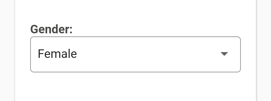
Column(
    crossAxisAlignment : CrossAxisAlignment.start,
    children: <Widget> [
        Text('Gender:'),
        InputDecorator(
            decoration: InputDecoration(
                border: OutlineInputBorder(borderRadius: const BorderRadius.all(Radius.circular(4.0)),
                contentPadding: EdgeInsets.all(10),
            ),
            child: DropdownButtonHideUnderline(
                child: DropdownButton<String>(
                    value: gender,
                    isDense: true,
                    isExpanded: true,
                    items: [
                        DropdownMenuItem(child: Text("Select Gender"), value: ""),
                        DropdownMenuItem(child: Text("Male"), value: "Male"),
                        DropdownMenuItem(child: Text("Female"), value: "Female"),
                    ],
                    onChanged: (newValue) {
                        setState(() {
                        });
                    },
                ),
            ),
        ),
    ]
),
You need to specify the side: property. By default it is BorderSide.none.
      decoration: ShapeDecoration(
        shape: RoundedRectangleBorder(
          side: BorderSide(width: 1.0, style: BorderStyle.solid),
          borderRadius: BorderRadius.all(Radius.circular(5.0)),
        ),
      ),
If what you want is this...
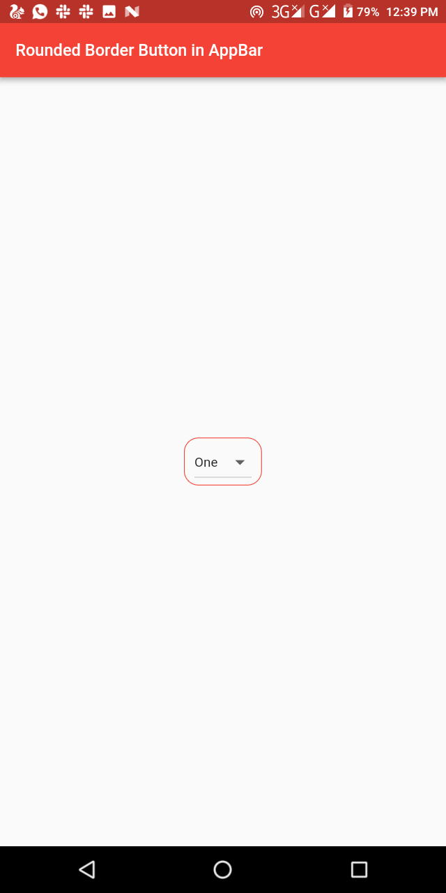
Then here you go
    import 'package:flutter/material.dart';

class RoundedBorderDropdown extends StatelessWidget {
  final List<String> _dropdownValues = [
    "One",
    "Two",
    "Three",
    "Four",
    "Five"
  ]; //The list of values we want on the dropdown

  @override
  Widget build(BuildContext context) {
    return Scaffold(
      appBar: AppBar(
        title: Text('Rounded Border Button in AppBar'),
      ),
      body: Center(
        child: Container(
          padding: EdgeInsets.symmetric(horizontal: 10.0),
          decoration: BoxDecoration(
            borderRadius: BorderRadius.circular(15.0),
            border: Border.all(
                color: Colors.red, style: BorderStyle.solid, width: 0.80),
          ),
          child: DropdownButton(
            items: _dropdownValues
                .map((value) => DropdownMenuItem(
                      child: Text(value),
                      value: value,
                    ))
                .toList(),
            onChanged: (String value) {},
            isExpanded: false,
            value: _dropdownValues.first,
          ),
        ),
      ),
    );
  }
}
That is courtesy inducesmile
Happy Coding...
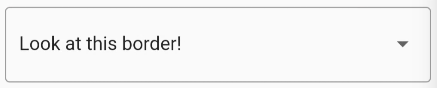
With the form field variant, you can use the OutlineInputBorder InputBorder, used normally for input text fields:
DropdownButtonFormField(
  ...
  decoration: const InputDecoration(
    border: OutlineInputBorder(),
  ),
),
The way the form field does this can be replicated and used with the regular DropdownButton:
InputDecorator(
  decoration: const InputDecoration(border: OutlineInputBorder()),
  child: DropdownButtonHideUnderline(
    child: DropdownButton(
      ...
    ),
  ),
),