How to make a curved edge hexagon by using CSS
I understand this is a fairly old question, but I thought I'd add an answer to show more about how it works.
So, first off, we need to create a single element on the page. I have gone for a size of height:300px; width:180px; and a border radius of 10px. Just because I like the roundness of the number (forgive the pun). Giving this element a position:relative; means that we can herein position everything absolutely in relative terms to this div.
We then need to create two pseudo elements, with the same height and width as the parent.
Because the pseudo elements are exactly that, pseudo elements, we need to add a content: to them. And since because we can put stuff within the parent, we don't really need these, so set them to "";
this leads us onto how to create the hexagon, rather than the rectangle we currently have. To do that, we're going to have to include a rotation in order to generate the other sides of the hexagon. With there being 6 sides, and the angles needing to add to 360, we can rotate one of the pseudo element by 60 degrees. The other we'll rotate by -60 degrees (or 300degrees, if you'd prefer).
This leaves us with our 'hexagon' in which we can add some nice styling and hover animations as need be:
.roundHex {
  position: relative;
  margin: 0 auto;
  background: rgba(0, 0, 0, 0.2);
  border-radius: 10px;
  height: 300px;
  width: 180px;
  transition: all 1s;
  line-height:300px;
  text-align:center;
  color:white;
  font-size:20px;
}
.roundHex:before,
.roundHex:after {
  content: "";
  position: absolute;
  top: 0;
  left: 0;
  background: inherit;
  border-radius: inherit;
  height: 100%;
  width: 100%;
  z-index:-1;
}
.roundHex:before {
  -webkit-transform: rotate(60deg);
  -moz-transform: rotate(60deg);
  transform: rotate(60deg);
  transition: all 1s 0.5s;
}
.roundHex:after {
  -webkit-transform: rotate(-60deg);
  -moz-transform: rotate(-60deg);
  transform: rotate(-60deg);
  transition: all 1s 1s;
}
.roundHex:hover {
  background: tomato;
}
<div class="roundHex">HOVER ME</div>Jsfiddle demo also available
I will consider the same trick I used in the previous answer Where I will build the hexagon using clip-path
.hex {
  width: 200px;
  display: inline-block;
  color:orange;
}

.hex::before {
  content: "";
  display: block;
  background:currentColor;
  padding-top: 90%;
  clip-path: polygon(25% 0%, 75% 0%, 100% 50%, 75% 100%, 25% 100%, 0% 50%);
}
<div class="hex"></div>Then I will apply an SVG filter:
.hex {
  width: 200px;
  display: inline-block;
  color:orange;
  filter: url('#goo');
}

.hex::before {
  content: "";
  display: block;
  background:currentColor;
  padding-top: 86.6%; /* 100%*cos(30) */
  clip-path: polygon(25% 0%, 75% 0%, 100% 50%, 75% 100%, 25% 100%, 0% 50%);
}
<div class="hex"></div>
<div class="hex" style="color:blue;width:150px;"></div>
<div class="hex" style="color:red;width:100px;"></div>
<svg style="visibility: hidden; position: absolute;" width="0" height="0" xmlns="http://www.w3.org/2000/svg" version="1.1">
<defs>
<filter id="goo"><feGaussianBlur in="SourceGraphic" stdDeviation="8" result="blur" />
<feColorMatrix in="blur" mode="matrix" values="1 0 0 0 0 0 1 0 0 0 0 0 1 0 0 0 0 0 19 -9" result="goo" />
<feComposite in="SourceGraphic" in2="goo" operator="atop"/>
</filter>
</defs>
</svg>
And in the opposite direction
.hex {
  width: 200px;
  display: inline-block;
  margin:0 5px;
  color:orange;
  filter: url('#goo');
}

.hex::before {
  content: "";
  display: block;
  background:currentColor;
  padding-top: 115%; /* 100%/cos(30)  */
  clip-path: polygon(0% 25%,0% 75%,50% 100%,100% 75%,100% 25%,50% 0%);
}
<div class="hex"></div>
<div class="hex" style="color:blue;width:150px;"></div>
<div class="hex" style="color:red;width:100px;"></div>
<svg style="visibility: hidden; position: absolute;" width="0" height="0" xmlns="http://www.w3.org/2000/svg" version="1.1">
<defs>
<filter id="goo"><feGaussianBlur in="SourceGraphic" stdDeviation="8" result="blur" />
<feColorMatrix in="blur" mode="matrix" values="1 0 0 0 0 0 1 0 0 0 0 0 1 0 0 0 0 0 19 -9" result="goo" />
<feComposite in="SourceGraphic" in2="goo" operator="atop"/>
</filter>
</defs>
</svg>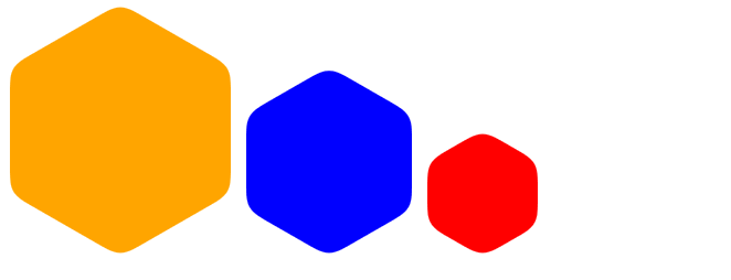
I think you are looking for this.
.hex {
  position: relative;
  margin: 1em auto;
  width: 10em;
  height: 17.32em;
  border-radius: 1em/.5em;
  background: orange;
  transition: opacity .5s;
}

.hex:before,
.hex:after {
  position: absolute;
  width: inherit;
  height: inherit;
  border-radius: inherit;
  background: inherit;
  content: '';
}

.hex:before {
  -webkit-transform: rotate(60deg);
  transform: rotate(60deg);
}

.hex:after {
  -webkit-transform: rotate(-60deg);
  transform: rotate(-60deg);
}
<div class="hex"></div>Try this way :(works in chrome and in ie 10)
<br><br><br>
<div id="hexagon-circle"></div>
<style>
 #hexagon-circle {
    position: relative;
    margin: 1em auto;
    width: 10em; height: 17.32em;
    border-radius: 1em/.5em;
    opacity: .25;
    background: orange;
    transition: opacity .5s;
    cursor: pointer;
 }
 #hexagon-circle:before, #hexagon-circle:after {
    position: absolute;
    width: inherit; height: inherit;
    border-radius: inherit;
    background: inherit;
    content: '';
  }
  #hexagon-circle:before {
   transform: rotate(60deg);
   -ms-transform:rotate(60deg); /* IE 9 */
   -webkit-transform:rotate(60deg); /* Opera, Chrome, and Safari */
  }
  #hexagon-circle:after {
    transform: rotate(-60deg);
    -ms-transform:rotate(-60deg); /* IE 9 */
    -webkit-transform:rotate(-60deg); /* Opera, Chrome, and Safari */
  }

  </style>