How to make a circle checkbox with Material UI?
Material's Checkbox supports custom icons. There are circular checked circle Material icons, and for the empty circle, you can cheat a bit and use the icon for Radio input (they are the same size, so it works perfectly):
import Checkbox from '@material-ui/core/Checkbox';
import CircleChecked from '@material-ui/icons/CheckCircleOutline';
import CircleCheckedFilled from '@material-ui/icons/CheckCircle';
import CircleUnchecked from '@material-ui/icons/RadioButtonUnchecked';

…

<Checkbox
  icon={<CircleUnchecked />}
  checkedIcon={<CircleChecked />}
  …
/>

// or with filled checked icon:

<Checkbox
  icon={<CircleUnchecked />}
  checkedIcon={<CircleCheckedFilled />}
  …
/>
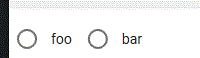
…and it looks like this (foo is CheckCircleOutline, bar is CheckCircle):