How to make 3-corner-rounded triangle in CSS
Use an image of some sort. That's what images are for. If you need it to scale, SVG is a good choice, otherwise, just use a png as a background, or an <img> element if it's part of content.
If you absolutely must have it in a CSS file, you could try data: urls (not supported in IE7 and below).
First we create the triangle using clip-path:
.triangle {
  display: inline-block;
  width: 150px;
  color:orange;
}

.triangle::before {
  content: "";
  display: block;
  padding-top: 86%;
  background: currentColor;
  clip-path: polygon(50% 0, 100% 100%, 0 100%);
}
<div class="triangle"></div>And then we apply and SVG filter inspired from this article
.triangle {
  display: inline-block;
  width: 150px;
  color:orange;
  filter: url('#goo');
}

.triangle::before {
  content: "";
  display: block;
  padding-top: 86%;
  background: currentColor;
  clip-path: polygon(50% 0, 100% 100%, 0 100%);
}
<div class="triangle"></div>
<div class="triangle" style="color:red;width:200px;"></div>
<div class="triangle" style="color:blue;width:250px;"></div>
<svg style="visibility: hidden; position: absolute;" width="0" height="0" xmlns="http://www.w3.org/2000/svg" version="1.1">
<defs>
<filter id="goo"><feGaussianBlur in="SourceGraphic" stdDeviation="8" result="blur" />
<feColorMatrix in="blur" mode="matrix" values="1 0 0 0 0 0 1 0 0 0 0 0 1 0 0 0 0 0 19 -9" result="goo" />
<feComposite in="SourceGraphic" in2="goo" operator="atop"/>
</filter>
</defs>
</svg>
To control the radius, we simply adjust the stdDeviation of the filter
Considering this, you can make it working with any kind of triangle and even a random shape:
.triangle {
  display: inline-block;
  width: 150px;
  color:orange;
  filter: url('#goo');
}

.triangle::before {
  content: "";
  display: block;
  padding-top: 86%;
  background: currentColor;
  clip-path: polygon(50% 0, 100% 100%, 0 100%);
}

.triangle.type2::before {
  padding-top: 70%;
  clip-path: polygon(0 0, 100% 100%, 0 100%);
}

.triangle.type3::before {
  padding-top: 100%;
  clip-path: polygon(50% 0, 80% 100%, 0 70%);
}

.triangle.hex::before {
  padding-top: 100%;
  clip-path: polygon(25% 0%, 75% 0%, 100% 50%, 75% 100%, 25% 100%, 0% 50%);
}
<div class="triangle"></div>
<div class="triangle type2" style="color:red;"></div>
<div class="triangle type3" style="color:blue;"></div>
<div class="triangle hex" style="color:purple;"></div>
<svg style="visibility: hidden; position: absolute;" width="0" height="0" xmlns="http://www.w3.org/2000/svg" version="1.1">
<defs>
<filter id="goo"><feGaussianBlur in="SourceGraphic" stdDeviation="8" result="blur" />
<feColorMatrix in="blur" mode="matrix" values="1 0 0 0 0 0 1 0 0 0 0 0 1 0 0 0 0 0 19 -9" result="goo" />
<feComposite in="SourceGraphic" in2="goo" operator="atop"/>
</filter>
</defs>
</svg>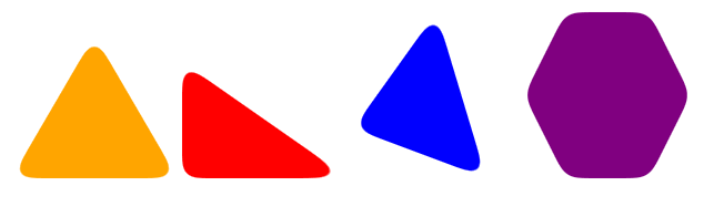
Worth to note that we can easily add complex background to the shapes:
.triangle {
  display: inline-block;
  width: 150px;
  filter: url('#goo');
}

.triangle::before {
  content: "";
  display: block;
  padding-top: 86%;
  background: var(--b,orange);
  clip-path: polygon(50% 0, 100% 100%, 0 100%);
}

.triangle.type2::before {
  padding-top: 70%;
  clip-path: polygon(0 0, 100% 100%, 0 100%);
}

.triangle.type3::before {
  padding-top: 100%;
  clip-path: polygon(50% 0, 80% 100%, 0 70%);
}

.triangle.hex::before {
  padding-top: 100%;
  clip-path: polygon(25% 0%, 75% 0%, 100% 50%, 75% 100%, 25% 100%, 0% 50%);
}
<div class="triangle"></div>
<div class="triangle type2" style="--b:linear-gradient(red,blue);"></div>
<div class="triangle type3" style="--b:conic-gradient(green,pink,green);"></div>
<div class="triangle hex" style="--b:url(https://picsum.photos/id/1067/200/200) center/cover;"></div>
<svg style="visibility: hidden; position: absolute;" width="0" height="0" xmlns="http://www.w3.org/2000/svg" version="1.1">
<defs>
<filter id="goo"><feGaussianBlur in="SourceGraphic" stdDeviation="8" result="blur" />
<feColorMatrix in="blur" mode="matrix" values="1 0 0 0 0 0 1 0 0 0 0 0 1 0 0 0 0 0 19 -9" result="goo" />
<feComposite in="SourceGraphic" in2="goo" operator="atop"/>
</filter>
</defs>
</svg>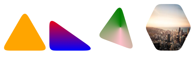
My best attempt: http://dabblet.com/gist/4592062
Pixel perfection at any size, uses simpler math than Ana's original solution, and is more intuitive in my opinion :)
.triangle {
	position: relative;
	background-color: orange;
	text-align: left;
}
.triangle:before,
.triangle:after {
	content: '';
	position: absolute;
	background-color: inherit;
}
.triangle,
.triangle:before,
.triangle:after {
	width:  10em;
	height: 10em;
	border-top-right-radius: 30%;
}

.triangle {
	transform: rotate(-60deg) skewX(-30deg) scale(1,.866);
}
.triangle:before {
	transform: rotate(-135deg) skewX(-45deg) scale(1.414,.707) translate(0,-50%);
}
.triangle:after {
	transform: rotate(135deg) skewY(-45deg) scale(.707,1.414) translate(50%);
}
<div class="triangle"></div>.triangle, .triangle:before, .triangle:after { width: 4em; height: 4em; }
.triangle {
overflow: hidden;
position: relative;
margin: 7em auto 0;
border-radius: 20%;
transform: translateY(50%) rotate(30deg) skewY(30deg) scaleX(.866);
cursor: pointer;
pointer-events: none;
}
.triangle:before, .triangle:after {
position: absolute;
background: orange;
pointer-events: auto;
content: '';
}
.triangle:before {
border-radius: 20% 20% 20% 53%;
transform: scaleX(1.155) skewY(-30deg) rotate(-30deg) translateY(-42.3%)
skewX(30deg) scaleY(.866) translateX(-24%);
}
.triangle:after {
border-radius: 20% 20% 53% 20%;
transform: scaleX(1.155) skewY(-30deg) rotate(-30deg) translateY(-42.3%)
skewX(-30deg) scaleY(.866) translateX(24%);
}
/** extra styles to show how it works **/
.triangle:hover { overflow: visible; }
.triangle:hover:before, .triangle:hover:after { background: none; }
.triangle:hover, .triangle:hover:before, .triangle:hover:after {
border: dashed 1px;
}<div class='triangle'></div>The idea is really simple: you first apply a series of transforms to your .triangle element (which has overflow: hidden; - you can remove that to see what happens ;) ) in order to get a rhombus.
Then you apply the same transforms to the :before and :after pseudo-elements, plus a few more to make them rhomboidal as well.
And in the end, you have three rhombuses which intersect, the orange shape being their intersection. Hover the triangle to see the intersecting shapes ;)
It scales nicely, you just have to change the width and the height of the .triangle element.
For Firefox, Chrome and Safari, only the orange triangle with rounded corners is sensitive to hover (thanks to pointer-events: none; on the .triangle element and pointer-events: auto; on the pseudo-elements). Otherwise, this could be achieved by wrapping .triangle in an element having the same width and height (and the same border-radius) and overflow: hidden;.
Notes
- You could also do it with CSS gradients. However, unlike 2D transforms, CSS gradients won't work in IE9.
- I'd wish I didn't have to unskew the pseudo-elemets which inherit the skew from their parent only to skew them again after a rotation, but it doesn't seem to work otherwise.