How to display tables on mobile using Bootstrap?
Bootstrap 3 introduces responsive tables:
<div class="table-responsive">
  <table class="table">
    ...
  </table>
</div>
Bootstrap 4 is similar, but with more control via some new classes:
...responsive across all viewports ... with
.table-responsive. Or, pick a maximum breakpoint with which to have a responsive table up to by using.table-responsive{-sm|-md|-lg|-xl}.
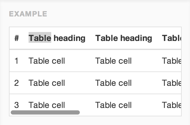
Credit to Jason Bradley for providing an example:
All tables within bootstrap stretch according to the container they're in. You can put your tables inside a .span element to control the size. This SO Question may help you out
Why do Twitter Bootstrap tables always have 100% width?
You might also consider trying one of these approaches, since larger tables aren't exactly friendly on mobile even if it works:
http://elvery.net/demo/responsive-tables/
I'm partial to 'No More Tables' but that obviously depends on your application.
After researching for almost 1 month i found the below code which is working very beautifully and 100% perfectly on my website. To check the preview how it is working you can check from the link. https://www.jobsedit.in/state-government-jobs/
and
https://www.jobsrob.in/category/central-government-jobs/
CSS CODE-----
@media only screen and (max-width: 500px)  {
    .resp table  {
        display: block ;
    }
    .resp th  {
        position: absolute;
        top: -9999px;
        left: -9999px;
        display:block ;
    }
     .resp tr {
    border: 1px solid #ccc;
    display:block;
    }
    .resp td  {
        /* Behave  like a "row" */
        border: none;
        border-bottom: 1px solid #eee;
        position: relative;
        width:100%;
        background-color:White;
        text-indent: 50%;
        text-align:left;
        padding-left: 0px;
        display:block;
    }
    .resp  td:nth-child(1)  {
        border: none;
        border-bottom: 1px solid #eee;
        position: relative;
        font-size:20px;
        text-indent: 0%;
        text-align:center;
}
    .resp td:before  {
        /* Now like a table header */
        position: absolute;
        /* Top/left values mimic padding */
        top: 6px;
        left: 6px;
        width: 45%;
        text-indent: 0%;
        text-align:left;
        white-space: nowrap;
        background-color:White;
        font-weight:bold;
    }
    /*
    Label the data
    */
    .resp td:nth-of-type(2):before  { content: attr(data-th) }
    .resp td:nth-of-type(3):before  { content: attr(data-th) }
    .resp td:nth-of-type(4):before  { content: attr(data-th) }
    .resp td:nth-of-type(5):before  { content: attr(data-th) }
    .resp td:nth-of-type(6):before  { content: attr(data-th) }
    .resp td:nth-of-type(7):before  { content: attr(data-th) }
    .resp td:nth-of-type(8):before  { content: attr(data-th) }
    .resp td:nth-of-type(9):before  { content: attr(data-th) }
    .resp td:nth-of-type(10):before  { content: attr(data-th) }
}
HTML CODE --
<table>
<tr>
<td data-th="Heading 1"></td>
<td data-th="Heading 2"></td>
<td data-th="Heading 3"></td>
<td data-th="Heading 4"></td>
<td data-th="Heading 5"></td>
</tr>
</table>