How to create Ripple effect on Click - Material Design
I have used this sort of code before on a few of my projects.
Using jQuery we can position the effect to its not just static and then we add the span element onclick. I have added comments so it makes it easier to follow.
Demo Here
jQuery
$("div").click(function (e) {

  // Remove any old one
  $(".ripple").remove();

  // Setup
  var posX = $(this).offset().left,
      posY = $(this).offset().top,
      buttonWidth = $(this).width(),
      buttonHeight =  $(this).height();

  // Add the element
  $(this).prepend("<span class='ripple'></span>");


 // Make it round!
  if(buttonWidth >= buttonHeight) {
    buttonHeight = buttonWidth;
  } else {
    buttonWidth = buttonHeight;
  }

  // Get the center of the element
  var x = e.pageX - posX - buttonWidth / 2;
  var y = e.pageY - posY - buttonHeight / 2;


  // Add the ripples CSS and start the animation
  $(".ripple").css({
    width: buttonWidth,
    height: buttonHeight,
    top: y + 'px',
    left: x + 'px'
  }).addClass("rippleEffect");
});
CSS
.ripple {
  width: 0;
  height: 0;
  border-radius: 50%;
  background: rgba(255, 255, 255, 0.4);
  transform: scale(0);
  position: absolute;
  opacity: 1;
}
.rippleEffect {
    animation: rippleDrop .6s linear;
}

@keyframes rippleDrop {
  100% {
    transform: scale(2);
    opacity: 0;
  }
}
This can be achieved with box-shadows. The positioning of the circle origin under the mouse when clicked will need JS.
li{
    font-size:2em;
    background:rgba(51, 51, 254, 0.8);
    list-style-type:none;
    display:inline-block;
    line-height:2em;
    width:6em;
    text-align:center;
    color:#fff;
    position:relative;
    overflow:hidden;
}
a{color:#fff;}
a:after{
    content:'';
    position:absolute;
    border-radius:50%;
    height:10em; width:10em;
    top: -4em; left:-2em;
    box-shadow: inset 0 0 0 5em rgba(255,255,255,0.2);
    transition: box-shadow 0.8s;
}
a:focus:after{
    box-shadow: inset 0 0 0 0em rgba(255,255,255,0.2);
}
<ul>
<li><a href="#">button</a></li>
</ul>Ripple effect in Material Design using jQuery and CSS3
To create a UX Ripple effect basically you need to:
- append to any element an
oveflow:hiddenelement to contain the ripple circle (you don't want to alter your original element overflow, neither see the ripple effect go outside of a desired container) - append to the overflow container the ripple wave translucent radial element
- get the click coordinates and CSS3 animate the scaling and opacity of the ripple element
- Listen for the
animationendevent and destroy the ripple container.
The basic code:
Basically add data-ripple (default as white ripple) or data-ripple="#000" to a desired element:
<a data-ripple> EDIT </a>
<div data-ripple="rgba(0,0,0, 0.3)">Lorem ipsum</div>
CSS:
/* MAD-RIPPLE EFFECT */
.ripple{
  position: absolute;
  top:0; left:0; bottom:0; right:0;
  overflow: hidden;
  -webkit-transform: translateZ(0); /* to contain zoomed ripple */
  transform: translateZ(0);
  border-radius: inherit; /* inherit from parent (rounded buttons etc) */
  pointer-events: none; /* allow user interaction */
          animation: ripple-shadow 0.4s forwards;
  -webkit-animation: ripple-shadow 0.4s forwards;
}
.rippleWave{
  backface-visibility: hidden;
  position: absolute;
  border-radius: 50%;
  transform: scale(0.7); -webkit-transform: scale(0.7);
  background: rgba(255,255,255, 1);
  opacity: 0.45;
          animation: ripple 2s forwards;
  -webkit-animation: ripple 2s forwards;
}
@keyframes ripple-shadow {
  0%   {box-shadow: 0 0 0 rgba(0,0,0,0.0);}
  20%  {box-shadow: 0 4px 16px rgba(0,0,0,0.3);}
  100% {box-shadow: 0 0 0 rgba(0,0,0,0.0);}
}
@-webkit-keyframes ripple-shadow {
  0%   {box-shadow: 0 0 0 rgba(0,0,0,0.0);}
  20%  {box-shadow: 0 4px 16px rgba(0,0,0,0.3);}
  100% {box-shadow: 0 0 0 rgba(0,0,0,0.0);}
}
@keyframes ripple {
  to {transform: scale(24); opacity:0;}
}
@-webkit-keyframes ripple {
  to {-webkit-transform: scale(24); opacity:0;}
}
jQuery
jQuery(function($) {

  // MAD-RIPPLE // (jQ+CSS)
  $(document).on("mousedown", "[data-ripple]", function(e) {

    var $self = $(this);

    if($self.is(".btn-disabled")) {
      return;
    }
    if($self.closest("[data-ripple]")) {
      e.stopPropagation();
    }

    var initPos = $self.css("position"),
        offs = $self.offset(),
        x = e.pageX - offs.left,
        y = e.pageY - offs.top,
        dia = Math.min(this.offsetHeight, this.offsetWidth, 100), // start diameter
        $ripple = $('<div/>', {class : "ripple",appendTo : $self });

    if(!initPos || initPos==="static") {
      $self.css({position:"relative"});
    }

    $('<div/>', {
      class : "rippleWave",
      css : {
        background: $self.data("ripple"),
        width: dia,
        height: dia,
        left: x - (dia/2),
        top: y - (dia/2),
      },
      appendTo : $ripple,
      one : {
        animationend : function(){
          $ripple.remove();
        }
      }
    });
  });

});
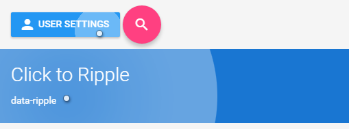
Here's a full-featured demo:
jQuery(function($) {

  // MAD-RIPPLE // (jQ+CSS)
  $(document).on("mousedown", "[data-ripple]", function(e) {

    var $self = $(this);

    if($self.is(".btn-disabled")) {
      return;
    }
    if($self.closest("[data-ripple]")) {
      e.stopPropagation();
    }

    var initPos = $self.css("position"),
        offs = $self.offset(),
        x = e.pageX - offs.left,
        y = e.pageY - offs.top,
        dia = Math.min(this.offsetHeight, this.offsetWidth, 100), // start diameter
        $ripple = $('<div/>', {class : "ripple",appendTo : $self });

    if(!initPos || initPos==="static") {
      $self.css({position:"relative"});
    }

    $('<div/>', {
      class : "rippleWave",
      css : {
        background: $self.data("ripple"),
        width: dia,
        height: dia,
        left: x - (dia/2),
        top: y - (dia/2),
      },
      appendTo : $ripple,
      one : {
        animationend : function(){
          $ripple.remove();
        }
      }
    });
  });

});
*{box-sizing:border-box; -webkit-box-sizing:border-box;}
html, body{height:100%; margin:0;}
body{background:#f5f5f5; font: 14px/20px Roboto, sans-serif;}
h1, h2{font-weight: 300;}
/* MAD-RIPPLE EFFECT */
.ripple{
position: absolute;
top:0; left:0; bottom:0; right:0;
overflow: hidden;
-webkit-transform: translateZ(0); /* to contain zoomed ripple */
transform: translateZ(0);
border-radius: inherit; /* inherit from parent (rounded buttons etc) */
pointer-events: none; /* allow user interaction */
animation: ripple-shadow 0.4s forwards;
-webkit-animation: ripple-shadow 0.4s forwards;
}
.rippleWave{
backface-visibility: hidden;
position: absolute;
border-radius: 50%;
transform: scale(0.7); -webkit-transform: scale(0.7);
background: rgba(255,255,255, 1);
opacity: 0.45;
animation: ripple 2s forwards;
-webkit-animation: ripple 2s forwards;
}
@keyframes ripple-shadow {
0% {box-shadow: 0 0 0 rgba(0,0,0,0.0);}
20% {box-shadow: 0 4px 16px rgba(0,0,0,0.3);}
100% {box-shadow: 0 0 0 rgba(0,0,0,0.0);}
}
@-webkit-keyframes ripple-shadow {
0% {box-shadow: 0 0 0 rgba(0,0,0,0.0);}
20% {box-shadow: 0 4px 16px rgba(0,0,0,0.3);}
100% {box-shadow: 0 0 0 rgba(0,0,0,0.0);}
}
@keyframes ripple {
to {transform: scale(24); opacity:0;}
}
@-webkit-keyframes ripple {
to {-webkit-transform: scale(24); opacity:0;}
}
/* MAD-BUTTONS (demo) */
[class*=mad-button-]{
display:inline-block;
text-align:center;
position: relative;
margin: 0;
white-space: nowrap;
vertical-align: middle;
font-family: "Roboto", sans-serif;
font-size: 14px;
font-weight: 500;
text-transform: uppercase;
text-decoration: none;
border: 0; outline: 0;
background: none;
transition: 0.3s;
cursor: pointer;
color: rgba(0,0,0, 0.82);
}
[class*=mad-button-] i.material-icons{
vertical-align:middle;
padding:0;
}
.mad-button-raised{
height: 36px;
padding: 0px 16px;
line-height: 36px;
border-radius: 2px;
box-shadow: /*amb*/ 0 0 2px rgba(0,0,0,0.15),
/*key*/ 0 1px 3px rgba(0,0,0,0.25);
}.mad-button-raised:hover{
box-shadow: /*amb*/ 0 0 2px rgba(0,0,0,0.13),
/*key*/ 0 2px 4px rgba(0,0,0,0.2);
}
.mad-button-action{
width: 56px; height:56px;
padding: 16px 0;
border-radius: 32px;
box-shadow: /*amb*/ 0 0 2px rgba(0,0,0,0.13),
/*key*/ 0 5px 7px rgba(0,0,0,0.2);
}.mad-button-action:hover{
box-shadow: /*amb*/ 0 0 2px rgba(0,0,0,0.11),
/*key*/ 0 6px 9px rgba(0,0,0,0.18);
}
[class*=mad-button-].mad-ico-left i.material-icons{ margin: 0 8px 0 -4px; }
[class*=mad-button-].mad-ico-right i.material-icons{ margin: 0 -4px 0 8px; }
/* MAD-COLORS */
.bg-primary-darker{background:#1976D2; color:#fff;}
.bg-primary{ background:#2196F3; color:#fff; }
.bg-primary.lighter{ background: #BBDEFB; color: rgba(0,0,0,0.82);}
.bg-accented{ background:#FF4081; color:#fff; }
/* MAD-CELL */
.cell{padding: 8px 16px; overflow:auto;}<link href='https://fonts.googleapis.com/css?family=Roboto:500,400,300&subset=latin,latin-ext' rel='stylesheet' type='text/css'>
<link href="https://fonts.googleapis.com/icon?family=Material+Icons" rel="stylesheet">
<script src="https://code.jquery.com/jquery-2.1.4.js"></script>
<div class="cell">
<button data-ripple class="mad-button-raised mad-ico-left bg-primary"><i class="material-icons">person</i>User settings</button>
<a data-ripple href="#" class="mad-button-action bg-accented"><i class="material-icons">search</i></a>
</div>
<div data-ripple class="cell bg-primary-darker">
<h1>Click to Ripple</h1>
<p>data-ripple</p>
</div>
<div data-ripple="rgba(0,0,0, 0.4)" class="cell bg-primary">
<p>data-ripple="rgba(0,0,0, 0.4)"</p>
<p> Lorem ipsum dolor sit amet, consectetur adipisicing elit, sed do eiusmod tempor incididunt ut labore....</p>
<p><a data-ripple class="mad-button-raised mad-ico-right bg-accented">Edit<i class="material-icons">edit</i></a></p>
</div>