How to create EditText with rounded corners?
Here is the same solution (with some extra bonus code) in just one XML file:
<?xml version="1.0" encoding="utf-8"?>
<!--  res/drawable/edittext_rounded_corners.xml -->
<selector xmlns:android="http://schemas.android.com/apk/res/android">

<item android:state_pressed="true" android:state_focused="true">
    <shape>
        <solid android:color="#FF8000"/>
        <stroke
            android:width="2.3dp"
            android:color="#FF8000" />
         <corners
            android:radius="15dp" />
    </shape>
</item>

<item android:state_pressed="true" android:state_focused="false">
    <shape>
        <solid android:color="#FF8000"/>
        <stroke
            android:width="2.3dp"
            android:color="#FF8000" />
        <corners
            android:radius="15dp" />
    </shape>
</item>

<item android:state_pressed="false" android:state_focused="true">
    <shape>
        <solid android:color="#FFFFFF"/>
        <stroke
            android:width="2.3dp"
            android:color="#FF8000" />
        <corners
            android:radius="15dp" />
    </shape>
</item>

<item android:state_pressed="false" android:state_focused="false">
    <shape>
        <gradient
            android:startColor="#F2F2F2"
            android:centerColor="#FFFFFF"
            android:endColor="#FFFFFF"
            android:angle="270"
        />
        <stroke
            android:width="0.7dp"
            android:color="#BDBDBD" />
        <corners
            android:radius="15dp" />
    </shape>
</item>

<item android:state_enabled="true">
    <shape>
        <padding
                android:left="4dp"
                android:top="4dp"
                android:right="4dp"
                android:bottom="4dp"
            />
    </shape>
</item>

</selector>
You then just set the background attribute to edittext_rounded_corners.xml file:
<EditText  android:id="@+id/editText_name"
      android:background="@drawable/edittext_rounded_corners"/>
Try this one,
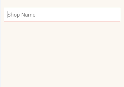
Create
rounded_edittext.xmlfile in your Drawable<?xml version="1.0" encoding="utf-8"?> <shape xmlns:android="http://schemas.android.com/apk/res/android" android:shape="rectangle" android:padding="15dp"> <solid android:color="#FFFFFF" /> <corners android:bottomRightRadius="0dp" android:bottomLeftRadius="0dp" android:topLeftRadius="0dp" android:topRightRadius="0dp" /> <stroke android:width="1dip" android:color="#f06060" /> </shape>Apply background for your
EditTextin xml file<EditText android:id="@+id/edit_expiry_date" android:layout_width="match_parent" android:layout_height="wrap_content" android:padding="10dip" android:background="@drawable/rounded_edittext" android:hint="@string/shop_name" android:inputType="text" />You will get output like this
There is an easier way than the one written by CommonsWare. Just create a drawable resource that specifies the way the EditText will be drawn:
<?xml version="1.0" encoding="utf-8"?>
<!--  res/drawable/rounded_edittext.xml -->
<shape xmlns:android="http://schemas.android.com/apk/res/android"
    android:shape="rectangle"
    android:padding="10dp">

    <solid android:color="#FFFFFF" />
    <corners
        android:bottomRightRadius="15dp"
        android:bottomLeftRadius="15dp"
        android:topLeftRadius="15dp"
        android:topRightRadius="15dp" />
</shape>
Then, just reference this drawable in your layout:
<?xml version="1.0" encoding="utf-8"?>
<LinearLayout xmlns:android="http://schemas.android.com/apk/res/android"
    android:orientation="vertical"
    android:layout_width="fill_parent"
    android:layout_height="fill_parent">

    <EditText
        android:layout_width="fill_parent"
        android:layout_height="wrap_content"
        android:padding="5dip"
        android:background="@drawable/rounded_edittext" />
</LinearLayout>
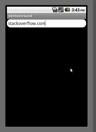
You will get something like:
Edit
Based on Mark's comment, I want to add the way you can create different states for your EditText:
<?xml version="1.0" encoding="utf-8"?>
<!-- res/drawable/rounded_edittext_states.xml -->
<selector xmlns:android="http://schemas.android.com/apk/res/android">
    <item
        android:state_pressed="true"
        android:state_enabled="true"
        android:drawable="@drawable/rounded_focused" />
    <item
        android:state_focused="true"
        android:state_enabled="true"
        android:drawable="@drawable/rounded_focused" />
    <item
        android:state_enabled="true"
        android:drawable="@drawable/rounded_edittext" />
</selector>
These are the states:
<?xml version="1.0" encoding="utf-8"?>
<!-- res/drawable/rounded_edittext_focused.xml -->
<shape xmlns:android="http://schemas.android.com/apk/res/android"
    android:shape="rectangle" android:padding="10dp">

    <solid android:color="#FFFFFF"/>
    <stroke android:width="2dp" android:color="#FF0000" />
    <corners
        android:bottomRightRadius="15dp"
        android:bottomLeftRadius="15dp"
        android:topLeftRadius="15dp"
        android:topRightRadius="15dp" />
</shape>
And... now, the EditText should look like:
<?xml version="1.0" encoding="utf-8"?>
<LinearLayout xmlns:android="http://schemas.android.com/apk/res/android"
    android:orientation="vertical"
    android:layout_width="fill_parent"
    android:layout_height="fill_parent">

    <EditText
        android:layout_width="fill_parent"
        android:layout_height="wrap_content"
        android:text="@string/hello"
        android:background="@drawable/rounded_edittext_states"
        android:padding="5dip" />
</LinearLayout>