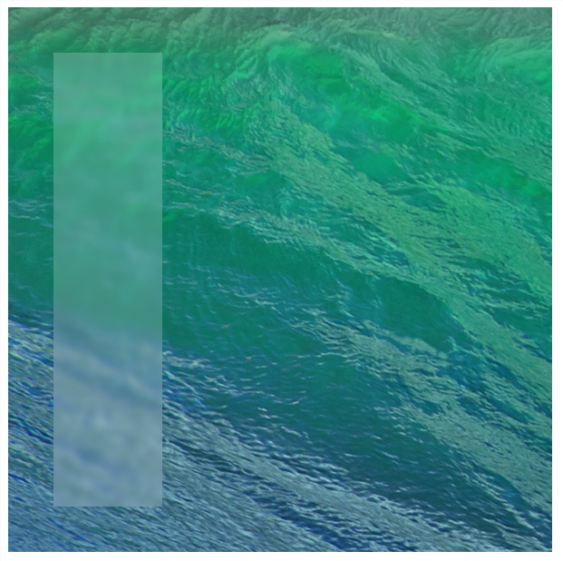
How to create a frosted glass effect using CSS?
You made me want to try, so I did, check out the example here:
http://codepen.io/Edo_B/pen/cLbrt
Using:
- HW Accelerated CSS filters
- JS for class assigning and arrow key events
- Images CSS Clip property
That's it.
I also believe this could be done dynamically for any screen if using canvas to copy the current dom and blurring it.
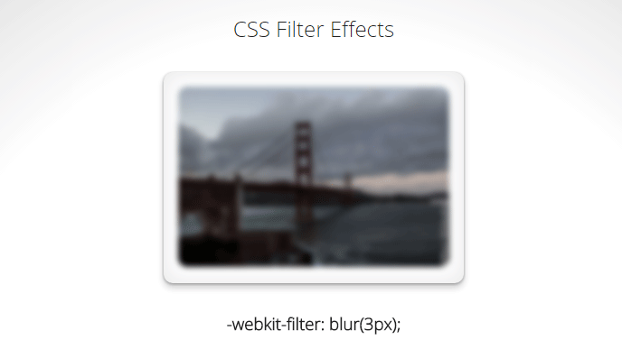
CSS
CSS 3 has a blur filter (only webkit at the moment Nov 2014):
-webkit-filter: blur(3px); /*chrome (android), safari (ios), opera*/
IE 4-9 supports a non-standard filter
filter:progid:DXImageTransform.Microsoft.Blur(PixelRadius='3')
See some nice demo for the blur and other filters here.
For future reference here is the compatibility table for CSS filter. Firefox seems to be getting the feature in v35+ while even IE11 does not seem to have any compatibility.
SVG
An alternative is using svg (safe for basically IE9 and up):
filter: url(blur.svg#blur);
SVG:
<svg version="1.1" xmlns="http://www.w3.org/2000/svg">
   <filter id="blur">
       <feGaussianBlur stdDeviation="3" />
   </filter>
</svg>
jsFiddle Demo
Javascript
You will achieve the highest browser compatibility with javascript, but usually the slowest performance and added complexity to your js.
- http://www.blurjs.com/ (jquery plugin, canvas solution so IE9+, FF, Chrome support)
- http://nbartlomiej.github.io/foggy/ (jquery plugin IE8+, FF,Chrome support)
This should be coming browsers in the future as a CSS filter called backdrop-filter. There's virtually no support for it at all currently. For browser support see: http://caniuse.com/#feat=css-backdrop-filter
This CSS filter will do the frosted glass without any funny business, or hacks. It'll just do it.
Someone recorded a demo of it on Vine, and it looks really good. They were using Safari nightly to get access to the CSS filter. https://vine.co/v/OxmjlxdxKxl
You can use CSS image filter.
-webkit-filter: blur(2px);
filter        : blur(2px);
More info on CSS image filters:
- http://techstream.org/Web-Design/CSS3-Image-Filters
- http://html5-demos.appspot.com/static/css/filters/index.html
Demo: JSFIDDLE

But in fact, they are using pre processed JPG, and just using it as a overlay in the correct position.
#background {
    position: absolute;
    left: 10px;
    top: 10px;
    width: 600px;
    height: 600px;

    background-image: url(http://images.apple.com/home/images/osx_hero.jpg);
    background-position: 0 0;
}
#blur {
    position: absolute;
    left: 50px;
    top: 50px;
    width: 120px;
    height: 500px;

    background-image: url(http://images.apple.com/home/images/osx_hero_blur.jpg);
    background-position: -50px -50px;
}

<div id="background">
    <div id="blur"></div>
</div>
Demo: JSFIDDLE