How to change colour of TogglerBar
A custom toggler grid with the desired look:
ClearAll[togglerGrid]
togglerGrid[Dynamic[y_], vals_, dims_, cols_: {RGBColor[.36, .67, .38],
    Lighter@ Lighter@RGBColor[.36, .67, .38]}, size_: {15, 20}] :=  Deploy @
  Grid[ArrayReshape[Table[With[{i = i},
    Item[Setter[Dynamic[MemberQ[y, i], BoxForm`TogglerBarFunction[y, i] &], {True}, i,
           Appearance -> None, Alignment -> Center, ImageSize -> size],
       ItemSize -> {All, All},
       Frame -> Dynamic[If[MemberQ[y, i], {{Gray, White}, {White, Gray}}, White]],
       FrameStyle -> Thick,
       Background -> Dynamic[If[MemberQ[y, i], cols[[2]], cols[[1]]]]]],
     {i, vals}], dims],
   Spacings -> {0, 0}, Dividers -> All, FrameStyle -> White, Alignment -> {Center, Center}]
Examples:
You can use togglerGrid (like Slider, Checkbox etc.) as the control type for control variables:
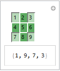
Manipulate[a, {{a, {}, ""}, Range @ 9, togglerGrid[#, Range @ 9, {3, 3}] &}]
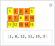
Manipulate[a, {{a, {}, ""}, Range@15, togglerGrid[#, Range@15, {3, 5}, {Orange, Yellow}]&}]
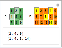
Manipulate[Column[{a, b}],
 Row[{Control@{{a, {2, 4}, "a"}, Range@9,
      togglerGrid[#, Range@9, {3, 3}] &},
   Spacer[20],
   Control@{{b, {1, 4, 8, 14}, "b"}, Range@15,
     togglerGrid[#, Range@15, {3, 5}, {Orange, Yellow}] &}}]]
Alternatively, you can use it as a dynamic object in the control area:
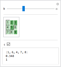
Manipulate[Column[{a, b, c}],
  {a, {}, None},
  {{b, 0}, 0, 1},
  Delimiter,
 Dynamic @ Panel @ togglerGrid[Dynamic@a, Range[9], {3, 3}],
 Delimiter,
 {{c, 0}, { 0, 1}}]
$Version
"11.3.0 for Microsoft Windows (64-bit) (March 7, 2018)"
It seems to be OS dependent. I think WRI tries to make their controls look like the ones OS's SDK builds. That means the effect of options such as Background will vary from OS to OS, and you can't expect the controls built-in by WRI to give much latitude. Of course, you can build a custom control that works exactly as you wish, but that might be a lot of work.
As an example of the how the OS influences the look and feel of controls, consider how much a toggle bar can differ on MacOS from what you see on your system.
Manipulate[a,
  {{a, {}, ""}, Range[9], TogglerBar,
   Appearance -> "Horizontal" -> {3, 3},
   Background -> GrayLevel[.9]}]

You can see that on MacOS WRI goes for a shallow 3D button effect. And you might also note that your code can be simplified quite a bit.
I used GrayLevel[.9] as the background color because all the alternatives I tried looked awful.
Update
This update attempts to address an issue raised the OP in comment to this answer.
I have made a number of custom controls for various apps I have built. None mimicked a toggle bar. However, some were close enough that I can give you a brief outline on how to go about implementing a toggle bar mimic.
The basic idea is use an array of
Buttonexpressions.Gridwould used to display the array.Each
Buttonexpression in the array would have the form:Button[label[state, ...], state = newState[...]; action[state, ...], Appearance -> None, ImageSize -> {width, height}]]The function
labelreturns a graphic which renders the look of button; the graphic depends the value ofstate. In your case,statewould toggle between two values,Truefor pressed andFalsefor not-pressed.The function
actionperforms whatever side effect should be performed as a result of the state change. In your case that would mean adding or deleting an element from a list of selected values.