How to change color AND width of non overlay scrollbars in Ubuntu 12.04
I'm assuming you are referring to the overlay scrollbars because you mention Unity. I don't know how to change the width but you can certainly change the color. If the color is distinct enough, I feel the width isn't that much of a problem because on hover it becomes decently wide.
You need to look in your theme's folder for files called gtkrc (in the gtk-2.0 folder) and gtk-widgets.css (in the gtk-3.0 folder). Open these files with a text editor. You may need to use gksudo gedit instead of just gedit if your theme is in /usr/share/themes and not in ~/.themes.
Then, search for overlay scrollbars or overlay-scrollbar or something similar and play with the colors specified in those sections. You can even specify your own color in hex code.
Obviously, you can set different colors in the two files if you so choose.
To visualize the changes you may need to switch to another theme and back after you've made and saved the changes to these files.
The changes you make in /usr/share/themes will be system-wide and changes in ~/.themes will be user-specific.
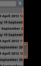
This is what my overlay scrollbar looks like in PCManFM.
Edit: In case, one is using conventional scrollbars, then to increase the contrast between the slider and trough in gtk-3.0 apps such as gedit, one can edit the gtk-widgets.css file mentioned above. To do so, search for the section titled scrollbar (or something similar) and look for the lines that have something like this:
.scrollbar.slider,
.scrollbar.slider:hover,
.scrollbar.button,
.scrollbar.slider.vertical,
.scrollbar.slider.vertical:hover,
.scrollbar.button.vertical {
    background-image: -gtk-gradient (linear, left top, right top,
                                 from (shade (@bg_color, 1.08)),
                                 to (shade (@bg_color, 0.92)));
    border-style: solid;
    border-width: 1px;
In here, one can play with the values for the background-image by changing the shade. A higher value is brighter, a lower value is darker.
I prefer to do something more simple: I change background-image to background-color and just have a color I like. So, for example, background-color: red; would probably give outstanding contrast.
My code looks like this:
.scrollbar.slider,
.scrollbar.button,
.scrollbar.slider.vertical,
.scrollbar.button.vertical {
    background-color: #003263; /*@theme_bg_color;*/
    /**/
    /**/
Obviously, a backup before editing is advisable and one can comment out stuff in the gtk-widgets.css file instead of deleting things by using /* and */.
(I can't get the formatting of block quotes to work while posting answers. If somebody would clean things up, I'd be grateful.)
One last edit (I hope):
Users of Chrome or Chromium may increase contrast by editing their gtk-2.0/apps/chromium.rc file if their theme provides it or by editing gtk-2.0/gtkrc if what is required is present there.
In both cases one should search for a section headed style "chrome-gtk-frame". In here, again, play with the shade value in this (or similar) line:
ChromeGtkFrame::scrollbar-slider-normal-color = shade (1.4, @panel_bg)
Or one can simply specific a color like this:
ChromeGtkFrame::scrollbar-slider-normal-color = "#003263"
or
ChromeGtkFrame::scrollbar-slider-normal-color = "blue"
(The quotes are required.)
Note:
The formattings in this answer are optimal for precise (Ubuntu 12.04) only, see next answer for improved formattings for trusty (Ubuntu 14.04).
Make scrollbars visible (change color)
Based on vasa1's informations provided above I changed the color of the classic scrollbars to the default selection color - the same that overlay scrollbars are using as well.
For GTK 3 applications modify:
gksu gedit /usr/share/themes/Ambiance/gtk-3.0/gtk-widgets.css
starting from line 1580 so that it looks like:
.scrollbar.slider,
.scrollbar.slider:hover,
.scrollbar.button,
.scrollbar.slider.vertical,
.scrollbar.button.vertical {
    background-image: -gtk-gradient (linear, left top, right top,
                                     from (shade (@selected_bg_color, 1.38)),
                                     to (shade (@selected_bg_color, 1.22)));
    border-style: solid;
    border-width: 1px;

    -unico-border-gradient: -gtk-gradient (linear, left top, right top,
                                           from (shade (@selected_bg_color, 1.14)),
                                           to (shade (@selected_bg_color, 1.14)));
    -unico-centroid-texture:  url("assets/scrollbar_handle_vertical.png");
    -unico-inner-stroke-gradient: -gtk-gradient (linear, left top, right top,
                                                 from (shade (@selected_bg_color, 1.46)),
                                                 to (shade (@selected_bg_color, 1.3)));
    -unico-inner-stroke-width: 1px;
}

.scrollbar.slider.vertical:hover {
    background-image: -gtk-gradient (linear, left top, right top,
                                     from (shade (@selected_bg_color, 1.28)),
                                     to (shade (@selected_bg_color, 1.02)));
    border-style: solid;
    border-width: 1px;

    -unico-border-gradient: -gtk-gradient (linear, left top, right top,
                                           from (shade (@selected_bg_color, 0.94)),
                                           to (shade (@selected_bg_color, 0.94)));
    -unico-centroid-texture:  url("assets/scrollbar_handle_vertical.png");
    -unico-inner-stroke-gradient: -gtk-gradient (linear, left top, right top,
                                                 from (shade (@selected_bg_color, 1.36)),
                                                 to (shade (@selected_bg_color, 1.1)));
    -unico-inner-stroke-width: 1px;
}

.scrollbar.slider.horizontal,
.scrollbar.button.horizontal {
    background-image: -gtk-gradient (linear, left top, left bottom,
                                     from (shade (@selected_bg_color, 1.38)),
                                     to (shade (@selected_bg_color, 1.22)));

    -unico-border-gradient: -gtk-gradient (linear, left top, left bottom,
                                           from (shade (@selected_bg_color, 1.14)),
                                           to (shade (@selected_bg_color, 1.14)));
    -unico-centroid-texture:  url("assets/scrollbar_handle.png");
    -unico-inner-stroke-gradient: -gtk-gradient (linear, left top, left bottom,
                                                 from (shade (@selected_bg_color, 1.46)),
                                                 to (shade (@selected_bg_color, 1.3)));
}

.scrollbar.slider.horizontal:hover {
    background-image: -gtk-gradient (linear, left top, left bottom,
                                     from (shade (@selected_bg_color, 1.28)),
                                     to (shade (@selected_bg_color, 1.02)));

    -unico-border-gradient: -gtk-gradient (linear, left top, left bottom,
                                           from (shade (@selected_bg_color, 0.94)),
                                           to (shade (@selected_bg_color, 0.94)));
    -unico-centroid-texture:  url("assets/scrollbar_handle.png");
    -unico-inner-stroke-gradient: -gtk-gradient (linear, left top, left bottom,
                                                 from (shade (@selected_bg_color, 1.36)),
                                                 to (shade (@selected_bg_color, 1.1)));
}


.scrollbar.button,
.scrollbar.button:insensitive {
    -unico-outer-stroke-width: 0;
}
This should be default.
For GTK 2 applications modify:
gksu gedit /usr/share/themes/Ambiance/gtk-2.0/gtkrc
starting from line 223 so that it looks like:
style "scrollbar" = "button" {
    xthickness = 2
    ythickness = 2

    bg[NORMAL] = shade(1.3, @selected_bg_color)
    bg[PRELIGHT] = shade (1.04, @selected_bg_color)

    bg[ACTIVE] = shade (0.96, @selected_bg_color)

    engine "murrine"
    {
        border_shades = {1.15, 1.1}
        roundness = 20
        contrast = 1.0
        trough_shades = {0.92, 0.98}
        lightborder_shade = 1.3
        glowstyle = 5
        glow_shade = 1.02
        gradient_shades = {1.2, 1.0, 1.0, 0.86}
        trough_border_shades = {0.9, 0.98}
    }
}
It does not look 100% identical to the GTK 3 formatting, so feel free to improve it.
Make scrollbars clickable (increase width)
To increase the silly small width that were never meant for being used in production, I assume, make the following changes to the same files.
For GTK 3 applications:
gksu gedit /usr/share/themes/Ambiance/gtk-3.0/gtk-widgets.css
modify line 1550 so that it looks like:
.scrollbar {
    -GtkScrollbar-has-backward-stepper: 0;
    -GtkScrollbar-has-forward-stepper: 0;
    -GtkRange-slider-width: 16;

    border-radius: 20px;

    -unico-border-gradient: -gtk-gradient (linear, left top, left bottom,
                                           from (shade (@bg_color, 0.74)),
                                           to (shade (@bg_color, 0.74)));
}
For GTK 2 applications modify:
gksu gedit /usr/share/themes/Ambiance/gtk-2.0/gtkrc
modify line 34 so that it looks like:
GtkScrollbar::slider-width = 16
For those preferring the complete files already edited, you can download mine from here:
GTK 3: gtk-widgets.css
GTK 2: gtkrc
Be careful. Make backups.
Enjoy! :)
For Ubuntu 14.04 (Trusty Tahr) slightly different modifications are needed.
GTK 3: gtk-widgets.css goes to: /usr/share/themes/Ambiance/gtk-3.0/gtk-widgets.css
GTK 2: gtkrc goes to: /usr/share/themes/Ambiance/gtk-2.0/gtkrc
Make backups prior:
sudo cp /usr/share/themes/Ambiance/gtk-2.0/gtkrc /usr/share/themes/Ambiance/gtk-2.0/gtkrc.bak
sudo cp gtkrc /usr/share/themes/Ambiance/gtk-2.0/
sudo cp /usr/share/themes/Ambiance/gtk-3.0/gtk-widgets.css /usr/share/themes/Ambiance/gtk-3.0/gtk-widgets.css.bak
sudo cp gtk-widgets.css /usr/share/themes/Ambiance/gtk-3.0/
Those commands expects the downloaded files gtkrc and gtk-widgets.css in the current directory.