How to add extra item at the bottom of the drawer navigation manually (like logout button)?
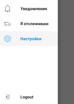
I was able to align Logout at the bottom of the drawer menu with adding justifyContent: 'space-between' to the ScrollView container. You can see the result in the picture
The result source code looks the following way:
const DrawerWithLogoutButton = (props) => (
  <ScrollView contentContainerStyle={{flex: 1,  flexDirection: 'column', justifyContent: 'space-between' }}>
    <SafeAreaView forceInset={{ top: 'always', horizontal: 'never' }}>
      <DrawerItems {...props} />
    </SafeAreaView>
    <TouchableOpacity>
      <View style={styles.item}>
        <View style={styles.iconContainer}>
          <Image source={require('./img/logout.png')} style={styles.icon}></Image>
        </View>
        <Text style={styles.label}>Logout</Text>
      </View>
    </TouchableOpacity>
  </ScrollView>
);

const styles = StyleSheet.create({
  item: {
    flexDirection: 'row',
    alignItems: 'center',
  },
  label: {
    margin: 16,
    fontWeight: 'bold',
    color: 'rgba(0, 0, 0, .87)',
  },
  iconContainer: {
    marginHorizontal: 16,
    width: 24,
    alignItems: 'center',
  },
  icon: {
    width: 24,
    height: 24,
  }
});
React Navigation docs recommend wrapping the drawer navigation with a custom content drawer function. This is what we do did to give our drawer a logout button, but also keep all of the Drawer.Screens in place.
In the code below we create a CustomDrawerContent that contains a DrawerItem as our logout button. This function wraps the Drawer.Navigator through its property drawerContent. Our final drawer then looks like:
- Home (Drawer.Screen)
- Edit Profile (Drawer.Screen)
- Landing (Drawer.Screen)
- Logout (DrawerItem)
const Drawer = createDrawerNavigator();

function CustomDrawerContent(props) {
  return (
    <DrawerContentScrollView {...props}>
      <DrawerItemList {...props} />
      <DrawerItem label={() => <Text style={{ color: 'white' }}>Logout</Text>}
        style={{backgroundColor: 'red'}}
        onPress={() => alert('Logged out')}
      />
    </DrawerContentScrollView>
  );
}

function App(props) {
  return (
    <Provider store={store}>
      <View style={styles.container}>
        <StatusBar translucent={true} />
        <NavigationContainer>
          <Drawer.Navigator drawerContent={props => <CustomDrawerContent {...props} />}>
            <Drawer.Screen name='Home' component={Home} />
            <Drawer.Screen name='Edit Profile' component={EditProfile} />
            <Drawer.Screen name='Landing' component={Landing} />
          </Drawer.Navigator>
        </NavigationContainer>
      </View>
    </Provider>
  )
}
You can set position:'absolute' and buttom:0 like this code:
<TouchableOpacity
    onPress={() => {this.logout()}}
    style={{ bottom: 0, position: 'absolute', width: '100%' }}>
      <View style={{ flex: 1, justifyContent: 'center', alignItems: 'center', flexDirection:'row', alignItems: 'center' }}>
        <Icon name="md-log-out" style={{marginRight: 10, color: '#444'}} size={20}/>
        <Text style={{color: '#444'}}>Logout</Text>
      </View>
</TouchableOpacity>
You can change the style to make it like other buttons. I hope this will help you...