How do I get the rightmost column to fill the remaining space?
I have found a simple solution:
table td:last-child {
    width: 100%;
}
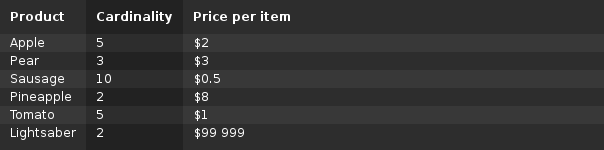
Result:
body {
    font: 12px sans-serif;
}

table {
    width: 100%;

    background-color: #222222;
    color: white;
    border-collapse: collapse;
}

table th {
    padding: 10px;
    text-align: left;
}

table td {
    padding: 2px 10px;
}

table td:last-child {
    width: 100%;
}

table td:nth-child(odd), table th:nth-child(odd) {
    background-color: rgba(255, 255, 255, 0.05);
}

table tr:nth-child(even) {
    background-color: rgba(255, 255, 255, 0.05);
}

table tr:last-child td {
    padding-bottom: 10px;
}
<table>
<tr>
<th>Product</th>
<th>Cardinality</th>
<th>Price per item</th>
</tr>
<tr>
<td>Apple</td>
<td>5</td>
<td>$2</td>
</tr>
<tr>
<td>Pear</td>
<td>3</td>
<td>$3</td>
</tr>
<tr>
<td>Sausage</td>
<td>10</td>
<td>$0.5</td>
</tr>
<tr>
<td>Pineapple</td>
<td>2</td>
<td>$8</td>
</tr>
<tr>
<td>Tomato</td>
<td>5</td>
<td>$1</td>
</tr>
<tr>
<td>Lightsaber</td>
<td>2</td>
<td>$99 999</td>
</tr>
</table>This appears to work in my current scenario, but it looks like something that can cause unwanted side effects in other situations. If I stumble across any, I'll edit this answer.
Possible side effects
- Multi-word table cells will be wrapped into multiple lines to keep the column as narrow as possible. One solution is to use
white-space: nowrapon the table cells, but that will hinder cells with lots of text from wrapping when they should.
If this is what you meant: 
Then I can achieve that using standard html table structure with the following css:
table {
  width:auto;
}
td {
  white-space:nowrap;
}
td:last-child {
  width:100%;
}
--EDIT : work with your jsfiddle